| Image |
Comment |
| 08/30/2006 06:31:42 AM |
|
 Photographer found comment helpful. Photographer found comment helpful. |
| 08/29/2006 05:52:43 PM |
|
| Photographer found comment helpful. |
| 08/29/2006 05:51:45 PM |
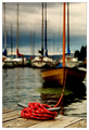
Washed Ashoreby Absinthe75Comment: You must have intended for this to be oof, but for me it doesn't do much as an image. I think that in order to show motion, you need to have at least one aspect of the image in focus. |
| 08/29/2006 05:36:28 PM |
|
| Photographer found comment helpful. |
| 08/29/2006 05:24:23 PM |
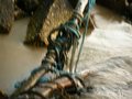
Welcomeby L1Comment: This was a well done still life. Love the grain on it and the tone. |
| Photographer found comment helpful. |
| 08/29/2006 05:22:17 PM |
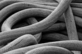
Nauticalby JewellianComment: Very nice abstract. Black and white really works with it as well. |
| Photographer found comment helpful. |
| 08/29/2006 05:21:10 PM |
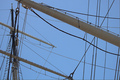
Forget-me-knotby digidoriComment: Blue background really enhances the rope. However, the rope is way overexposed. Very little detail. Maybe an exposure compensation to make the detail come out better would have avoided the overexposure. |
| Photographer found comment helpful. |
| 08/29/2006 05:12:40 PM |
Ropes and Spars and Negative Spaceby chaliceComment: Like the idea. The blue is lovely in the background and serves as a great backdrop for the spars. Found the lines and spars to be too busy, though. Maybe a little less of them would have had more impact. |
| Photographer found comment helpful. |
| 08/28/2006 07:33:10 AM |
|
| Photographer found comment helpful. |
| 08/24/2006 09:47:05 PM |
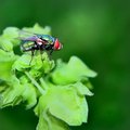
Mr. Flyby SJCarterComment: Very vivid color, and I love the fly detail. It truly does make the humble fly look beautiful. The only part I didn't like was the blue tinging on the leaves. It looks as if there might me too much contrast given to the image, or perhaps too much tonal mapping. Still, love the image and the dof is really good. |
| Photographer found comment helpful. |
Home -
Challenges -
Community -
League -
Photos -
Cameras -
Lenses -
Learn -
Help -
Terms of Use -
Privacy -
Top ^
DPChallenge, and website content and design, Copyright © 2001-2026 Challenging Technologies, LLC.
All digital photo copyrights belong to the photographers and may not be used without permission.
Current Server Time: 05/20/2026 09:45:41 AM EDT.