| Image |
Comment |
| 10/09/2006 08:00:47 PM |
|
 Photographer found comment helpful. Photographer found comment helpful. |
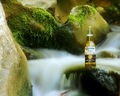
| 10/09/2006 07:58:34 PM |
Meagre Selectionby mattisokayComment: Very good concept. Saw one like this on a billboard, so you did a fine job of depicting it in a way the advertising market would jump on. I know it is basic editing, so spot editing is not allowed, but the overexposed line at the bottom is distracting. Still, overall, you used dramatic lighting to highlight the product. 8 |
| 10/09/2006 07:54:57 PM |
Cool. Smooth. Refreshing. by SJCarterComment: I love the concept of this one. A bit more crop to focus more on the product would have really brought it out better. It is the product you are selling, not the background. 8 |
| Photographer found comment helpful. |
| 10/09/2006 07:49:53 PM |
Illuminatis™by glodaComment: Very cool. Not sure how you did it, but I will check when challenge is over. The only thing I wonder about is why there is no product name on the label. Since it is an ad, I think that might have been an important point. |
| 10/08/2006 09:07:21 AM |
Privacy Pleaseby DianaComment: Oh, this was so underrated. I can't believe it placed where it did. I feel your pain on this one. It was a terrific image, though I did read one comment that said a bit more crop might have helped, but still, definitely a great capture. |
| Photographer found comment helpful. |
| 10/08/2006 09:02:47 AM |
Gothic Bondageby Physics_GuruComment: I gave this one a 7, but am not surprised at the score of this one. It really doesn't jive with dp narrowmindedness. Anyway, I have a goth living in my house, so I thought your image was well done. Too bad it didn't do better. |
| Photographer found comment helpful. |
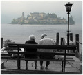
| 10/06/2006 10:58:08 PM |
Mirageby LevTComment: Very nice technique in post processing. I like the black and white foreground and the colored island in the distance. Nice subject, too. Warm and fuzzy. |
| Photographer found comment helpful. |
| 10/06/2006 08:53:03 AM |
|
| Photographer found comment helpful. |
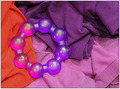
| 10/06/2006 08:46:11 AM |
Laundry Basketby Bear_MusicComment: I like the orange contrast on this one. It made an interesting reflection in the plastic beads. The overall effect is lacking in contrast, though. The orange gave it some zip, but not enough. |
| Photographer found comment helpful. |
| 10/06/2006 07:33:27 AM |
|
| Photographer found comment helpful. |
Home -
Challenges -
Community -
League -
Photos -
Cameras -
Lenses -
Learn -
Help -
Terms of Use -
Privacy -
Top ^
DPChallenge, and website content and design, Copyright © 2001-2026 Challenging Technologies, LLC.
All digital photo copyrights belong to the photographers and may not be used without permission.
Current Server Time: 07/28/2026 10:56:39 AM EDT.