| Image |
Comment |
| 11/19/2005 08:17:55 PM |
Practice Practice Practiceby totaldisComment: I like the high contrast, though I'm not sure if that feeling is universal. I think I might like it better without the harsh shadows, with a bit more empty space on top, and maybe with the tees more precisely vertical. Nice concept though, and overall a great job! |
 Photographer found comment helpful. Photographer found comment helpful. |
| 11/19/2005 08:10:34 PM |
Happy Howlidaysby nsoroma79Comment: Hahaha!! I would try swapping the two shots on the right, since I tend to be drawn mostly to the right-most panel, and the middle feller is facing a bit to the left. Bet this was a fun one to shoot! :-) |
| 11/19/2005 08:05:22 PM |
The Diveby scrum8Comment: Beautiful series of captures! I think it would be even more dramatic if there was more variation between the second and third panels. Also the background on the third is a *little* lighter than the previous two. Great job though--each shot could easily stand on its own. :-) |
| Photographer found comment helpful. |
| 11/19/2005 03:09:25 AM |
|
| Photographer found comment helpful. |
| 11/17/2005 12:48:43 AM |
|
| Photographer found comment helpful. |
| 11/17/2005 12:39:05 AM |
Triptych Splashby bob_bobskiComment: Nice! The left panel bothers me a bit though, since the shadow doesn't line up with the other two splashes (not that that's where the drop will hit, but that's still where it *looks* like it's going to hit!); and there's also some sort of vertical smudge-type thing going on which is distracting. |
| Photographer found comment helpful. |
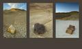
| 11/17/2005 12:24:44 AM |
Badlandsby crabappl3Comment: Nice concept. Varying the relative positioning of the rocks within the three panels may be helpful in adding even more visual interest. |
| Photographer found comment helpful. |
| 11/17/2005 12:20:48 AM |
The Damselby idnicComment: Nice shot, and I like the choice of matching border color. It looks like you sharpened after adding the border? The border lines might look cleaner if you add them after other post-processing steps. |
| Photographer found comment helpful. |
| 11/17/2005 12:14:31 AM |
Changeby TooCoolComment: Nice concept and execution. I'll assume you used at most three shots and not four. ;-) The background on the rightmost leaf seems a little less dark than the other two. |
| Photographer found comment helpful. |
| 05/21/2005 12:26:12 AM |
Rythm And Bass Is The Combination To Harmonyby tolovemoonComment: I like the thought behind this, especially since I play both guitar and bass; though it would help if more of the instruments could be seen in silhouette, especially the curve of the bodies. My attention is mostly drawn towards the tuning pegs. |
| Photographer found comment helpful. |
Home -
Challenges -
Community -
League -
Photos -
Cameras -
Lenses -
Learn -
Help -
Terms of Use -
Privacy -
Top ^
DPChallenge, and website content and design, Copyright © 2001-2026 Challenging Technologies, LLC.
All digital photo copyrights belong to the photographers and may not be used without permission.
Current Server Time: 06/24/2026 01:48:18 PM EDT.