| Image |
Comment |
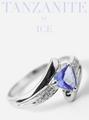
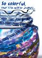
| 04/25/2005 07:11:04 AM |
Iceby bruskiComment: V Nice image - i need a macro lens... ! Great detail on stone. Very typical of adverts I have seen. Lettering works. |
 Photographer found comment helpful. Photographer found comment helpful. |
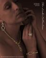
| 04/25/2005 07:10:10 AM |
The Links Collectionby EddyGComment: Okay - text here makes this look like a good advertising image. Image is very high class. Great lighting and use of dodge/burn type effect to focus on jewellery (spelled wrongly ;) ). |
| Photographer found comment helpful. |
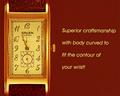
| 04/25/2005 07:08:17 AM |
Gruenby graphicfunkComment: Nice image. not to my taste. Text does not feel "right": not enought of it to look like an advert, but too much to act as a byline. Font does not fit the style of watch - watch is a bit fussy, font is plain and simple. |
| Photographer found comment helpful. |
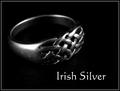
| 04/25/2005 07:06:55 AM |
Irish Silverby banmornComment: Really nice work. So much detail, however, that the imperfections (scratches?) are showing on the ring, which is a distraction. |
| Photographer found comment helpful. |
| 04/25/2005 07:05:22 AM |
Tree of Amberby smartypantsComment: V nice image. good focus, colour, detail, contrast etc. maybe subject matter itself is a little quiet on the interest front. slightly too much space on top for me. |
| Photographer found comment helpful. |
| 04/25/2005 07:04:08 AM |
Natural Jewelryby RissaComment: Clear image. Not to my taste. Cannot work out what is going on in the bottom LHS - is that a tray with a pebble design? maybe too much water on pebbles: maybe a few well placed dops would have worked better? |
| Photographer found comment helpful. |
| 04/25/2005 07:01:36 AM |
Kid Stuffby pcodyComment: Great colour and idea. water spots are a little distracting. |
| Photographer found comment helpful. |
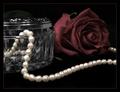
| 04/25/2005 07:00:47 AM |
Simple Eleganceby ShannonComment: Very nice - great detail and a really "smooth" look. lighting is v good. subject matter perhaps a little on the quiet side, though: don't know if you could have doubled up pearls to give more to look at? |
| Photographer found comment helpful. |
| 04/25/2005 06:59:48 AM |
Visit Arizonaby justineComment: Nice image. liek the photo. text does v little for me: essentially, three styles (normal, italics, capitals) feels very confused/messy & distracts. |
| Photographer found comment helpful. |
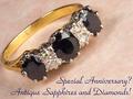
| 04/25/2005 06:58:33 AM |
Sapphires and Diamondsby hughletherenComment: Nice image. Great detail. Lighting good. Text - I don't like! Quite a fussy font, and is very loaded to the bottom of the image. Could do with being less text (or three lines), higher and being more balanced in the bottom RH corner, rather than the bottom. |
| Photographer found comment helpful. |
Home -
Challenges -
Community -
League -
Photos -
Cameras -
Lenses -
Learn -
Help -
Terms of Use -
Privacy -
Top ^
DPChallenge, and website content and design, Copyright © 2001-2026 Challenging Technologies, LLC.
All digital photo copyrights belong to the photographers and may not be used without permission.
Current Server Time: 07/17/2026 07:11:00 PM EDT.