| Image |
Comment |
| 05/13/2005 06:47:12 AM |
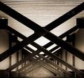
Underby bruskiComment: I like the grain and top/bottom contrast. some marks onthe beams would presumably go with spot editing. slight loss of detail in the middle, but does not hurt this pleasing image. |
 Photographer found comment helpful. Photographer found comment helpful. |
| 05/13/2005 06:46:02 AM |
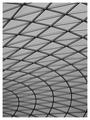
Trianglesby AndrewTOComment: British Library? I thought of taking this - nice capture.
Maybe lacking a little in contrast - the best images have the full range of white to black, IMO, which is just lacking here - I have recently been playing with this, and find that whacking up the yellows under colour balance before converting to greyscale produces a pleasing B&W image. |
| Photographer found comment helpful. |
| 05/13/2005 06:43:36 AM |
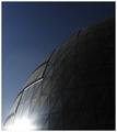
The Triangles of POWER!by redmoonComment: very limited power in this case - the power to offend with Nazi jibes and extend the CC zone by about a street.
The glare on the BLHS is just too strong for me on my monitor. I really like the semi-silhouetted nature of the rest of the dome, and the glare adds to that, but it is just slightly too strong. I might have punched up the blues very slightly - there is a very slight dull tint that I get with my P&S: I get rid of it with "colour balance" in PS by moving top slider -10, second slider +3, third slider +7.
|
| 05/13/2005 06:39:44 AM |
It's a Robot!!!by PeterCComment: I had necer noticed the skylights before on the Lord Mayor's building! the absence of anything in the top part of the frame makes me wonder how else this could have been framed. The negative space is not working strongly for me. The branches on the RHS are on the distracting, rather than complementary side of the border. I might have tried (and in fact did with an outtake) something with the cranes behind and further to the right of this image. |
| Photographer found comment helpful. |
| 05/13/2005 06:36:36 AM |
Carpenter's Visionby wheeleddComment: I guess in Cape Cod you have the space for a nice big workshed.
I like this photo - great colour and lighting. Skin tones look a little pale on my monitor and could be warmed - though may be your intention to fix focus on the triangle. I might have tried very fractionally more sharpening to pull the triangle into absolute clarity - very slightly more than usual, given the geometrical nature of the subject. |
| Photographer found comment helpful. |
| 05/13/2005 04:29:41 AM |
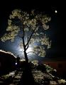
Lost Not Foundby Man_Called_HorseComment: I am impressed at the lengths you went to get this stunning photo, SJ: it is truly reminiscent of a "lost" dream. Great work. |
| Photographer found comment helpful. |
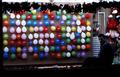
| 05/09/2005 10:47:05 AM |
Go Ahead...Give It Your Best Shot!by LokiComment: Nice idea, but colours lack vibrancy and overall quite a dark image on my screen. I would definitely boost the saturation level. Bit of dodging might have lightened up attendant's face a little. |
| Photographer found comment helpful. |
| 05/09/2005 10:45:15 AM |
Looking inside through the mirrorby SteveinnzComment: Good idea - but you should have cleaned the mirror to perfection first (or cloned out the spots in PS). Over exposed exterior is distracting, and could have been minimised with tighter crop. |
| Photographer found comment helpful. |
| 05/09/2005 10:43:59 AM |
Night-Lightsby conglettComment: Good focus on face, but lack of focus on jar is really distracting me here. Probably intentional, but I don't like. Also slight colour cast (yellows) that could be removed in PS easily using colour balance tool - something i am only learning, but that I would probably do here to giove a more natural look. |
| Photographer found comment helpful. |
| 05/09/2005 10:41:54 AM |
Got bones?by dogzComment: Nice capture, though wish I could see fraction more of dog face. Eye appears marginally out of focus to me. Fence is a little lacking in contrast and depth of tone. |
| Photographer found comment helpful. |
Home -
Challenges -
Community -
League -
Photos -
Cameras -
Lenses -
Learn -
Help -
Terms of Use -
Privacy -
Top ^
DPChallenge, and website content and design, Copyright © 2001-2026 Challenging Technologies, LLC.
All digital photo copyrights belong to the photographers and may not be used without permission.
Current Server Time: 07/17/2026 08:17:00 PM EDT.