| Author | Thread |
|
|
11/12/2012 08:30:44 PM |
|
Surprised it didn't do better. Very nice tones & light. Love the style |
|
 Photographer found comment helpful. Photographer found comment helpful. |
Comments Made During the Challenge  |
|
|
05/17/2005 09:08:45 PM |
|
A good capture with great light and shadow play. Bump. |
|
| Photographer found comment helpful. |
|
|
05/17/2005 04:34:05 PM |
|
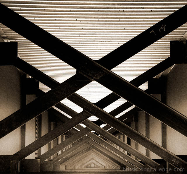
Very interesting composition and subject matter. This must have been hard to shoot, with that bright light above, causing all else to go dark. however, I like the sepia toning and grain makes this a more artistic piece. I especially like the how the beams create tight little triangles in the bottom center. It would be interesting to see what the original photo looks like. |
|
| Photographer found comment helpful. |
|
|
05/17/2005 03:38:05 PM |
|
nice use of repetition, and one of the better perspectives for repeated triangles in the challenge. i usually like grain in an image, but for this i feel a softer look would be more effective. 9 |
|
| Photographer found comment helpful. |
|
|
05/17/2005 12:35:44 PM |
|
| Photographer found comment helpful. |
|
|
05/17/2005 10:05:01 AM |
|
Coloring a little soft, but great graphics. 8 |
|
| Photographer found comment helpful. |
|
|
05/17/2005 09:50:51 AM |
|
| Photographer found comment helpful. |
|
|
05/17/2005 12:54:05 AM |
|
Very nice. Awesome perspective - I hope this does well. 10 |
|
| Photographer found comment helpful. |
|
|
05/15/2005 06:31:29 AM |
|
Love the grainy feel.. would have almost been better to crop off the top third to give more attention to the (more interesting) lower half of the image. 7 |
|
| Photographer found comment helpful. |
|
|
05/15/2005 12:17:02 AM |
|
Reasonably abtract, but it works well. I like. |
|
| Photographer found comment helpful. |
|
|
05/13/2005 06:47:12 AM |
|
I like the grain and top/bottom contrast. some marks onthe beams would presumably go with spot editing. slight loss of detail in the middle, but does not hurt this pleasing image. |
|
| Photographer found comment helpful. |
|
|
05/12/2005 05:52:37 PM |
|
Nice geometric study, good use of light and shadow. |
|
| Photographer found comment helpful. |
|
|
05/12/2005 11:09:29 AM |
|
Beautiful colours and a succesful composition but for my eyes your photo is a little bit too disordered. Maybe if you cropped the upper half the title "triangle" would be better visible. |
|
| Photographer found comment helpful. |
|
|
05/11/2005 04:42:51 PM |
|
Beautiful repeating pattern. Very graphical - with lines, repetition, rhythm, the works. Symmetry works well except that its off on the horizontal. But who's minding it? |
|
| Photographer found comment helpful. |
|
|
05/11/2005 04:29:54 PM |
|
| Photographer found comment helpful. |
|
|
05/11/2005 12:57:23 PM |
|
Great shot, excellent perspective! |
|
| Photographer found comment helpful. |
|
|
05/11/2005 10:26:11 AM |
|
fantastic image...I'm jealous! |
|
| Photographer found comment helpful. |
|
|
05/11/2005 05:44:07 AM |
|
| Photographer found comment helpful. |
|
|
05/11/2005 05:10:55 AM |
Wow, really cool. Neatimage might be able to reduce the noise on either side but I figure the light must have been pretty low in there so the high ISO is understandable. Great symmetry, fits the challenge perfectly - only little detracting thing is the noise, but even then the noise may add to the photo in some ways. Nice job, 8.
|
|
| Photographer found comment helpful. |
Home -
Challenges -
Community -
League -
Photos -
Cameras -
Lenses -
Learn -
Help -
Terms of Use -
Privacy -
Top ^
DPChallenge, and website content and design, Copyright © 2001-2026 Challenging Technologies, LLC.
All digital photo copyrights belong to the photographers and may not be used without permission.
Current Server Time: 06/29/2026 11:52:05 PM EDT.