| Author | Thread |
Comments Made During the Challenge  |
|
|
05/17/2005 10:29:38 PM |
|
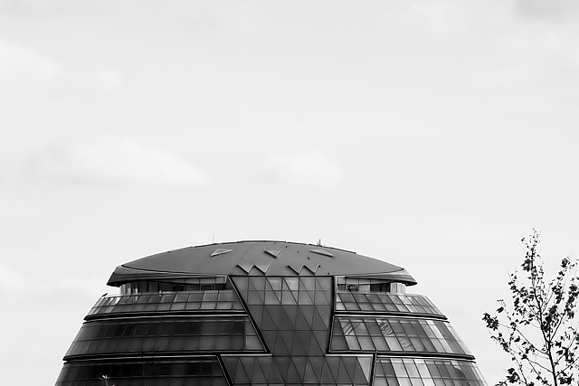
Wow, what an interesting building. Cool shot, I may have chopped just a bit more off the top. |
|
 Photographer found comment helpful. Photographer found comment helpful. |
|
|
05/17/2005 06:54:59 PM |
|
looks like a jacko lantern... shame about the tree in the bottom rhs |
|
| Photographer found comment helpful. |
|
|
05/17/2005 01:16:21 PM |
|
What a cute view of the building. I would have liked to see it cropped closer to excluse the tree and have the building fill the frame. |
|
| Photographer found comment helpful. |
|
|
05/17/2005 09:46:09 AM |
|
Interesting building. My only recommendation would be a tigher crop. I think there is too much sky, and it detracts from the building itself. |
|
| Photographer found comment helpful. |
|
|
05/16/2005 09:05:27 PM |
|
Egad! It IS a robot! Those triangle robots are taking over the world! I like the sense of humor in this, but the proportion of open sky seems to diminish the photo to me. |
|
| Photographer found comment helpful. |
|
|
05/16/2005 07:15:14 PM |
|
Black and white works well for this picture. I think there is too much unused space at the top. The triangles are there, but they are too small. |
|
| Photographer found comment helpful. |
|
|
05/15/2005 10:48:48 PM |
|
Nice shot, just wish you had a larger veiw of the biulding and a bit less empty pace. |
|
| Photographer found comment helpful. |
|
|
05/13/2005 06:39:44 AM |
|
I had necer noticed the skylights before on the Lord Mayor's building! the absence of anything in the top part of the frame makes me wonder how else this could have been framed. The negative space is not working strongly for me. The branches on the RHS are on the distracting, rather than complementary side of the border. I might have tried (and in fact did with an outtake) something with the cranes behind and further to the right of this image. |
|
| Photographer found comment helpful. |
|
|
05/12/2005 06:48:06 PM |
|
Interesting shot, but I think I would have liked it better in color... particulalry if the windows are as multicolored as they seem thye might be in this B&W shot. |
|
| Photographer found comment helpful. |
|
|
05/12/2005 08:46:24 AM |
|
Like the overall layout. I liek the way the sky is almost "invisible" Nice colors and shape to the subject. I gave it an 8. |
|
| Photographer found comment helpful. |
|
|
05/12/2005 12:21:42 AM |
|
Too bad you couldn't control the weather! :) It would have been much nicer without the overcast sky. |
|
| Photographer found comment helpful. |
|
|
05/11/2005 08:01:38 PM |
|
| Photographer found comment helpful. |
|
|
05/11/2005 03:07:07 PM |
|
This looks to be just a little tiltes.. Too bad this is a basic challengs I think burning the sky would have looked real neat with this interestin "robot" |
|
| Photographer found comment helpful. |
|
|
05/11/2005 05:57:20 AM |
|
| Photographer found comment helpful. |
Home -
Challenges -
Community -
League -
Photos -
Cameras -
Lenses -
Learn -
Help -
Terms of Use -
Privacy -
Top ^
DPChallenge, and website content and design, Copyright © 2001-2026 Challenging Technologies, LLC.
All digital photo copyrights belong to the photographers and may not be used without permission.
Current Server Time: 06/30/2026 08:00:13 PM EDT.