| Image |
Comment |
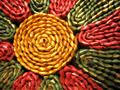
| 07/08/2005 11:23:57 AM |
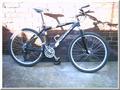
Circles of Lifeby protophotoComment: suspicions on your frame being legal within the editing rules but will ignore for vote.
Image suffers from over exposure in top half: you must get the lighting right, it is critical to a good image. If the bike was in the light or the shade, it would have been much better. Half and half means that you will either have one half under or over exposed (here, over exposed). Colours are washed out generally (increase satuaration), and the image is not sharp (use Unsharp Mask as the last editing step when preparing for submission). The composition is poor - the bike is photographed side on against a dull background: change angle, bend down, get some intersting angles and see if you can find a better way of capturing this image. Take a photo that meets the challenge, not meet a challenge and hope that the photo will do. |
| 07/08/2005 11:19:49 AM |
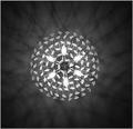
Second circleby ajschelComment: Clever and attractive. Great tones on the clockface. Like the razor sharp look. Nice. |
 Photographer found comment helpful. Photographer found comment helpful. |
| 07/08/2005 11:19:20 AM |
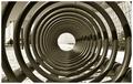
Circles casting circlesby itripnComment: Ooh - pretty! great capture. Nice contrast and well caught with the reflections. Have you painted your ceiling black especially?
Only criticism is in your cropping: not quite central, to my eye. Needs to be perfect for an impact, central composition like this. Still a good score from me! |
| Photographer found comment helpful. |
| 07/08/2005 11:17:42 AM |
Round & Roundby DiscraftComment: great tones. Love the contrast. Very approporiate image. Person on LHS is not quite a distraction nor focal point, though he is noticeable - might be better with him not there, or with him as a greater part of the subject. Still v nice. |
| Photographer found comment helpful. |
| 07/08/2005 11:16:28 AM |
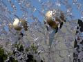
Radiateby banmornComment: pretty, but I really want to be in a bit closer (tighter crop) - you have clipped the outside edges, and if doing that, then realy get in there and focus on the detail in the flower, not the surrounding bushes. composition v central - would suggest putting flower centre onto a third line when recropping. |
| Photographer found comment helpful. |
| 07/08/2005 11:14:59 AM |
Water curtainby Bela45Comment: great idea, interesting, but you need wither a faster shutter speed, to make the drops hang in frae perfectly still, or a slower shutter speed to make them flow (result is like sand or salt being poured). This is half way, and does neither. |
| 07/08/2005 11:13:37 AM |
me in the garden globeby drake217Comment: nice idea, but composition v central, and the "self portrait" bit do not do much for me. Outside areas maybe fractionally too large to be an efective frame. |
| 07/08/2005 11:11:49 AM |
Wovenby ChicboneComment: nice composition, but white balance off (too yellow) and image has slight focus issue - just out of focus, I think. |
| Photographer found comment helpful. |
| 07/06/2005 01:57:38 PM |
Swiss' Potatoby andrerussoComment: erm - colour balance is off, making this look unappetising. green/yellow cast is bad. subject not the best in any case. Needs DoF onad focus on details - not a good choice of subject to get a pretty circle out of, I thnk |
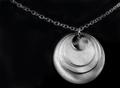
| 07/06/2005 01:56:25 PM |
The Necklaceby beautyqn25Comment: pretty. chain looks soft/poorly lit, but overall nice. missing a bit of wow. |
| Photographer found comment helpful. |
Home -
Challenges -
Community -
League -
Photos -
Cameras -
Lenses -
Learn -
Help -
Terms of Use -
Privacy -
Top ^
DPChallenge, and website content and design, Copyright © 2001-2026 Challenging Technologies, LLC.
All digital photo copyrights belong to the photographers and may not be used without permission.
Current Server Time: 07/16/2026 10:26:21 PM EDT.