|
|
|
Showing 7711 - 7720 of ~9565 |
| Image |
Comment |
| 08/31/2005 09:46:09 AM | |  Photographer found comment helpful. Photographer found comment helpful. |
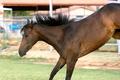
| 08/30/2005 11:05:50 PM | IMG_1359.jpgby LKMoteComment: Wow - this is such an unusual capture of a pose for a horse (or any other animal for that matter). I think it has a lot of positive qualities (i.e., focus, tonality, DOF, composition, et.c), but the overall impression I get is not aesthetically pleasing to me personally. Not to say that this wouldn't appeal to a great many of frequent horse show attendees, but it loses something in the translation for me. Still, overall an interesting and debatable capture. | | Photographer found comment helpful. |
| 08/30/2005 11:01:16 PM | Cloud Shadowsby justin_hewlettComment: You managed to create a world wherein white was not overblown or overexposed. Kudos to you - this is not an easy task. Beautiful composition, colors, focus, & lighting (although I realize that much of the benefits have probably come via processing). Great job nonetheless. Beautiful shot! | | Photographer found comment helpful. |
| 08/30/2005 10:47:10 PM | Jaguar, Branding Affluenceby phinbobComment: It's a beautiful shot - no argument there. You have plenty of comments to back that up. Personally, I scored this shot a 7. I think it showed a tremendous amount of promise, but could have perhaps brought it all together a little more concisely. The blue and red overtones create a very dramatic effect, but I'm not sure what they really add to the overall image. Sure, blue, red, silver/black/white are all very bold and appealing tones, but why did you choose those two particular ones? Jaguar used to be a British car (now owned by Ford), so I'm not sure if you were trying to suggest nostalgia or patriotism, or if it was simply the two colors that first came to mind when processing this image. Any of the possibilities seem plausible to me, given the final product.
I dont' say this to be cruel or insensitive. Trust me, I appreciate the sacrifices United States citizens (and for that matter any other nation's citizens) make every day, but it begs the question "why those colors?" Certainly, they make a dramatic statement, but I don't see the relevance in this particular image. I know I've gone about this the long way around, but I'm just trying to convey my thought process.
Don't get me wrong - I did score this a 7 (which is pretty darn good I think on this site with world-class photographers). Perhaps there is no real reason for selecting those particular tones to augment, but it does lead me to ponder the question. Regardless, I think this is a very strong entry and image on its own merit. |
| 08/30/2005 10:36:23 PM | remakescan0018.jpgby LKMoteComment: Great work on the old photo. The selective color really adds to the nostalgia already present here. Great job! | | Photographer found comment helpful. |
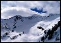
| 08/30/2005 10:35:16 PM | The Sky is the Limitby justin_hewlettComment: I think you have an exceptional eye for the dramatic. The leading lines for this are very good. In addition, you have a good eye for disregarding those elements that are immaterial to the impact of your shot. That's a deadly profitable combination... (IMHO)
Although I don't think this is your best work, I think it is exceptional - in that it produced a significant growth point for you and a marketable piece to boot. Please don't misinterpret my comments to mean that I am being condescending or otherwise disrespectful - it's exactly the opposite. You've got a lot going on here that's not necessarily displayed in this particular photo - and it shows. This is not a bad thing - in fact you should try to capitalize on it as much as possible now, because it won't last long. Such are the realities of life.
I would suggest burning the wood and pole in this shot, to regulate the "wow" factor to the area it will serve you best. This is a wonderful shot, full of depth, color, life, and meaning (at least in my little world). Great job and I look forward to more of your work in the future. | | Photographer found comment helpful. |
| 08/30/2005 09:50:48 PM | | | Photographer found comment helpful. |
| 08/30/2005 09:40:17 PM | Man Made Rainbowby Buckeye_FanComment: Fantastic capture. Truly again one of those "once-in-a-lifetime" opportunities that you seemed to be in the right place at the right time for. It's obvious that you are destined for great things with photography! (I'm not being entirely facetious here!) I think that you are being presented with a number of opportunities to show the rest of the world what you are seeing at the moment, and by learning how to best represent those types of images via this site, you are doing so. (Okay, okay, so I'm REALLY veering off topic here...) Great capture - wish I was there - I'm jealous... | | Photographer found comment helpful. |
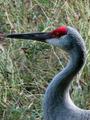
| 08/30/2005 09:28:04 PM | Craneby tsheetsComment: I think this particular shot suffers from the 100% crop. Not saying that your camera can't do this type of shot justice, just saying that I'm not sure this was the best example of its capabilities. It seems a bit noisy to me and while I love bird shots and the composition is very good, the detail just isn't there. I think you could also bump up the color sat a hair. It's a beautiful bird - I wish I could see the uncropped shot. | | Photographer found comment helpful. |
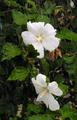
| 08/30/2005 09:19:51 PM | Hibiscus in the Rainby Buckeye_FanComment: Yet another of your images that was severely overlooked. I think this shot has all the elements necessary for a truly enjoyable viewer experience. There's no way this should have scored a 5.2 - it should have been 6.0 minimum. (Again, just my opinion, but damn! What were these people looking for?!?)
You managed to not overblow the whites in this shot (which would be extremely easy to do - Every single shot of magnolia blossoms that I have taken are completely blown out). You captured rain beautifully, and presented it in an environment of extremely rich, deep color and good focus. I don't understand the voters sometimes. BUT, sometimes they do make mistakes (at least I like to think they do!). :-) They certainly did here!
EDIT: So okay, they're not magnolias... You get my point! ROFL Message edited by author 2005-08-30 21:20:32. | | Photographer found comment helpful. |
|
Showing 7711 - 7720 of ~9565 |
Home -
Challenges -
Community -
League -
Photos -
Cameras -
Lenses -
Learn -
Help -
Terms of Use -
Privacy -
Top ^
DPChallenge, and website content and design, Copyright © 2001-2026 Challenging Technologies, LLC.
All digital photo copyrights belong to the photographers and may not be used without permission.
Current Server Time: 04/16/2026 10:14:32 AM EDT.
|