DPChallenge: A Digital Photography Contest You are not logged in. (log in or register
 
Browse Settings
Currently viewing:
Registered UserSJCarter

Show comments:

Per page:

Order:

Comments:


Comments Made by SJCarter
Pages:   ... [718] [719] [720] [721] [722] [723] [724] ... [957]
Showing 7201 - 7210 of ~9566
Image Comment
hearst castle.jpg
09/15/2005 11:41:03 PM
hearst castle.jpg
by Rikki

Comment:
Great shot! Love the composition and the color tones - although it may be a tad "too" blue. Very nice mood to the piece and a shot that really sticks to your recollection cells. :-)
Photographer found comment helpful.
The Cyclism.jpg
09/15/2005 11:38:55 PM
The Cyclism.jpg
by Rikki

Comment:
While the colors and composition are really good, I think that the focus (at least for me personally) is a bit of a distraction. Very endearing commentary on the image - really brings the whole image home. Nice capture.
Photographer found comment helpful.
The Da Vinci Code
09/15/2005 11:35:49 PM
The Da Vinci Code
by sher

Comment:
I not only thoroughly enjoyed the book, but I thoroughly enjoy this tribute as well. Great composition and tones. Your choices of the muted purple tones fit in perfectly with the time period (at least of what would be left) of da Vinci. Outstanding piece of work! :-)
Photographer found comment helpful.
Project Bandaloop (2 of 2)
09/15/2005 08:20:22 PM
Project Bandaloop (2 of 2)
by kearock

Comment:
Hmmm... The perspective is bit confusing to me at first. And the focus on the bottom hand & foot is good, but not so good on the top ones. I think I'd like it better if I could see an expression on his face. I'm sure there's a story that goes with the shot that makes it make more sense, but without it I think the average viewer may be a little lost. Just my 2 cents...
Photographer found comment helpful.
Enter Sandman... on the highway
09/15/2005 02:35:10 PM
Enter Sandman... on the highway
by CalamitysMaster00

Comment:
I agree that this is one car mirror shot that stands out as good. Great focus and perspective. I would consider bumping up the color a hair (of course, I tend to overdo that myself!). Good shot!
100_0084.jpg
09/15/2005 02:33:25 PM
100_0084.jpg
by ajschel

Comment:
Very interesting perspective and DOF. I would consider cropping it tighter at the top (to minimize the blown out sky yet maintaining just a hint of it). I like the colors too. I probably would have scored it a 6.
Photographer found comment helpful.
hot summer days
09/15/2005 02:30:42 PM
hot summer days
by frumoaznicul

Comment:
Great shot! Love the expression on her face.
Photographer found comment helpful.
Visitor
09/15/2005 02:29:13 PM
Visitor
by Matthew

Comment:
This is the second shot of this place I've seen and I still don't know where it is. It's spectacular! LOVE it. This shot really shows it off well and I love the model's attire - it really suits the environment. Great capture!
Photographer found comment helpful.
Yellow
09/15/2005 02:27:45 PM
Yellow
by Rikki

Comment:
Wow... Incredible focus and color tones. Good DOF. I also really like how you filled the frame with the flower. Very nice crop - it's offset enough from center to maintain lots of interest, yet is still all flower. Great lighting too. Very nice!
Photographer found comment helpful.
HI!
09/15/2005 12:08:12 PM
HI!
by marklovell

Comment:
* Greetings from the Critique Club *

For your first challenge entry, I'd say you did well. Some of my observations are:

Composition:
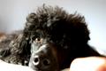
Good, but you might consider a more offset approach. Nice expression in the dog's eyes. The bottom right is a bit distracting though - looks like a finger got in the way.

Lighting:
A little harsh, causing the bottom left to be blown out, but good for the most part on the dog itself.

Focus/DOF:
A tad off IMHO - probably due to being handheld. I also think the DOF is a bit shallow, as I'd like to see more of the dog's face in focus.

Color:
Again good, but I think a little bump might help it some. Good brown's in the dog's eyes.

Meeting the Challenge:
Not sure that this was "High Contrast" enough to capture the attention of the majority of voters. Honestly, I think this is probably one of the main areas where your score suffered. Yes, it has contrasting elements and tones, but they don't come across as being that sharp or extreme.

Overall:
I think it was a good first entry. (You should take a look at mine - it was AWFUL! LOL) I've found that over time I understand what many more of the voters here on DPC look for in a "great" shot. Although it doesn't necessarily mean that great shots always score highly here either. We're all learning and if we keep on listening to feedback, experimenting with new shots and techniques, providing your own commentary on other people's shots (which is an exceptionally valuable educational tool IMHO), and taking lots of shots, we'll all keep getting better!

Just my 2 cents...
Photographer found comment helpful.
Pages:   ... [718] [719] [720] [721] [722] [723] [724] ... [957]
Showing 7201 - 7210 of ~9566


Home - Challenges - Community - League - Photos - Cameras - Lenses - Learn - Help - Terms of Use - Privacy - Top ^
DPChallenge, and website content and design, Copyright © 2001-2025 Challenging Technologies, LLC.
All digital photo copyrights belong to the photographers and may not be used without permission.
Current Server Time: 09/18/2025 09:23:04 PM EDT.