| Image |
Comment |
| 09/16/2005 09:56:59 PM |
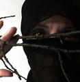
Ninja Princessby JutildaComment: I didn't realize this shot was you (or yours)! Very cool photo. I scored it a 7. Love the way you can see through the material. I like the fact that you're looking around the branch - seems more stealthy and ninja-like to me. Great shot! |
 Photographer found comment helpful. Photographer found comment helpful. |
| 09/16/2005 08:04:27 PM |
Balloons Aloft 11x14by jpochardComment: Very cool shot! Have you considered burning each individual balloon to deepen the colors and depth? Just an idea to make them stand out a little more. Great composition! |
| Photographer found comment helpful. |
| 09/16/2005 08:02:59 PM |
Dayton Lane Home (11x14)by jpochardComment: Really beautiful shot! The colors are almost overwhelming (in a good way). I agree that the flag being cut off is a little distracting, but love the busy composition. Good capture! |
| 09/16/2005 07:55:42 PM |
Pollutionby soupComment: This is awesome! Wow... What a memorable capture. Beautiful piece of work. |
| Photographer found comment helpful. |
| 09/16/2005 07:39:17 PM |
Cloud Riderby ph223048Comment: Wow - beautiful shot! Can't believe all that sky action! Very nice. |
| 09/16/2005 07:21:02 PM |
Beginningby AtroposComment: Wow - now that's tack sharp focus! Beautiful vibrant color tones too. Great lighting and composition. Excellent shot. |
| Photographer found comment helpful. |
| 09/16/2005 02:01:28 PM |
IMG_6463.jpgby ajschelComment: I'm not sure that I agree with the tighter crop perspective. I think that the enormity of the adverts plastered all over the wall really illuminate the smallness and relative inconsequential nature of the lone, struggling guitarist. I do agree that it's a lot of information and color for the viewer to take in. Have you considered a selective desat to show the musician and his "wares" in full color and perhaps a muted tonal version of the signs and B/W for everything else? Or perhaps just a few of the signs in color? Just a thought... My thinking was that 1) you wouldn't need to crop the shot and lessen the impact of the musician's plight, 2) you could bring the viewer's focus back to the musician, and 3) you could "highlight" (but not overwhelm) the competition. Just my 2 cents on a good shot as is. :-) |
| Photographer found comment helpful. |
| 09/16/2005 12:56:48 PM |
Fear & Loathing in NashVegasby Rook3000Comment: I especially like this shot, as I used to live in NashVegas! :-) Cool effect and I like the movement of the hands. The movement of the head is a little distracting though - or maybe that's an optical illusion from the light cast by the match on the sunglasses. I like the crop, but the background being blown out is also a distraction. Still, like I said, I love the shot for sentimental reasons! Wish I was back there - and maybe again soon! |
| Photographer found comment helpful. |
| 09/16/2005 12:47:41 PM |
Condoreoby bpcardonaComment: Powerful piece of work here. I agree that the arm in the foreground is a bit distracting, but it also "hides" the grieving person's identity, so I see pros and cons to the crop. I immediately "felt" emotion when I saw this shot - it's filled to overflowing with it. And I agree... If you convey an emotion to your viewers, then you've successfully achieved art. Nice shot and I'm sorry for your loss. |
| Photographer found comment helpful. |
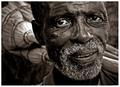
| 09/16/2005 12:14:48 PM |
broom vendor by whiteroomComment: * Greetings from the Critique Club *
Great... How the **** am I supposed to comment on such a phenomenally successful image!!! LOL I'll do my best to give you my opinions, but please take them with a grain of salt, as this shot won the blue for a lot of very good reasons!
Composition:
Perfect. I can't think of anything that would improve it. This shot really captured personal character beautifully. The weary eyes and expression speak volumes.
Lighting:
Almost perfect. The lighting on his face is superb. There is a hot spot on one of the brooms.
Focus/DOF:
Perfect. Incredible detail on the man's face and a very gentle DOF that allows the viewer to see the background (and the brooms) but concentrate on the man.
Meets the Challenge:
Exceptional (obviously)! This image really stood out to so many people for a reason. It really captured a beautiful moment in very high contrast (on a number of levels).
Overall:
Outstanding shot. Congratulations on your well-deserved blue ribbon. |
| Photographer found comment helpful. |
Home -
Challenges -
Community -
League -
Photos -
Cameras -
Lenses -
Learn -
Help -
Terms of Use -
Privacy -
Top ^
DPChallenge, and website content and design, Copyright © 2001-2026 Challenging Technologies, LLC.
All digital photo copyrights belong to the photographers and may not be used without permission.
Current Server Time: 04/30/2026 03:28:12 AM EDT.