| Image |
Comment |
| 04/21/2006 10:40:43 AM |
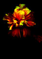
PlasticFlower.jpgby catholicskinComment: This is an interesting image with such heavy contrast - not your typical flower shot. I like the colors against the black background. My only real nit is the petal off to the right - I'd clone that out. Nice capture. |
| 04/21/2006 10:39:18 AM |
Lake Over Lightning.jpgby catholicskinComment: I've never attempted to capture lightning before - you did a great job. I like the landscape backdrop too. Nice composition with fluid sweeping lines. |
| 04/21/2006 10:37:58 AM |
The King Parrot.jpgby catholicskinComment: As a fellow birdlover, I really like the subject matter and colors. I agree that the crop could be tighter on the right. The focus seems to be a bit off too, but you have nice bokeh. Looks like a great parrot. |
 Photographer found comment helpful. Photographer found comment helpful. |
| 04/21/2006 12:00:10 AM |
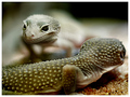
"Wha-chu lukin at?!"by RikkiComment: LOVE the focus/DOF! Awesome shot - really. Sorry I missed voting on this one. This shot would have scored very well with me. COOL |
| Photographer found comment helpful. |
| 04/20/2006 11:56:34 PM |
Little Birkiesby missinseattleComment: I like the composition and the selective desat idea, but the color choices seem strange to me. They're not especially "appealing" shades against the starkness of B/W. Something softer and/or perhaps against a background of pinkish gray maybe? Probably just a matter of taste... |
| Photographer found comment helpful. |
| 04/20/2006 11:54:10 PM |
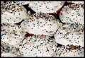
Sprinklesby missinseattleComment: Too much of a good thing... ;-) I scored it a 5 during the challenge. Everything is technically pretty much okay, but compositionally it's a bit scattered and overwhelming. Difficult for the viewer to focus on anything in particular. I agree that perhaps with fewer cupcakes and sprinkles (I could come over and eat some for you) it would work. =D |
| Photographer found comment helpful. |
| 04/20/2006 11:51:52 PM |
Forgottenby missinseattleComment: I like this editing job. The composition is good too - fills the frame without seeming too crowded. Nice lines. Great job. |
| Photographer found comment helpful. |
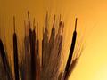
| 04/20/2006 11:50:52 PM |
sunrise.jpgby RikkiComment: Great gradient in the sky. Something about the cattails' placement seems 'off' to me, but can't exactly tell what. It's almost like they take up too much of the shot IMHO - especially at the top of the frame. Otherwise, I like the subject and tones. |
| Photographer found comment helpful. |
| 04/20/2006 11:47:58 PM |
|
| Photographer found comment helpful. |
| 04/20/2006 11:46:05 PM |
IMG_1245_web.jpgby RikkiComment: Now THOSE are whiskers... ;-) Great DOF and color. The focus on his face seems just a hair off tack sharp, but that's splitting hairs (so to speak). Excellent job pulling him out of the crowd. |
| Photographer found comment helpful. |
Home -
Challenges -
Community -
League -
Photos -
Cameras -
Lenses -
Learn -
Help -
Terms of Use -
Privacy -
Top ^
DPChallenge, and website content and design, Copyright © 2001-2026 Challenging Technologies, LLC.
All digital photo copyrights belong to the photographers and may not be used without permission.
Current Server Time: 05/08/2026 11:41:51 PM EDT.