| Image |
Comment |
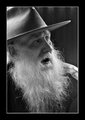
| 04/22/2006 04:21:15 PM |
Beardby cabaComment: Beautiful portrait. Love the composition and lighting. |
 Photographer found comment helpful. Photographer found comment helpful. |
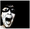
| 04/22/2006 04:20:20 PM |
Weatheredby JutildaComment: "You are too twisted for color TV Clarie!" ;-) Love the processing. |
| Photographer found comment helpful. |
| 04/22/2006 04:18:50 PM |
For the Boysby jenesisComment: WOW!!! Hello sailor is right! You go girl! ;-) Even made me look twice! Message edited by author 2006-04-22 16:19:17. |
| Photographer found comment helpful. |
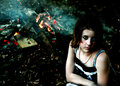
| 04/21/2006 12:54:18 PM |
Fire Starterby CalliopeKelComment: Yikes! What a broody, defiant stare! And with the flames in the background, it reminds me of "Firestarter". Cool shot - great comp. |
| Photographer found comment helpful. |
| 04/21/2006 12:53:08 PM |
Identicalby ecdillonComment: I really like this, but was bothered by something about it... Then I realized that there are no light reflections in the eyes. You might consider adding some catchlights in PP - I've found that it can really brighten up a portrait shot. Neat to have a twin! |
| Photographer found comment helpful. |
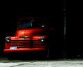
| 04/21/2006 12:50:53 PM |
The Orange Truckby JutildaComment: GREAT shot! Love the deep color sat. Nice comp & I'm diggin the dark nostalgic mood. Good work. |
| Photographer found comment helpful. |
| 04/21/2006 12:49:09 PM |
Night of the Stamenby Art RoflmaoComment: Way back when, I scored this a 4. I must admit that was way too low. I've learned a lot since then and appreciate things a little differently. It would probably score a 7-8 from me now. :-) Love the radial blur and the tack sharp focus of the stamen. The DOF/perspective of the petals is particularly striking and I think the colors are great. The crop may be a tad tight, but nice work and apologies for the low ball. |
| Photographer found comment helpful. |
| 04/21/2006 12:43:58 PM |
Imaginationby TroyMosleyComment: I must admit I scored this too low during the challenge - I gave it a 4. Upon further reflection, I really like the composition and see more of what you were going for (I think). The interrupted zoom focus is an interesting choice to emphasize the subject matter and pattern. Still, I would have liked to see it with a brighter background - I think the hard dark gray is a distraction from the soft pastels of the shells. Today, I'd give it a 6. :-) |
| Photographer found comment helpful. |
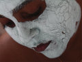
| 04/21/2006 12:40:08 PM |
Cracksby IndigoButterflyComment: I like the concept here, but the image seems slightly oof and too dark. I think if you lightened up the face a bit and brought out more details and some glow, that it would really perk up the shot. Nice composition and captured expression. |
| Photographer found comment helpful. |
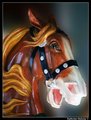
| 04/21/2006 12:38:26 PM |
carousel horseby ArpeggioAngelComment: I like the colors and glow - and the blurred background - but there seem to be editing artifacts around the edge of the horse (especially muzzle) that are distracting. I've found that using the auto or lasso tools frequently don't do an accurate enough job selecting an object, so that I end up going back and painstakingly tracing it by hand. It takes a LOT longer, but the results are usually a lot cleaner. I'm sure I'm not telling you anything you don't already know... ;-) I really like the composition and saturation. |
| Photographer found comment helpful. |
Home -
Challenges -
Community -
League -
Photos -
Cameras -
Lenses -
Learn -
Help -
Terms of Use -
Privacy -
Top ^
DPChallenge, and website content and design, Copyright © 2001-2026 Challenging Technologies, LLC.
All digital photo copyrights belong to the photographers and may not be used without permission.
Current Server Time: 05/09/2026 12:47:06 AM EDT.