| Image |
Comment |
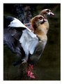
| 06/18/2006 03:44:29 PM |
balletby whiteroomComment: Beautiful Egyptian geese? (That fowl family anyway - They're mean as hell! HA) We used to raise them. Gorgeous clarity and colors. |
 Photographer found comment helpful. Photographer found comment helpful. |
| 06/18/2006 02:37:09 PM |
2IMG4413.jpgby LKMoteComment: This is sooo good! Perfect choice of processing. Fantastic focus & DOF. Great job! WOW This certainly says cowboy to me! |
| Photographer found comment helpful. |
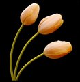
| 06/18/2006 02:35:37 PM |
Tulipsby kari1Comment: Beautiful shot - lovely color tones and leading lines/curves. Very appealing visually and effective use of black background to emphasize your subject. I didn't vote in this challenge but would have probably scored this an 8. The only things I see that I would try to improve are a couple of spots in the background (easily cloned or blended out) and a little stronger focus on the actual tulips themselves. Well done. Love the peach color. |
| Photographer found comment helpful. |
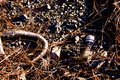
| 06/18/2006 02:31:33 PM |
Buried Treasure (Human Impact)by kari1Comment: I like this shot, although it's a tad on the dark side. I would probably do a little selective dodging/burning to brighten it up a bit and bring out some more of the contrast. However, I have a tendency to overdo that sort of thing... ;-) Love the statement this makes - so true... Well seen and captured. |
| Photographer found comment helpful. |
| 06/18/2006 02:20:37 PM |
Tracyby Joey LawrenceComment: Love the horizontals, and black & white with a splash of red has always been a weakness of mine. ;-) Beautiful piece of work (and the model ain't bad either). HA Great job as always dude. |
| Photographer found comment helpful. |
| 06/18/2006 02:18:41 PM |
Etherealby graphicfunkComment: This is really cool! I love the seamless transition from photograph to drawing/painting. Wonderful work as usual. |
| Photographer found comment helpful. |
| 06/18/2006 02:13:50 PM |
IMG_9955.jpgby kevrobertsonComment: Have to agree that the overall yellow cast (and especially on her teeth) is a bit distracting. I'd also probably clone out the chair. The pose is playful, natural, and great. The crop and composition otherwise is really good too. I'd love to see it brightened up a bit without the yellow - I bet it could really sing. |
| Photographer found comment helpful. |
| 06/18/2006 02:11:15 PM |
Alexandraby kevrobertsonComment: This is fantastic! WOW!!! The shape that her arms creates cradles & frames her head beautifully. Extremely appealing editing with major WOW factor. You hit the jackpot with this one! GREAT JOB - Love it! |
| Photographer found comment helpful. |
| 06/18/2006 02:09:07 PM |
IMG_9926-01by kevrobertsonComment: I like the lines and high key editing of this shot. Great pose and expression you captured too. Well done. |
| Photographer found comment helpful. |
| 06/18/2006 02:03:13 PM |
Three in a Rowby sherpetComment: Lovely color and focus on these three. I agree about the background and shadows. You could try cloning the shadows out (I did it on some of my clown SPs) - it's a pain in the ***, but I was surprised at how much better it looks when it's done. ;-) It's a great shot as is, so either way you win. |
| Photographer found comment helpful. |
Home -
Challenges -
Community -
League -
Photos -
Cameras -
Lenses -
Learn -
Help -
Terms of Use -
Privacy -
Top ^
DPChallenge, and website content and design, Copyright © 2001-2026 Challenging Technologies, LLC.
All digital photo copyrights belong to the photographers and may not be used without permission.
Current Server Time: 05/09/2026 09:41:08 PM EDT.