| Image |
Comment |
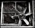
| 04/17/2006 07:04:37 PM |
fanby bucketComment: Always way ahead of the curve. Now what are you going to do for window framed? ;) I shouldn't bother to try knowing you will be there - you always have the best insight into windows... As for this one, there is something compelling about it. At the same time, I am a bit put off by it - I think it is the ugly gray on the right hand side. Not sure why. The image is very weighted to the right - that might be what's doing it. I feel heavy... Somehow I love the juxtaposition of the fan and the glass. |
 Photographer found comment helpful. Photographer found comment helpful. |
| 04/17/2006 09:42:44 AM |
Together...by mandyturnerComment: I agree with Skiprow - this is just a little too close. I get no sense of environment. I am glad that the fingernails are well groomed. Nothing more distracting... :) |
| Photographer found comment helpful. |
| 04/17/2006 09:41:15 AM |
just a friendby mandyturnerComment: I'm not bigoted against toys or barbie or anything but, I would score this image a lot higher if it was a person. The composition and point of view are excellent. But its a barbie doll. Also, on my monitor at work, it seems a little blurry. |
| Photographer found comment helpful. |
| 04/17/2006 09:35:49 AM |
well traveledby mandyturnerComment: I love the tones of this but I didn't know it was a tire. Maybe the inclusion of the letters would have helped. I wouldn't just my progress based on scores here. Lowering of your score just means you are moving past the bright and shinys and experimenting with other types of images. I actually like the drama in this image and again, the tones are outstanding. |
| Photographer found comment helpful. |
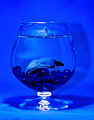
| 04/17/2006 09:30:55 AM |
Ring Around the bowlby smilebig4me1xComment: This is one of those shots where you have to juggle shutter speed and light. I think, if the light had been brighter, this would have scored better (dropping shutter speed might have blurred the fish). A background of a complementary color to the fish would have made this image eye catching - right now all the hues are too similar to stop people in their tracks. That effect works for moody images, but this image isn't moody. The smudges and the blown out rings on the bottom do detract but I think they could have been overcome with more contrast in hues - a yellow background would have made this really pop. |
| Photographer found comment helpful. |
| 04/17/2006 09:27:15 AM |
Speed of Lightby smilebig4me1xComment: Interesting, but really nothing I can 'grab on to.' It doesn't give me a sense of anything. Maybe if it were cropped to just the colors - all the black just makes it smaller (an less important) than it really needs to be. Very interesting but not something that holds my attention long. |
| Photographer found comment helpful. |
| 04/17/2006 08:39:00 AM |
Dandilion Princessby smilebig4me1xComment: This image is nice - perfectly sharp, decent lighting, good composition. But (don't you hate that?) for me, the Point of View is awkward. I am looking down on the child (which lengthens her nose) and I feel I am too close, which leaves me uncomfortable. An eye level view would be much more flattering to the model and allow me not to feel so, well overbearing as a viewer (that works for some images but I feel it doesn't work here). Also, blurring the grass (shorter Depth of Field) would remove some of its texture. Currently, the texture is distracting as it is not too appealing (brown spots detract). I can see you have learned to use your camera well. Now a new learning phase starts in seeing the whole picture before you snap, being able to judge what other will people see. I am currently in that phase too. :) Good luck! From what I see in your portfolio, you are moving along quite well. |
| Photographer found comment helpful. |
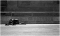
| 04/13/2006 05:53:48 PM |
Restingby kevrobertsonComment: Very well taken. The lighting on her hair and face make her glow. I wish a little more of her environment had been included - I don't get much of a feel for her as it is. 6 |
| Photographer found comment helpful. |
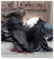
| 04/13/2006 05:39:43 PM |
Siestaby tryals15Comment: I like the space and I like the graininess. Tones well done. 7 |
| Photographer found comment helpful. |
| 04/13/2006 05:38:30 PM |
A Beggar's Lifeby bigjComment: This image is well done but I wish the crop were a little looser to give me more environment. 6 |
| Photographer found comment helpful. |
Home -
Challenges -
Community -
League -
Photos -
Cameras -
Lenses -
Learn -
Help -
Terms of Use -
Privacy -
Top ^
DPChallenge, and website content and design, Copyright © 2001-2026 Challenging Technologies, LLC.
All digital photo copyrights belong to the photographers and may not be used without permission.
Current Server Time: 07/27/2026 07:39:04 PM EDT.