| Image |
Comment |
| 10/22/2006 07:39:39 AM |
A Naughty Wife-to-Beby davidus428Comment: Greeting from the Critique Club!
From your notes, I see that you would like a critique of the technicals. Personally, I think this image is pretty sound technically. It could use a hair more DOF to add a little more sharpness - its not soft focus and its not razor sharp - wavering somewhere in the middle that really doesn't resolve well either way. I think it could also use a slight boost in contrast, but that could be fixed by selectively sharpening just a little bit more. (I took the image into photoshop and used a very light sharpening and a very slight curve adjustment that for me, helped the image contrast). The face is in sharp focus; the hand, which is the largest, closest to the center object that is also mentioned in the title, is not. The face is beautiful; the hand is not.
Compositionally, and I know you didn't ask for that in a critique, I think this image suffers a little. The hand, the focus of the image is slightly soft (while not soft focus). The hand is also in an awkward, indelicate postion; this fights against everything else in the image - the colors and tones, the rest of the objects in the image. The hand also seems overly large - a bit jarring if you look long enough. The hand fights against everything else it seems the image is trying to portray. The relationship of the hand to the face, the hand to the flowers - its all so close and compact it feels very unnatural. I put my hand in the same postion and couldn't figure out why anyone would position their hand there unless they had a splinter. I understand that that is the point - but I don't think it works well here. Maybe if her smile had been different...
Relation to the challenge: The challenge was "faceless portrait." I would say yes, this is a facelss portrait in that it is of a person not showing their face and it gives me a sense of the person. For me at least, this met the challenge much more strongly than many of the the other entries.
In the end, I think your lighting is very well done. I think the concept is excellent. I think your toning and hue choices are great. I just think it missed in the composition of the elements. Probably not what you wanted to hear - but its only one person's opinion. |
 Photographer found comment helpful. Photographer found comment helpful. |
| 10/19/2006 06:29:12 AM |
beyond the bathtub ... by tateComment: excellent concept! One of those - "Damn, wish I thought of that!" Love the color tones in your processing - work very well to really highlight the tiny subject. Congrats on your blue! |
| Photographer found comment helpful. |
| 10/15/2006 05:40:44 PM |
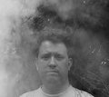
Self Portraitby posthumousComment: the man is lost. his eyes squint but it doesn't seem to be against the smoke - its more of a tightening - his lips are the same way. But the upturn of his eyebrows show his confusion. He is lost. At the same time, he doesn't seem to want contact. He's not reaching for it - he's trying to hide. Is that what you wanted to show? Someone who wants to disappear into the background? Into the bushes - he's already melding with them now. |
| Photographer found comment helpful. |
| 10/13/2006 12:26:48 PM |
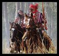
Seminole Warriorsby ArpeggioAngelComment: This actually looks like a still from a movie. Excellent job keeping the background in without allowing it to be overwhelming. I think its great, particularly as a spur of the moment shot - looks like you were in the perfect place. The placement of all the elements in relation to each other is perfect - the grass, the horses, the men, the trees... Everything else is so perfect, who cares about the gun - I only notice because you mentioned it in your notes. |
| Photographer found comment helpful. |
| 10/13/2006 10:03:33 AM |
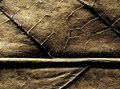
Being and Nothingness by alfrescoComment: I already told you I was in love with this one, right? This is what I'm talking about - your reality is so much better than mine. |
| Photographer found comment helpful. |
| 10/13/2006 10:02:17 AM |
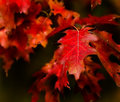
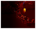
The Red Leafby alfrescoComment: the focus/soft focus on this is beautiful. The tones push it home. Very restful even in its vibrancy. Maybe that's why it works so well. |
| Photographer found comment helpful. |
| 10/13/2006 10:00:50 AM |
|
| Photographer found comment helpful. |
| 10/13/2006 10:00:18 AM |
The Light Within - M02by alfrescoComment: this is cool. You are a much more patient man than I. And I see you are also quite capable of making your own reality. :) |
| Photographer found comment helpful. |
| 10/13/2006 09:58:13 AM |
Demarcation - M01by alfrescoComment: see, now this is beautiful. And people can relate to it. You don't need my comment to tell you. :) |
| Photographer found comment helpful. |
| 10/13/2006 09:29:25 AM |
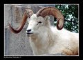
Dall ramby ArpeggioAngelComment: He looks stuffed. :) Great detail. The color toning you've kept is excellent. Even dirty white animals tend to get washed out but you've overcome that. You've done great keeping all the detail. The textures of his horn work very well with the textures of his fur. |
| Photographer found comment helpful. |
Home -
Challenges -
Community -
League -
Photos -
Cameras -
Lenses -
Learn -
Help -
Terms of Use -
Privacy -
Top ^
DPChallenge, and website content and design, Copyright © 2001-2026 Challenging Technologies, LLC.
All digital photo copyrights belong to the photographers and may not be used without permission.
Current Server Time: 07/25/2026 07:52:50 AM EDT.