| Image |
Comment |
| 11/23/2006 07:05:02 AM |
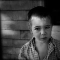
IMG_6325-copy.jpgby xianartComment: Really love this image. There is such a mood - his facial expression, the angle, the POV all work with the processing. Excellently done. :) |
 Photographer found comment helpful. Photographer found comment helpful. |
| 11/08/2006 07:10:49 AM |
|
| Photographer found comment helpful. |
| 11/02/2006 10:03:11 AM |
Withinby IvoComment: This was the only 10 I found in the challenge. Does that reflect on me or on the entries? Excellent work BTW. :) |
| Photographer found comment helpful. |
| 11/01/2006 05:25:19 AM |
boleroby ursulaComment: I really thought this was the winner. |
| Photographer found comment helpful. |
| 10/31/2006 09:39:12 PM |
For Foggy Morningsby JPRComment: I was there. No really - IMAGE_ID=279727. Okay, not physically in the same place, but mentally. I swear. Like oyur colors better. May rework mine... Glad you had an excellent day. :) |
| Photographer found comment helpful. |
| 10/31/2006 09:36:12 PM |
|
| Photographer found comment helpful. |
| 10/31/2006 09:35:19 PM |
Meetingby JPRComment: hmmm. I think red. Great to see you back! |
| Photographer found comment helpful. |
| 10/29/2006 07:32:07 AM |
UP by cloudsmeComment: I had to do a critique club critique earlier on a ballon image. Everything it didn't have, this one has. Balloons float in space really; without a point of reference an image of one would be a picture of a thing - not very interesting in and of itself. Here, you set a mood and gave us context. The sky the balloon is wrapped in is doing something. And there is something else in the image that I know, that is concrete, that gives me reference. These two things make the balloon here all the more ethereal - the way it should be. I don't remember even seeing this on the front page. But, the score shows how good use of context and drama can turn an 'object' into an excellent photograph to which people can connect. Very well seen and taken. Congrats on your ribbon! |
| Photographer found comment helpful. |
| 10/28/2006 08:55:51 AM |
Kick Startby lauraodomComment: Greetings from the Critique Club!
Good morning! Let me start by saying that the longer I looked at and worked with this image, the more I fell in love with it. It has a few issues as presented here, but its got great bones (as my mother says). :)
For me, the image is a little soft. I pulled it in (at this size - different size images require differing amounts of USM) PS and gave it a USM of 67% at .8. This helped get the sign in tight focus. Also, there is truly no black point or white point. Not sure what you mean by running Curves but a great way to use curves is to click on the black eye-dropper and find the blackest point of the image and click there then click on the white eye dropper and find the whitest point of the image and click there. Adjust your mid-tones up and down. In my editing I adjusted the mid tones slightly darker.
I think your image tells a story - its a slice of life. Typically, 'slice of life' images do better here in B&W. I think conversion to B&W would have boosted your score. Not everyone likes odd angles. I think the angle works here but others may not. Its luck of the draw. I'm sure some people were put off by the Starbucks sign being smack dab in the middle. At first it bothered me and I tried cropping it, but the image lost something. I do think a very slight crop on the right and top helps focus the image.
As I said before, you have an image here with excellent bones. Its not to everyones tastes but who cares - as long as you like it. I like the story it tells about both the photographer and the subject. I think it works really well. I love the inclusion of the patience sign - we all need that now and then. Your score is what it is - don't take it to heart - some amazing images here have done poorly in voting.
I posted an edit in my workshop temporarily - where I went while playing around.  Keep up the great work! |
| Photographer found comment helpful. |
| 10/28/2006 08:29:31 AM |
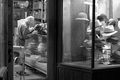
Breakfast.by wingyisleedsComment: Greetings from the Critique Club!
Wow! What a close up! Excellently captured BTW. I agree with one commenter that the duck is slightly soft. I took this image into PS and added USM at 67% and .8 and it really helped define the feathers. Its often difficult to figure out how much is enough and some voters will think its too much and some not enough. You really can't please everyone. :) A slight curves adjustment increased contrast just a hair and further defined the feathers.
I think this image suffered in voting because of the lighting. It almost looks as if it was taken indoors. When the challenge topic is morning you really need to make sure you show the voters morning. :) Also, the lighting makes the image seem a little flat. A boost in contrast with curves would have helped a little. Not sure about leaving in the shadows as I can't see what it would have looked like. But the background blue takes away any depth the grass adds (which is why it looks to me like it was shot inside).
Overall, I see you know how to make a good image. The composition is good, the focus is good, the colors/tones are good. I wouldn't worry about the score as that is due to the challenge topic.
|
| Photographer found comment helpful. |
Home -
Challenges -
Community -
League -
Photos -
Cameras -
Lenses -
Learn -
Help -
Terms of Use -
Privacy -
Top ^
DPChallenge, and website content and design, Copyright © 2001-2026 Challenging Technologies, LLC.
All digital photo copyrights belong to the photographers and may not be used without permission.
Current Server Time: 07/24/2026 11:39:18 AM EDT.