| Image |
Comment |
| 10/16/2003 02:48:17 PM |
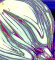
Strawberry peaches and cream rainbow tartsby neenee1999Comment: I like the arrangement a lot -- unfortunately the overall quality of the shot seems to be lacking a bit. I'm not sure if you used a flash here, but it seems like the overall image has a bit too much contrast and is a bit blown out in spots. The idea of using the red/white background is great, though. |
 Photographer found comment helpful. Photographer found comment helpful. |
| 10/16/2003 02:46:31 PM |
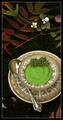
Fast and Easy Tex Mex Dipby RefocusedComment: I may have tried getting nice & close to the main dish, rather than attempt the entire setting. Actually, I think I would have enjoyed seeing the dish a lot closer -- it's probably something I would enjoy eating! I also would have tried to avoid using the flash (at least it appears that a flash was used here). The flash brings out bright spots in the fork, the top & bottom of the dish, the spoon, etc. Try using a tripod with a long exposure -- the results provide for much better lighting. |
| Photographer found comment helpful. |
| 10/16/2003 02:43:20 PM |
Onion Diced Up (with color)by ArtessaComment: This one might have been more compelling without the effect, although I'm sure you'll get an equal number of people who say "love the effect!" :) |
| 10/16/2003 02:42:05 PM |
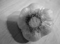
Garlicby gakoutComment: It's a bit small to make a good judgement, but it seems like the lighting could have been a little better for this one. Sometimes it takes multiple light sources placed just right to balance the lighting evenly. |
| 10/16/2003 02:40:48 PM |
|
| Photographer found comment helpful. |
| 10/16/2003 02:39:28 PM |
Pollo Involtini al'la Nonnaby EddyGComment: A wonderful presentation! I was hoping to see a lot of shots in this challenge that look like they could appear in a cookbook, and this is one of the few that really does meet that expectation. |
| Photographer found comment helpful. |
| 10/15/2003 01:32:40 PM |
|
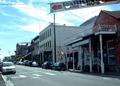
| 10/10/2003 05:33:44 PM |
Virginia Cityby msstyckComment: I'm afraid there's not a whole lot of "wow" here -- it just seems like there wasn't a lot of thought put into it in all honesty. The banner and wires are distracting, and the exposure is a bit too "contrasty," particuarly in the white of the clouds. I'd also try to submit shots a bit closer to the maximum size allowed -- this is just a bit too small to judge well. Just being honest... |
| 10/10/2003 05:31:26 PM |
|
| Photographer found comment helpful. |
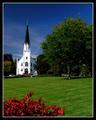
| 10/10/2003 05:29:42 PM |
Itasca Downtownby pitsamanComment: Looks like a postcard! I love the rich colors -- the deep blue of the sky (thanks to a polarizing filter, I'm guessing) are a great contrast for the white of the church. |
| Photographer found comment helpful. |
Home -
Challenges -
Community -
League -
Photos -
Cameras -
Lenses -
Learn -
Help -
Terms of Use -
Privacy -
Top ^
DPChallenge, and website content and design, Copyright © 2001-2026 Challenging Technologies, LLC.
All digital photo copyrights belong to the photographers and may not be used without permission.
Current Server Time: 05/07/2026 04:30:29 PM EDT.