| Author | Thread |
|
|
10/15/2003 11:05:58 PM |
|
I came back to find out if i guessed right, and i did. |
|
 Photographer found comment helpful. Photographer found comment helpful. |
|
|
10/15/2003 10:19:52 AM |
|
I came back to see how my fav photo of the week did and surprise its yours. Simply beautiful Kosta. I really like it. |
|
| Photographer found comment helpful. |
Comments Made During the Challenge  |
|
|
10/14/2003 09:31:17 PM |
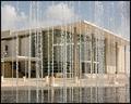
Perfect Composition, holy cow!
This is an amazing photo--
People may vote it low because its not a "City" shot, but not me, this deserves a 10 |
|
| Photographer found comment helpful. |
|
|
10/14/2003 03:01:56 PM |
|
Simply beautiful. Wonderful composition. Nicely done. |
|
| Photographer found comment helpful. |
|
|
10/13/2003 10:48:41 PM |
|
I would love to visit here. Perfect exposure, and to keep the colors in check too! Nice work! 10 -danny |
|
| Photographer found comment helpful. |
|
|
10/13/2003 06:19:32 PM |
|
Great colors, Good lighting. |
|
| Photographer found comment helpful. |
|
|
10/13/2003 12:21:44 AM |
|
i'd give you a 10 if I didn't feel that the colors were manipulated. |
|
| Photographer found comment helpful. |
|
|
10/12/2003 11:16:17 PM |
|
Very nice color saturation in this image. Plenty of highlights in the church and lots of shadows in the trees. Very nice image. Congradulations. 10. |
|
| Photographer found comment helpful. |
|
|
10/12/2003 07:08:59 PM |
|
Gorgeous shot! The colors are vibrant and the church beautiful. Like the angle this was shot at, too. |
|
| Photographer found comment helpful. |
|
|
10/12/2003 12:29:34 PM |
|
| Photographer found comment helpful. |
|
|
10/12/2003 11:38:01 AM |
|
Classic Pitsaman style. Brilliant colors...maybe too much saturation? Good capture. You have a talent at capturing churches. I gave it a try and have a new respect for your talent. I see this more as a suburb setting than urban. Regardless: 7 bordering 8 |
|
| Photographer found comment helpful. |
|
|
10/11/2003 12:28:19 AM |
|
That is the best shot so far to bad it’s in the wrong contest. |
|
| Photographer found comment helpful. |
|
|
10/10/2003 05:29:42 PM |
|
Looks like a postcard! I love the rich colors -- the deep blue of the sky (thanks to a polarizing filter, I'm guessing) are a great contrast for the white of the church. |
|
| Photographer found comment helpful. |
|
|
10/10/2003 05:19:29 PM |
|
good compositional balance - nice saturation |
|
| Photographer found comment helpful. |
|
|
10/10/2003 11:59:35 AM |
|
Nice image, colours seem a little oversaturated and sky a little overpolarised? |
|
| Photographer found comment helpful. |
|
|
10/10/2003 03:42:36 AM |
|
The image is very cheery, almost like a postcard. But the border is depressing and takes away from the beauty of the photo. Maybe if it was thinner a bit. |
|
| Photographer found comment helpful. |
|
|
10/10/2003 01:09:18 AM |
|
Average composition but it's the contrast and colors that are so inspirational |
|
| Photographer found comment helpful. |
|
|
10/10/2003 12:10:57 AM |
|
I love, love, love the composition on this 10 |
|
| Photographer found comment helpful. |
|
|
10/09/2003 08:29:21 PM |
|
This is just beautifullllllllllllll 10 + |
|
| Photographer found comment helpful. |
|
|
10/09/2003 07:11:50 PM |
|
Picture postcard country I see. IMHO the black border is too thick. |
|
| Photographer found comment helpful. |
|
|
10/09/2003 05:46:50 PM |
|
Nice landscape may be a bit over saturated. |
|
| Photographer found comment helpful. |
|
|
10/09/2003 03:26:40 PM |
|
I like the color saturation on the greens and blues, but the red in the foreground looks fake or something. Can't put my finger on it. I do, however, like the placement of it - the photo definitely needs something there. |
|
| Photographer found comment helpful. |
|
|
10/09/2003 09:54:25 AM |
|
Not what I originally would have called "urban landscape". This is a beautiful photo so I'm going to score it higher than I probably should. (one building, more rural than urban) Love the colors in it, but the red bush looks just a bit over saturated. Could just be me. 9 from me. Good luck! |
|
| Photographer found comment helpful. |
|
|
10/08/2003 11:59:57 PM |
|
Beautiful colors, like the border with this shot too! |
|
| Photographer found comment helpful. |
|
|
10/08/2003 07:40:46 PM |
|
Wow, talk about some vivid colors :) nice shot of Itaska.....MN? |
|
| Photographer found comment helpful. |
|
|
10/08/2003 03:22:52 PM |
|
I believe this to be a Pitsaman original. Beautiful work as always, very impressive.10 |
|
| Photographer found comment helpful. |
|
|
10/08/2003 12:09:38 PM |
|
Great color. Nice composition. This is a very nice image. |
|
| Photographer found comment helpful. |
|
|
10/08/2003 11:42:47 AM |
|
Lovely. This could be the cover of a travel brochure. |
|
| Photographer found comment helpful. |
|
|
10/08/2003 11:26:19 AM |
|
Nice. Colors are superb. The border is a bit too heavy but will not affect my score for you. 10 |
|
| Photographer found comment helpful. |
|
|
10/08/2003 10:51:16 AM |
|
| Photographer found comment helpful. |
|
|
10/08/2003 09:31:24 AM |
|
Very nice shot, I think the red tree is a little too much.....looks fake.....9 |
|
| Photographer found comment helpful. |
|
|
10/08/2003 06:17:22 AM |
|
| Photographer found comment helpful. |
|
|
10/08/2003 04:17:17 AM |
|
| Photographer found comment helpful. |
|
|
10/08/2003 02:49:48 AM |
|
This is a gorgeous shot, the colors are perfectly captured and are very vivid, the clarity is amazing and the detail is wonderful! 10 |
|
| Photographer found comment helpful. |
|
|
10/08/2003 02:38:11 AM |
|
It doesn't say urban to me but it is a great picture. Fantastic color. Nice framing! |
|
| Photographer found comment helpful. |
|
|
10/08/2003 02:31:42 AM |
|
Lovely photo --the colors are great. |
|
| Photographer found comment helpful. |
|
|
10/08/2003 01:55:06 AM |
base 1: 1/1; challenge: 3/3; technical: 2/3; aesthetics: 2/3; total: 8
The colors were pushed a bit too much for me. Specifically shown in the red blob foreground bush. |
|
| Photographer found comment helpful. |
|
|
10/08/2003 01:24:07 AM |
|
a bit oversaturated perhaps |
|
| Photographer found comment helpful. |
Home -
Challenges -
Community -
League -
Photos -
Cameras -
Lenses -
Learn -
Help -
Terms of Use -
Privacy -
Top ^
DPChallenge, and website content and design, Copyright © 2001-2026 Challenging Technologies, LLC.
All digital photo copyrights belong to the photographers and may not be used without permission.
Current Server Time: 06/28/2026 03:05:21 PM EDT.