| Image |
Comment |
| 04/17/2006 01:54:00 PM |
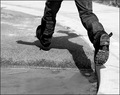
Puddle Jumpingby MelethiaComment: Originally posted by SandyP:
Now. . .why did this one only score 5.0! This is so creative. I love the way he's jumping over his shadow!
I love it! |
I think it scored a 5 because it had 79 votes of "5"... :-)
|
| 04/17/2006 12:20:44 AM |
|
 Photographer found comment helpful. Photographer found comment helpful. |
| 04/14/2006 08:27:10 AM |
|
| Photographer found comment helpful. |
| 04/14/2006 08:23:27 AM |
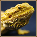
Bearded Dragon by bvoiComment: I liked this guy (or should I say gal?) from the moment I saw the thumbnail. Congratulations on the yellow!! Make sure she knows she's famous. :-) |
| Photographer found comment helpful. |
| 04/14/2006 07:11:24 AM |
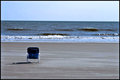
Vacant Ocean Viewby MrXpressComment: The horizon seems ever so slightly off-level. Overall, though, I like the simplicity and serene feeling of this picture. Chair is in just the right place. |
| Photographer found comment helpful. |
| 04/14/2006 12:18:53 AM |
As I Lay Dyingby RKTComment: I could look at this all day - you were a bit robbed, I have to say. Great entry for the challenge, and an even better picture on it's own right. |
| Photographer found comment helpful. |
| 04/14/2006 12:15:19 AM |
Tapping into textureby Rae-AnnComment: Rae Ann - this was one of my favorites in this challenge - it was in my top ten. I loved it from the minute I saw it and kept coming back to it. Very nice! |
| Photographer found comment helpful. |
| 04/14/2006 12:12:23 AM |
|
| Photographer found comment helpful. |
| 04/14/2006 12:08:25 AM |
Stories of Her Life by librodoComment: Conratulations for one heckuva fine picture - I suspected this was your work. Amazing score here as well. Thank you SO much for sharing her with us! |
| Photographer found comment helpful. |
| 04/13/2006 11:11:49 PM |
|
| Photographer found comment helpful. |
Home -
Challenges -
Community -
League -
Photos -
Cameras -
Lenses -
Learn -
Help -
Terms of Use -
Privacy -
Top ^
DPChallenge, and website content and design, Copyright © 2001-2026 Challenging Technologies, LLC.
All digital photo copyrights belong to the photographers and may not be used without permission.
Current Server Time: 07/18/2026 01:25:32 AM EDT.