| Image |
Comment |
| 05/14/2006 11:52:19 AM |
Hear my roar !by ShutterPugComment: Wow - looks like you dragged this guy into a studio and had him pose for you. Somehow I'm betting that's not the case. So you apparently got great lighting and did a marvelous job with post processing. Very nice!! |
 Photographer found comment helpful. Photographer found comment helpful. |
| 05/14/2006 06:55:22 AM |
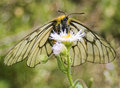
Butterfly tongueby Pug-HComment: Great capture! I love the detail on it's face and legs. The wings look almost translucent. |
| Photographer found comment helpful. |
| 05/14/2006 12:00:36 AM |
|
| Photographer found comment helpful. |
| 05/13/2006 11:02:33 PM |
|
| Photographer found comment helpful. |
| 05/13/2006 11:01:33 PM |
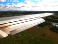
Descending Plane Crashesby naomikComment: Something in post processing maybe has made the sky a rather unnatural color - clouds to the right are "blown". |
| Photographer found comment helpful. |
| 05/13/2006 11:00:35 PM |
|
| 05/13/2006 11:00:03 PM |
|
| Photographer found comment helpful. |
| 05/13/2006 10:59:33 PM |
Darth Potato Conquestby scarbrdComment: Good use of the diagonal and good crisp focus on the front potato guy. Back potato guy needed to be looking a bit more in the forward direction maybe. |
| Photographer found comment helpful. |
| 05/13/2006 10:57:51 PM |
|
| Photographer found comment helpful. |
| 05/13/2006 10:57:49 PM |
|
| Photographer found comment helpful. |
Home -
Challenges -
Community -
League -
Photos -
Cameras -
Lenses -
Learn -
Help -
Terms of Use -
Privacy -
Top ^
DPChallenge, and website content and design, Copyright © 2001-2026 Challenging Technologies, LLC.
All digital photo copyrights belong to the photographers and may not be used without permission.
Current Server Time: 07/22/2026 05:03:45 AM EDT.