| Image |
Comment |
| 05/16/2006 06:31:17 PM |
|
 Photographer found comment helpful. Photographer found comment helpful. |
| 05/16/2006 06:30:34 PM |
|
| Photographer found comment helpful. |
| 05/16/2006 06:29:38 PM |
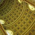
Cathedral Ceilingby banmornComment: Nice capture of the detail but kinda needs a bit more perspective to know what we're looking at - include a wall or part of one, maybe? |
| Photographer found comment helpful. |
| 05/16/2006 06:27:38 PM |
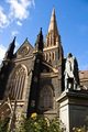
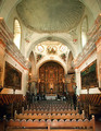
St. Patrick's Cathedralby likewh0aComment: A beautiful structure. I don't know well enough of it's location to know whether you can get the face fully lit by the sun - would be better than half and half if at all possible. |
| 05/16/2006 06:25:11 PM |
|
| Photographer found comment helpful. |
| 05/16/2006 06:24:45 PM |
|
| Photographer found comment helpful. |
| 05/16/2006 06:23:36 PM |
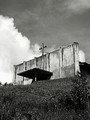
Silent Gloryby gotrondComment: Good choice for the challenge. May be nice in a square crop with less of the foreground which to me detracts from your lovely subject. |
| Photographer found comment helpful. |
| 05/16/2006 06:22:30 PM |
Sanctuaryby breadfan35Comment: Nice use of black and white here. Too bad about the television monitors - seem very incongruous, don't they? |
| Photographer found comment helpful. |
| 05/16/2006 06:21:43 PM |
|
| Photographer found comment helpful. |
| 05/16/2006 06:20:36 PM |
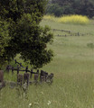
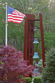
Roadside Faithby shelley1017Comment: I like the composition and the angle you chose to shoot from - good use of the clouds, too. A bit grainy and perhaps oversharpened in the foreround. |
Home -
Challenges -
Community -
League -
Photos -
Cameras -
Lenses -
Learn -
Help -
Terms of Use -
Privacy -
Top ^
DPChallenge, and website content and design, Copyright © 2001-2026 Challenging Technologies, LLC.
All digital photo copyrights belong to the photographers and may not be used without permission.
Current Server Time: 07/22/2026 07:42:56 AM EDT.