| Image |
Comment |
| 06/10/2006 12:00:39 AM |
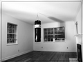
Minimalist Gymby Jaded_HousewifeComment: This is one instance where I don't think the single line within the picture border works - well, it works on the top and sides, but I thought it was a cord across the floor at first. I do like the concept and hope you didn't hang that thing just for the challenge! |
 Photographer found comment helpful. Photographer found comment helpful. |
| 06/09/2006 11:57:20 PM |
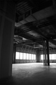
Under Constructionby dunnewoldComment: Like the composition - this is a very nice shot of an "under construction" building - conveys a sense of emptiness and "not quite there" well. |
| Photographer found comment helpful. |
| 06/09/2006 11:56:11 PM |
|
| Photographer found comment helpful. |
| 06/09/2006 11:54:57 PM |
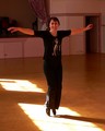
Tap Dancing Practiseby trainComment: Like the expression on the subjects face and the use of the sunlit patches on the floor. The composition is a bit too centered for me - might be nice to see a bit more of the shadow. |
| Photographer found comment helpful. |
| 06/09/2006 11:53:49 PM |
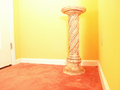
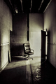
Judgment Incorporatedby RKTComment: I like the tones and textures - nice lighting. Would maybe like the chair not quite on the center line. |
| Photographer found comment helpful. |
| 06/09/2006 11:52:52 PM |
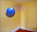
Dimensional Spaceby seebrownComment: Quite creative! The room doesn't look quite real but it's a surreal picture of sorts so that's OK. |
| Photographer found comment helpful. |
| 06/09/2006 11:51:37 PM |
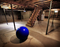
Basement Singularityby Bear_MusicComment: That's a very big blue ball. Like the perspective, the lighting and the shadows. Like the fact that the very big blue ball looks quite odd in this setting. |
| Photographer found comment helpful. |
| 06/09/2006 11:18:40 PM |
unwilling modelby timfythetooComment: Trading Post comment
Composition/subject
He's still a cute kid. Looks a lot like his dad, if you ask me. :-) I almost think this needs a bit more room, or less - more of a square crop, maybe, or crop just above the armpit?
Technical
Seems sharpest on his lips and a bit soft on the eye - I'd prefer it the other way 'round. Post processing seems to be very good - by that I mean I can't tell it's been post-processed.
Meets challenge
Yep. Single light source appears to have been used. I do like how the light highlights his curls just "so".
My opinion
More 6s than 5s, more 7s than 4s - I'd say that's pretty good as far as pleasing the "client". I just really like the way he's looking at the camera. |
| Photographer found comment helpful. |
| 06/09/2006 11:07:03 PM |
A Glass of Wine with a Bottle to Goby chaliceComment: Trading Post comment
Composition/subject
Excellent composition! I especially like that you chose to work from the upper left down into the picture.
Technical
I LOVE the lighting! I particularly like how the bottle pratically disappears in parts, the "blown" bit of the glass where the edge disappears (yes, I do like "blown" bits in pictures sometimes), and the red and it's just-barely-there reflection.
Meets challenge
Definitely meets challenge, and then some.
My opinion
I really like this alot - probably my favorite of yours I've critiqued thus far, and in my humble not-all-that-photographically-educated opinion, this deserved a much higher score. |
| Photographer found comment helpful. |
| 06/09/2006 10:59:38 PM |
Well, she was just seventeen, You know what I mean, And the way she looked was way beyond compare.by KelliComment: Trading Post comment
Composition/subject
I like the way you have her positioned in the frame, and the looking over the shoulder angle that you chose. She also happens to be very pretty!
Technical
The spotlight effect, while illegal for DPC, does add interest to this, but I think I'd like to see the original without it. It appears the background color is a bit dull - maybe work with the original with curves and levels, maybe even a bit of color shift, to make the background a bit more appealing color. The lighting seems a bit harsh on her arm, but not sure if that's in the original or an effect of the filter.
Meets challenge
Definitely met the challenge - the line you chose fits perfectly!
My opinion
I like the shot as far as the pose and the placement in the frame quite a bit. |
| Photographer found comment helpful. |
Home -
Challenges -
Community -
League -
Photos -
Cameras -
Lenses -
Learn -
Help -
Terms of Use -
Privacy -
Top ^
DPChallenge, and website content and design, Copyright © 2001-2026 Challenging Technologies, LLC.
All digital photo copyrights belong to the photographers and may not be used without permission.
Current Server Time: 07/24/2026 10:21:28 AM EDT.