| Image |
Comment |
| 06/15/2006 10:35:59 PM |
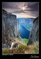
Beauty Diveby terjeComment: Stunning, from the perspective to the colors. Marvelous work. |
 Photographer found comment helpful. Photographer found comment helpful. |
| 06/15/2006 10:34:31 PM |
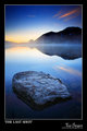
The Last Shotby terjeComment: Bummer about the camera - was wondering how the title came about. Very nice last shot, though! |
| Photographer found comment helpful. |
| 06/15/2006 10:30:51 PM |
|
| Photographer found comment helpful. |
| 06/15/2006 09:56:04 PM |
|
| Photographer found comment helpful. |
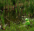
| 06/14/2006 06:06:36 PM |
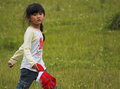
Through Long Grassby Pug-HComment: Sweet shot - I don't mind that you cut her legs off. Like the way she's walking through the frame, and looks like she caught you shooting her, too! |
| Photographer found comment helpful. |
| 06/14/2006 10:01:30 AM |
Am I Green Enoughby trainComment: Great portrait! I'm sure the subject's family is suitably impressed and hope you gave them a copy for their den. :-) Seriously, this is an awesome shot - great "pose" and composition, and definitely green. And I gotta differ with some commenters - I think the subject is very cute in this capture! |
| Photographer found comment helpful. |
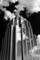
| 06/14/2006 09:56:04 AM |
Frost Bank Towerby yankoComment: Another great architecture shot - great use of the clouds and the tonality is perfect. |
| Photographer found comment helpful. |
| 06/14/2006 09:54:46 AM |
Texas Capitol Roadby yankoComment: Dang - you need to get a job doing this architecture photography stuff! Love the angle you chose here with the leading line a painted curb of all things. Where are finding clouds? |
| Photographer found comment helpful. |
| 06/14/2006 09:49:34 AM |
Maybe it is easy being green.by timfythetooComment: Trading Post comment
Composition/subject - I didn't vote in this challenge and truthfully never got a chance to even look through the entries, but I suspected you might have used Kermit... I really like Kermit so I'm down with the subject choice. :-) Good environment in which to stick Kermie. Only nit on the composition is lay of the fishing line - I'd have preferred it straight out to the point where the float is.
Technical - Good exposure, good color, good contrast. All good.
Meets challenge - Yep
My opinion - Nice use of a good prop. As I mentioned, the only thing I don't like is the way the fishing line is angled. (So are 6s getting boring now?) Heh - just noticed that Kermie is in 3 of your top 6! Message edited by author 2006-06-14 09:51:19. |
| Photographer found comment helpful. |
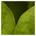
| 06/14/2006 09:40:34 AM |
Gammaby LouisComment: Trading Post comment
Composition/subject - I wonder how many people "got" the title. The choice of subject is appropriate for the challenge (though I suspect some probably got tired of this subject while voting). Composition is more interesting than the normal "leaf" shot, though I can see moving the seam between the two leafs further left a bit.
Technical - Depth of field works for me. Lighting is a bit flat, but sufficient for this shot.
Meets challenge - It's green so it's a fair bet this meets the challenge.
My opinion - I think this would make an interesting series. |
| Photographer found comment helpful. |
Home -
Challenges -
Community -
League -
Photos -
Cameras -
Lenses -
Learn -
Help -
Terms of Use -
Privacy -
Top ^
DPChallenge, and website content and design, Copyright © 2001-2026 Challenging Technologies, LLC.
All digital photo copyrights belong to the photographers and may not be used without permission.
Current Server Time: 07/24/2026 05:57:58 PM EDT.