| Image |
Comment |
| 06/24/2006 08:03:03 PM |
|
 Photographer found comment helpful. Photographer found comment helpful. |
| 06/24/2006 08:02:20 PM |
|
| Photographer found comment helpful. |
| 06/24/2006 08:02:18 PM |
|
| Photographer found comment helpful. |
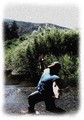
| 06/24/2006 07:45:26 PM |
Downtownby amberComment: I like this a lot. Very good use of B&W; excellent contrast. |
| Photographer found comment helpful. |
| 06/24/2006 05:53:08 PM |
|
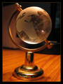
| 06/24/2006 05:52:33 PM |
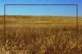
asdby ashishkushwahaComment: I think you may be trying to depict overall desolation of the African continent, but not sure it comes across. Without the challenge description attached, this is just a shot of a globe. |
| 06/24/2006 05:51:21 PM |
|
| Photographer found comment helpful. |
| 06/24/2006 05:45:57 PM |
|
| Photographer found comment helpful. |
| 06/24/2006 05:45:14 PM |
|
| Photographer found comment helpful. |
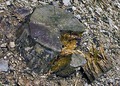
| 06/24/2006 05:45:05 PM |
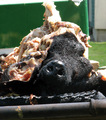
The Descrated hogby albc28Comment: Kinda gross to look at. Picture is at an odd angle (sloped to the leftas viewed). Not sure how desecrated (or baked, for that matter) relates to desolation. |
| Photographer found comment helpful. |
Home -
Challenges -
Community -
League -
Photos -
Cameras -
Lenses -
Learn -
Help -
Terms of Use -
Privacy -
Top ^
DPChallenge, and website content and design, Copyright © 2001-2026 Challenging Technologies, LLC.
All digital photo copyrights belong to the photographers and may not be used without permission.
Current Server Time: 07/25/2026 11:32:08 PM EDT.