| Image |
Comment |
| 07/06/2006 09:28:12 PM |
|
| 07/06/2006 09:27:20 PM |
|
 Photographer found comment helpful. Photographer found comment helpful. |
| 07/06/2006 09:25:39 PM |
Apiaceaeby undieyatchComment: Very nice use of light, shallow DOF. Result is very delicate and soft! |
| 07/06/2006 09:24:42 PM |
|
| Photographer found comment helpful. |
| 07/06/2006 09:22:08 PM |
SOUTHERN BELLSby bonnettComment: I like the background - contributes nicely to the feel of the photograph. |
| Photographer found comment helpful. |
| 07/06/2006 12:18:58 AM |
Glass Towersby timfythetooComment: Trading Post comment
What I said the first time through. :-) Simple, clean lines; nice gradation in the sky, too. |
| Photographer found comment helpful. |
| 07/06/2006 12:17:47 AM |
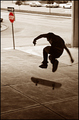
No Skateboarding Allowedby timfythetooComment: Trading Post comment
I like the alternate, but I like this one much better. It has a very "skateboard" feel to it - the freedom and singleness that the activity seems to imply. I like the stop sign in red and everything else in brown. That could well be a statement, but it doesn't really say that for me - I just like the tonality of it. In scrolling back and forth to comment, it seems to me you could crop the top just down to where the cars are gone - puts the skateboarder even more into his world. Oh, and don't get hung up on scores - this is actually a pretty darn cool picture that requires more than the standard DPC 2 seconds. |
| Photographer found comment helpful. |
| 07/06/2006 12:04:46 AM |
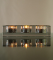
Glass Candle Holder on a Glass Tableby chaliceComment: Trading Post comment
I gave this a 7 - I really like the neutral tones and the balance this has. In looking at it again, I also think it's kinda neat how the center flame is the strongest, particularly in the reflection. |
| Photographer found comment helpful. |
| 07/06/2006 12:01:08 AM |
Sailing towards calmer waterby KelliComment: Trading Post comment
I remember this one from voting - I thought you achieved the goal implied by the title very well. I suspect the majority of voters didn't like the processing and perceived it as "overdone" rather than intentional. I really like the way it fades to dark on the right - sort of "uncharted territory" in that direction! |
| Photographer found comment helpful. |
| 07/05/2006 11:42:30 PM |
Death of a Kingby tngrndreamComment: Trading Post comment
I remember this one from voting - I'm pretty sure I said something about it being a bit too red, though I did think it was red to signify death. I think this was a good choice for the challenge and I like the pieces lined up but not fully visible on each side. Technically, it seems a little soft, but I kinda like soft. The pieces in the upper right seem sharper than those in the center, though, which implies the focus was just a tad closer to that corner than the center pieces. |
Home -
Challenges -
Community -
League -
Photos -
Cameras -
Lenses -
Learn -
Help -
Terms of Use -
Privacy -
Top ^
DPChallenge, and website content and design, Copyright © 2001-2026 Challenging Technologies, LLC.
All digital photo copyrights belong to the photographers and may not be used without permission.
Current Server Time: 07/27/2026 04:37:39 PM EDT.