| Image |
Comment |
| 09/10/2010 03:47:01 PM |
|
 Photographer found comment helpful. Photographer found comment helpful. |
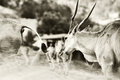
| 09/10/2010 03:38:07 PM |
Put me IN, Coach!by LydiaComment: I wander how will people react to the background, to me it's too much, sort of like plastic filter in the Photoshop |
| Photographer found comment helpful. |
| 09/05/2010 05:56:56 AM |
gimmie, gimmie, gimmieby radarbratComment: I wonder why people preferred all the boosted yellow flowers to the real stuff. A very good idea and desaturation. Message edited by author 2010-09-06 17:21:50. |
| Photographer found comment helpful. |
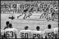
| 09/05/2010 05:52:54 AM |
Colour meby sarampoComment: fully agree with bob350, tho i can imagine also a slighter change: you seem to look slightly off camera, like if you are looking into camera, but not really. which was probably not the intention. I guess the impact would be stronger this way too. And more sharpening would probably bring higher votes (even if not a better picture).
what means the tattoo? looks like david, but again... not really. unless i's personal. |
| Photographer found comment helpful. |
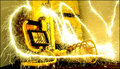
| 09/05/2010 05:06:56 AM |
You said Yellow Vby daisydavidComment: seems to me that the sparkler makes sense on the original, but after cropping, is more messy than anything else. that said the sparkler is quite cool even without making sense :-) |
| Photographer found comment helpful. |
| 08/25/2010 03:50:41 PM |
|
| Photographer found comment helpful. |
| 08/22/2010 02:57:44 PM |
me-avatar'edby prashant_168Comment: Actually it seems like a very good piece of editing. Except for the font used for the text :-) |
| Photographer found comment helpful. |
| 07/28/2010 04:48:46 PM |
|
| Photographer found comment helpful. |
| 07/13/2010 05:38:47 PM |
the millennium danby bladComment: A really good one, stood out when I browsed through this challenge, unfortunately only after voting was closed. |
| Photographer found comment helpful. |
| 06/26/2010 04:21:43 PM |
|
| Photographer found comment helpful. |
Home -
Challenges -
Community -
League -
Photos -
Cameras -
Lenses -
Learn -
Help -
Terms of Use -
Privacy -
Top ^
DPChallenge, and website content and design, Copyright © 2001-2026 Challenging Technologies, LLC.
All digital photo copyrights belong to the photographers and may not be used without permission.
Current Server Time: 07/15/2026 03:37:59 PM EDT.