|
|
|
Showing 9551 - 9560 of ~12478 |
| Image |
Comment |
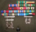
| 06/06/2006 02:42:48 PM | Marine Successby PleasantDreamsComment: *** C R I T I Q U E C L U B C O M M E N T ***
This very straightforward image certainly addresses the concept of "success" in a way that we can all relate to. so you fulfilled the challenge, definitely.
Photographically, it's rather dull, and the score you received shows that. Specific suggestions for improvement:
1. It's cropped very tight, it feels "crowded". More breathing room on all 4 sides would be good, especially on the bottom where it would be nice to see the pocket flap completed.
2. There's a lot of "glare" here, and it is robbing saturation from the ribbons. Did you shoot it with a flash? A light from the side would have worked better, I think.
3. There's an overall sense it's not critically sharp, which is a definite flaw in a shot of this sort.
4. In a more general sense, you could have made this work better by providing more context. Exactly what that would be I don't know, but possibly just to have someone WEARING the jacket so it is "modeled", has dimension, maybe a trace of jawline, let the ribbons and badges be the FOCUS of the image but not the WHOLE of the image, you know?
In any case, thanks for serving! I admire marines :-) My uncle was one... |
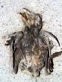
| 06/06/2006 03:05:12 AM | failed attemptby eatbaklavaComment: *** C R I T I Q U E C L U B C O M M E N T ***
This is actually an interesting image, from my perspective, since it seems so much to look like a fossil, when in fact it's a dead and dessicated baby bird, if I'm not mistaken.
The image as a whole is sharp, so that's good. The composition is utterly matter-of-fact, bang-on-centered, and most would see that as a flaw, but for this image I don't see it that way. The fact that the leg (?) is cut off on the right side is a negative, compositionally; I wish it had an equal border of cement all around, so left, right, top, and bottom were the same "framing".
Because this is a basic editing challenge, there's not a hell of a lot you can do with that bright BG, since the bird itself has so many equally-bright spots on it. But in advanced editing, I'd burn in the corners/periphery fairly significantly to contain & isolate the bird.
I believe your very low score on this is a result of a profoundly unappealing subject and an utterly deadpan, in-your-face 'scientific" presentation; the combination doesn't give people much to like unless they're "quirky appreciators" like me. But I see what youw ere after, and I think you had it heading int he right direction.
Robt. |
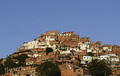
| 06/06/2006 02:55:53 AM | We failed to eradicate poverty....by mercolinoComment: *** C R I T I Q U E C L U B C O M M E N T ***
Speaking to the image as it stands on its own, disregarding the challenge:
While the shot, the scene, has potential, I am immediately aware of the extreme flatness/dullness of the lighting, which is coming from directly behind you. All sense of depth is lost, the surfaces aren't fully expressed. Shooting earlier or later in the day could have done wonders for this scene.
The same is true of the sky; it is utterly flat and featureless, except for the annoying kite (?) just left of center, which if this were an advanced editing challenge you'd surely have gotten rid of.
One can see where you have attempted to compensate for the flatness of the lighting by increasing the contrast, but that only takes you so far. As it is, it has resulted in the trees going nearly black, as they are by far the darkest objects in the image, so they have become like "blobs" in the picture, not contributing much at all.
So my advice would be to shoot at a better time of day, where the light is more expressive.
Compositionally, the image is awfully cut-and-dried, not dynamic at all, very static. Without having seen the location I don't know what's actually possible, but to me the image cries for foreground to give it both depth and context. If the foreground consists of elements that are in CONTRAST to the poverty of the favelas (is that right?) on the hillside, why then, so much the better IMO.
Speaking to the image as a challenge entry:
While I understand your perception of this scene as representative of "failure", I think that without the title it would be very hard to read that way, and even with the title it seems to be a bit of a stretch in a challenge called "failure". For example, some looking at this image would see it as an image showing men reaching upwards, striving, and think of it as an image of hope or striving, you know what I mean?
So it's an uneasy fit for the challenge, made all the more so by the fact that the image itself doesn't bring us INTO the poverty at all; instead we stand at a distance, observing but neither touching nor smelling nor hearing the very real human travail that IS extreme poverty.
I guess what I'm saying is, I'd love to see work from you that got much more up-close and personal on this subject :-)
Robt. |
| 06/06/2006 01:01:47 AM | |  Photographer found comment helpful. Photographer found comment helpful. |
| 06/06/2006 12:59:59 AM | Muddier Watersby tateComment: GREAT bird! nice reshoot, subtle and effective. the tonalities are very well-rendered. | | Photographer found comment helpful. |
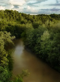
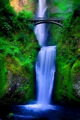
| 06/06/2006 12:59:13 AM | Return to Multnomahby DrAchooComment: Damn, you went for the full Rikki here didn't ya? If it were me I'd have toned down the warm rocks upper left, made 'em cooler; they really stand out among these surreal blues and greens, to no good advantage. | | Photographer found comment helpful. |
| 06/06/2006 12:57:19 AM | Sophisticated 2 (86275)by hopperComment: and she's baaaaaaaaaaaaack! makes me want to say "hiya, honey!" to your wife, who I'm starting to feel like I know :-) | | Photographer found comment helpful. |
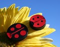
| 06/06/2006 12:51:42 AM | Super Glue Was Usedby Tap10Comment: ROTFLMAO... this gets the humor award handed out by the "save the ladybugs" organization! | | Photographer found comment helpful. |
| 06/06/2006 12:49:38 AM | |
| 06/06/2006 12:42:32 AM | | | Photographer found comment helpful. |
|
Showing 9551 - 9560 of ~12478 |
Home -
Challenges -
Community -
League -
Photos -
Cameras -
Lenses -
Learn -
Help -
Terms of Use -
Privacy -
Top ^
DPChallenge, and website content and design, Copyright © 2001-2026 Challenging Technologies, LLC.
All digital photo copyrights belong to the photographers and may not be used without permission.
Current Server Time: 05/07/2026 10:40:43 PM EDT.
|