| Image |
Comment |
| 12/29/2004 02:26:06 PM |
Hands Requiredby Prime_TimeComment: I feel there's too much negative space at the top. I wish the arc were not tangent to the warm diagonal. The "tabs" lower right are eyetraps for me. Close, but needs fine tuning. |
 Photographer found comment helpful. Photographer found comment helpful. |
| 12/29/2004 02:24:15 PM |
|
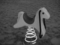
| 12/29/2004 02:23:38 PM |
Giddy Up Goby FrostyPawsComment: Cute as hell. I wish there were more "pop" in the horsey, and the tight cropping at bottom is a major flaw to me eye. |
| 12/29/2004 02:22:50 PM |
|
| 12/29/2004 02:21:34 PM |
Stonegroundby Richie23Comment: That somebody found and shot a millstone, one of the more ancient mechanical devices, please me no end. The image itself is muddy and diffuse, to my eye. |
| Photographer found comment helpful. |
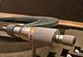
| 12/29/2004 02:20:15 PM |
Baitcaster X-rayby pahlComment: Gonna be fascinating to see how this was pulled off within the rules. Give it an "A" for technical wizardry. I just wish the resultant image pleased me more, but my aesthetic reaction is "heh!". |
| Photographer found comment helpful. |
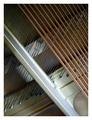
| 12/29/2004 02:18:50 PM |
Piano Studyby nicolepComment: fascinating composition, but in need of more sophisticated lighting to make it really get up and dance. the background wires, all that area in the piano body, need soemthign more. |
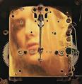
| 12/29/2004 02:17:40 PM |
Clock Faceby MarieWComment: This is creative, but it's not really singing to me. I'm not sure why. |
| Photographer found comment helpful. |
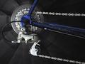
| 12/29/2004 02:16:04 PM |
Motioned Gearsby hdogg4uComment: Nice framing and effect, but lacking in the critical sharpness this sort of image seems to demand. |
| 12/29/2004 02:15:10 PM |
|
| Photographer found comment helpful. |
Home -
Challenges -
Community -
League -
Photos -
Cameras -
Lenses -
Learn -
Help -
Terms of Use -
Privacy -
Top ^
DPChallenge, and website content and design, Copyright © 2001-2026 Challenging Technologies, LLC.
All digital photo copyrights belong to the photographers and may not be used without permission.
Current Server Time: 06/20/2026 06:50:13 AM EDT.