| Image |
Comment |
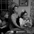
| 01/04/2005 01:37:53 AM |
Game Facesby SkipComment: This is just SO dine, the expressions, the tonal control, the overall human richness of it. The face in the mirror TOTALLY takes it over the top. Fine candid! |
 Photographer found comment helpful. Photographer found comment helpful. |
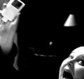
| 01/04/2005 01:36:40 AM |
kate fixes her ipodby muckpondComment: I LOVE this for the genre of "accidental snaps", it is stronger precisely because it is so obviously spontaneous and irreprodicible. The overall composition is remarkably wacky. You obviously cropped this; I'd love to see the original. A solid high score from me, I hope others see what I see. |
| 01/04/2005 01:34:43 AM |
The Cookhouse Windowby BudComment: Immaculate in every respect. Clone away the tiny, bright dot center right? The red hat and it's associated ear are simply wonderful. |
| Photographer found comment helpful. |
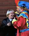
| 01/04/2005 01:33:26 AM |
A New Year's Laughby banmornComment: Fine expression captured. Jester is apparently using a cellphone, pity we can't see it. I wish the point of critical sharpness were on the woman's face and the jester were slightly out of focus. A strong entry. |
| Photographer found comment helpful. |
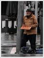
| 01/04/2005 01:32:01 AM |
Or Just a Smile if Nothing Elseby stragsComment: In this example, the selective desaturation looks much more natural than in most cases. I think the figure behind the pole should be desatted also, though. The image is marred by not being rotated ccw to a truer vertical; it's so close that it looks accidental that it's NOT vertically aligned. I could wish for a little more sharpness too. A fine, gritty slice-of-the-streets. |
| Photographer found comment helpful. |
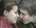
| 01/04/2005 01:29:23 AM |
Anticipationby ellamayComment: There is just a world of emotion in this. A true candid. Marvelous shape formed in the negative space between foreheads and noses, as if their whole world were there. Lovely how the noses don't-quite-kiss. I wish her ear were sharper, and perhaps a little green cast removed from the image. Wonderful picture. |
| Photographer found comment helpful. |
| 01/04/2005 01:26:58 AM |
Father and sonby gaurawaComment: Exceptionally beautiful image. The more I look at it, the more details I see that interest me. Love the squinting right eye of the father, the detail of the wrappers, the fine hair detail on the foreheads, the perfect arc of hood around ear, etc etc.
The image is sl;ightly flawed by overuse of the USM, whch has produced a halo around the figures where the pixels contrast with the background. This can be avoided by using a selection mask to select out the figures alone, then shrinking the mask by 2 pixels all around, which woukld leave no extreme contrast at the edges of the mask and generate no halo. |
| Photographer found comment helpful. |
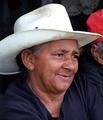
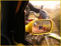
| 01/04/2005 01:17:55 AM |
On the moveby nolockComment: Remarkable, out-of-the-box take on the challenge. There's a slightly distracting sliver of background showing upper left that should be cropped out. Possibly crop down also so the intersection of windowframe and extended arm of rider is at the top, not much of a crop. The critical sharpness in the reflection juxtaposed with the blurry reaility outside the window makes this picture. |
| Photographer found comment helpful. |
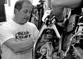
| 01/04/2005 01:14:29 AM |
Wrenchin'by cbellerComment: There's a lot to like in this image, but a number of things are detracting as well.
Good points: sharpness of, and expression on, face. It's a nice study of concentration. Also the tonalities are rich, it's a good B/W conversion, mellow and smooth.
The croppung seems off to me; the truncated head is arbitrary, the space below the elbow is not doing anything. I tried cropping most of that lower space off and bringing the right edge in so I couldn't see any of the "77" in the background, and this was a tighhter & stronger crop to my eyes. Often, with candids, the crop will make or break the image.
It's unfortunate that the mechanic's hand and the rag are not also sharp. The hand, especially, could be a vital part of the image, but it's not. It looks like if you'd pul;led focus forward a bit, your DOF would have been ample to have had hand and face both sharp.
Finally, and this is critical, the wall behind the head is too bright, and it is pulling my eye in the wrong direction; I want to be following the direction of his gaze, but the eyetrap in upper left is oulling me the other way.
|
| Photographer found comment helpful. |
| 01/03/2005 03:49:58 AM |
|
| Photographer found comment helpful. |
Home -
Challenges -
Community -
League -
Photos -
Cameras -
Lenses -
Learn -
Help -
Terms of Use -
Privacy -
Top ^
DPChallenge, and website content and design, Copyright © 2001-2026 Challenging Technologies, LLC.
All digital photo copyrights belong to the photographers and may not be used without permission.
Current Server Time: 06/20/2026 06:41:08 AM EDT.