| Image |
Comment |
| 09/18/2005 01:38:39 AM |
|
 Photographer found comment helpful. Photographer found comment helpful. |
| 09/18/2005 12:35:06 AM |
|
| Photographer found comment helpful. |
| 09/18/2005 12:33:05 AM |
|
| Photographer found comment helpful. |
| 09/18/2005 12:26:39 AM |
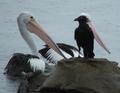
The Meetingby roscoComment: Damned pity about the second pelican and the bizarre headgear on the black bird. At least IMO. If it were just the two birds... |
| 09/18/2005 12:22:32 AM |
ICUCingMeby MPRPROComment: Love that Manfrotto 3021; GOT to be the tripod-of-choice in DPC. Pretty cool shot too :-) |
| Photographer found comment helpful. |
| 09/18/2005 12:19:47 AM |
|
| Photographer found comment helpful. |
| 09/18/2005 12:18:55 AM |
Men In Black Agent by Joey LawrenceComment: Gawd, Joey (I'm assuming this is Joey, forgive me if it ain't), MIB don't wear patterned tires, dude. jejeje
great shot regardless. Hi score from me. |
| Photographer found comment helpful. |
| 09/17/2005 09:12:04 PM |
|
| 09/17/2005 01:30:00 PM |
Fore River Marsh (BW)by NeilComment: This is a handsome shot. In this case the B/W works better for me than the color version. However, I feel the dark areas in the BG are too blocked up, and I'm not happy with the awkward truncation of the trees on the upper right. Finally, for me the stray branch upper left is a significant distraction/anomaly in this image, though others might not feel that way. I don't like how it touches the BG treetops at all, and I also wish it weren't totally disembodied, floating out of nowhere. |
| Photographer found comment helpful. |
| 09/14/2005 01:53:42 PM |
Oven Viewby DigiPiqueComment: hahaha! This is a GREAT take on the challenge. It's more POV than perspective (I realize POV is one deifnition of perspective) so the voters are gonna crucify you on that alone, but I really admire your whimsical thinking here. 8 from me :-) |
| Photographer found comment helpful. |
Home -
Challenges -
Community -
League -
Photos -
Cameras -
Lenses -
Learn -
Help -
Terms of Use -
Privacy -
Top ^
DPChallenge, and website content and design, Copyright © 2001-2026 Challenging Technologies, LLC.
All digital photo copyrights belong to the photographers and may not be used without permission.
Current Server Time: 07/23/2026 05:19:35 AM EDT.