| Image |
Comment |
| 09/20/2005 01:31:29 PM |
Space Needleby ttreitComment: Beautifully-rendered, muted tonalities. Perspective, obviously, dominates this image, so check that off LOL. |
 Photographer found comment helpful. Photographer found comment helpful. |
| 09/20/2005 01:30:32 PM |
Beavertail Lighthouseby djtj1980Comment: That Acadia national Park? Canon 10-22mm? jejeje™ One wonders if the processing coulkd have been a tad more luminous, but a very strong entry rgardless. |
| 09/20/2005 01:29:23 PM |
|
| 09/20/2005 01:28:29 PM |
Not Forgottenby Links 2 3 4Comment: This is quite haunting. Use of massed perspective and slightly washed-out sense of depth haze is emotionally very powerful. That the splashes of light are confined to the BG works particulalrly well. This is perhaps the most emptionally evocative entry in thsi challene, a shot that seems to "be what it is" rather than a textbook illustration of perspective devoid of emotional context. My top pick for that reason, Good luck! |
| Photographer found comment helpful. |
| 09/20/2005 12:41:58 PM |
Future Hallmark Card 2437.JPGby FotoMunkiComment: Amazingly wonderful image. New meaning to the term "ants in her pants"... Not only does this capture the (priceless) moment, it's also technically flawless re: lighting and focus. Instant favorite. |
| Photographer found comment helpful. |
| 09/18/2005 02:03:40 AM |
The Italianby aKiwiComment: If only the tongue of white bench weren't there, you'd have a virtually perfect comkposition. It's unfortunate that the ear and the edge of the collar are not int he frame, as well. But a very nice piece of work that I have enjoyed viewing. |
| Photographer found comment helpful. |
| 09/18/2005 02:02:19 AM |
Bit of the Irish in her.by BrennanOBComment: Wow. wonderful, "real" capture of skin tones and hair, right down to the vaguely "bruised" look under the eyes that's so characteristic of some redheads. Beautiful framing witht he hair, as well. |
| Photographer found comment helpful. |
| 09/18/2005 02:01:08 AM |
Briannaby nico_blueComment: In many ways a very average picture, but a striking POV. I wish the post processing were a little "richer", it feels somewhat washed out to me, like half a stop too bright overall. |
| Photographer found comment helpful. |
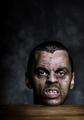
| 09/18/2005 01:57:07 AM |
Bite meby heidaComment: I'm fascinated by this bizarre image. The complementary lighting of the two ears is a remarkable grace note. |
| Photographer found comment helpful. |
| 09/18/2005 01:56:16 AM |
Weatheredby BrianRComment: Absolutely beautiful work with light here. Stands out in its unpretentiousness. A remarkable sense of the man comes through for a shot with dark glasses :-) |
| Photographer found comment helpful. |
Home -
Challenges -
Community -
League -
Photos -
Cameras -
Lenses -
Learn -
Help -
Terms of Use -
Privacy -
Top ^
DPChallenge, and website content and design, Copyright © 2001-2026 Challenging Technologies, LLC.
All digital photo copyrights belong to the photographers and may not be used without permission.
Current Server Time: 07/23/2026 05:19:27 AM EDT.