| Image |
Comment |
| 10/24/2005 12:19:26 AM |
|
 Photographer found comment helpful. Photographer found comment helpful. |
| 10/24/2005 12:14:04 AM |
|
| Photographer found comment helpful. |
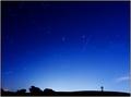
| 10/23/2005 02:37:42 AM |
Summer's Endby Bear_MusicComment: Originally posted by susi:
This is gorgeous! I see you own the 60mm lens, isn't it great! |
Yup, great lens. Though this, of course, was shot with the 10-22mm, which is beyond great, possibly beyond compare :-) |
| 10/23/2005 02:11:50 AM |
|
| Photographer found comment helpful. |
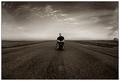
| 10/23/2005 02:10:45 AM |
A Long Road To Here.by PedroComment: Strong & Compelling image, marred noticeably by two things: the house on the right is screaming out for some breathing room so it can take its rightful place as a counter-element, and there's a noticeable sharpening (or contrast) halo around the figure that really hurts. On a more contemplative note, I'm not 100% sure the pure, central symmetry of this shot was the correct choice. I'm not against symmetry per se, I use it a lot msyelf, but in this case the image seems to speak a little more strongly to me if about an eighth or a fifth of the image is cropped off, all that the bottom, to give it a much more hoeizontal orientation; this seems to emphasize the emptiness better. It's a gut-call though. Nice shot! Bumping you up. |
| Photographer found comment helpful. |
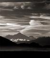
| 10/23/2005 12:23:32 AM |
Mont-Blancby jjbeguinComment: Ah man, I rememeber this view so well. Instant favorite on nostalgia alone. The sky's fabulous, as is the layering of depth. |
| Photographer found comment helpful. |
| 10/21/2005 12:24:52 PM |
runnels on beach.jpgby Bear_MusicComment: I'm with Neil on this one; I have other images from the same shoot that are done from an angle that has no glare, and they have no power at all. Without the brightness, we lose most of the sense of depth, the sense of "huge" contained in such a small slice of sand. |
| 10/20/2005 03:19:30 AM |
|
| Photographer found comment helpful. |
| 10/20/2005 01:38:54 AM |
|
| Photographer found comment helpful. |
| 10/20/2005 01:35:26 AM |
|
Home -
Challenges -
Community -
League -
Photos -
Cameras -
Lenses -
Learn -
Help -
Terms of Use -
Privacy -
Top ^
DPChallenge, and website content and design, Copyright © 2001-2026 Challenging Technologies, LLC.
All digital photo copyrights belong to the photographers and may not be used without permission.
Current Server Time: 07/23/2026 09:12:17 AM EDT.