|
|
|
Showing 851 - 860 of ~2785 |
| Image |
Comment |
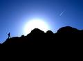
| 08/16/2003 06:58:19 PM | Hiking New Mountainsby RiderGalComment: *Critique Club*
I really like the color here. The blue really stands out of the darkness of the silhouettes.
The angle and framing/cropping are good. I think that the placement of the shooting star is wonderful, as well as the sun. I think that you could have gotten away with less black at the bottom, but this ammount is not bad at all.
I am not really sure what the future aspect is. Maybe being able to see the sun and the shooting star at the same time? I supose since I'm not voting though, who really cares if I can see it or not. lol
The only thing that I can mention that might need improvement on is what has already been suggested, the compression artifacts. I think they effect this shot greatly in a bad way. Everything else is beautiful, and then there are these 'scars' throughout the whole shot.
Like I said though, the rest is wonderful. Great work.
~Heather~ |  Photographer found comment helpful. Photographer found comment helpful. |
| 08/11/2003 01:46:30 PM | A Mother's Loveby BobsterLobsterComment: I haven't been commenting a lot lately, but I just have to say that this shot is creepy as hell. The thumbnail looks like a face!! The eye being the area where the mother and child are, there is a nose shaped area where the grass meets the water, and the dark spot in the water resembles a mouth. This is a really great photo. I like how you have framed the mother and child, and your focus and clarity are really good as well. Very dreamy. And quite creepy in the thumbnail size. ~Heather~ | | Photographer found comment helpful. |
| 08/10/2003 11:33:01 PM | Old treeby heidaComment: *Critique Club*
The only real downfall I see here is what has already been mentioned, and that is the out of focus piece of bark that is closest to the camera. It is right in the center, and creates a bit of a distraction as it is so noticable and right in the center.
I think that the angle and framing/cropping are perfect for the challenge. Fits just fine. I like the closeness and the textures and detail are really good.
The lighting seems to be ok and I see no horrible bright spots or distracting shadows.
Focus on the bark is good, with the exception of the closest pieces. I think a larger DOF would have worked better here to possibly have the closer pieces in focus. This wouldn't be such a distraction then.
Overall, a nice shot, good detail.
~Heather~ | | Photographer found comment helpful. |
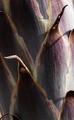
| 08/10/2003 11:15:54 PM | yuccaby gabrielapolloComment: *Critique Club*
I'm looking around trying to find a part that is in crisp focus and I have noticed that it is only the small sections that are very close to the camera. This isn't very much of the photo. (looks like just the tips of the leaves that fold outward toward the camera) I think I would prefer this to have a bit more DOF and therefor show more of the detail in the leaves themselves, and not just in the tiny tips of the leaves.
The lighting is a little harsh on the right side of the photo. See where there is a light glare about mid way down on the photo and also in the upper right of the photo?
While I realize that the Yucca isn't a terribly colorful plant, It seems like the brightness here is muting the colors a bit. They look foggy or cloudy. They don't seem to stand out or have much punch at all.
The angle and framing/cropping is excellent. I realy think you did a perfect job of meeting the challenge, and the closeness is really great for the pattern and details. Had the focus been on the flat part of the leaves, this would really have been excellent for showing the detail of these leaves. There is a lot there to see.
Overall a nice shot, but with a focus and lighting adjustments, I think this would be great.
~Heather~ |
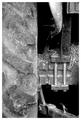
| 08/10/2003 10:57:53 PM | Horsepowerby AaronComment: *Critique Club*
Well, The first thing I notice is that there is a bit of background here. The black area looks to be background to me. While it is not distracting, I do think that a challenge titled 'fill the frame' should not really have any background. This is only the way I personally interpreted the challenge, and since I didn't vote, that doesn't matter too much anyawy.
I think that your focus and clarity are really good. I can see a lot of detail here, from the tread on the tire right down to the screw thread on the vertical bars near the middle of the photo. Very nice detail, and great focus to accomplish such detail.
The lighting to me seems good as well. I wonder though how it would look with a bit of shadow on the tire to help the tread stand out just a little bit more? Otherwise, I see no bright spots or distracting shadows.
The framing and cropping are a major part of this challenge, and as I said before, while it doesn't really fit the 'fill the frame' in my opinion, I do like the framing/cropping very much. The closeness is nice and also helps to make the details stand out. I really like the tire to the left, but maybe it leaves the photo just a little unballanced? Kind of like the left side is a little heavy and the right side doesn't really contain a lot of info.
Overall a nice shot with lovely detail.
~Heather~ | | Photographer found comment helpful. |
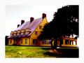
| 08/06/2003 07:51:48 AM | Whalehead Clubby bioshoreComment: You know, I have never seen this movie. This is a really bright photo. It looks like you upped the saturation a little high though. While I can accept that this might be the color of the house, the grass looks a little unnatural. Maybe boosted just a tad too much? I can also see some orange funny colored spots in the tree in the upper right corner that look like they aren't really suposed to be there. Overall a nice shot of the house though. I think focus and clarity are good. Maybe a touch of wide angle lens distortion? Looks like the sides of the shot turn inward just a bit. ~Heather~ | | Photographer found comment helpful. |
| 08/06/2003 07:49:16 AM | Foot Fetishistby shareinncComment: This looks really grainy. I'm not really sure if it's the feet themselves, or if there is something weird going on with the photo, but the feet look like they have a black fungus all over them. Really kind of non appealing. The anglea and framing/cropping are good, and lighting on the subject is ok, however it does create some distracting shadow over to the left of the photo. LIghting on the rope is nice. ~Heather~ |
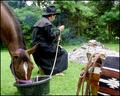
| 08/06/2003 07:46:44 AM | Blazing Saddlesby MarjoComment: My brother loves this movie although I have never seen it. I think that your setup here is great. I love the way you put the sadle and stuff in the lower right corner, that really adds a very nice touch in my opinion. Like I said, have't seen the movie, but with the way you got detailed, I assume it's a good representation. Focus and clarity are good, and I do really like the set up. ~Heather~ | | Photographer found comment helpful. |
| 08/06/2003 07:43:48 AM | Lawrence of Arabiaby KonadorComment: THe lighting is a little harsh on this guys face up on top of his head and between his eyes. Your focus and clarity are good though, and I like the closeness of the shot as well. I think that the angle and framing/cropping are good. Nice close up. ~Heather~ | | Photographer found comment helpful. |
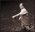
| 08/06/2003 07:41:35 AM | A River Runs Through Itby karmatComment: You have 'jaggies' on the pole and around the guys clothing in places. I think I was told that compression causes these jaggie things, but I'm not really sure how accurate that info was. Definately something to check into though. you can see them on the pole part, and also on the string that goes along side the pole part mostly. Otherwise, I think it's a great shot. Focus and clarity are really good, and the angle and framing/cropping are good as well. The lighting is very nice, but I wouldn't want to see it any brighter on his hand. Nice shot. ~Heather~ | | Photographer found comment helpful. |
|
Showing 851 - 860 of ~2785 |
Home -
Challenges -
Community -
League -
Photos -
Cameras -
Lenses -
Learn -
Help -
Terms of Use -
Privacy -
Top ^
DPChallenge, and website content and design, Copyright © 2001-2026 Challenging Technologies, LLC.
All digital photo copyrights belong to the photographers and may not be used without permission.
Current Server Time: 07/23/2026 05:48:04 AM EDT.
|