| Author | Thread |
|
|
08/11/2003 10:39:29 AM |
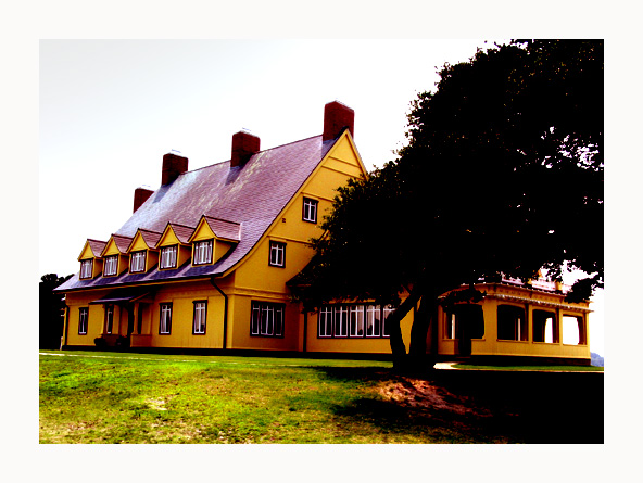
Thank you all for suggestions! The photo was given a new title "Whalehead Club". The print uses a different color scheme.
Message edited by author 2003-08-11 12:05:47. |
|
Comments Made During the Challenge  |
|
|
08/09/2003 08:49:47 PM |
|
I don't remember any house like this in "Gone With The Wind" |
|
 Photographer found comment helpful. Photographer found comment helpful. |
|
|
08/09/2003 10:13:00 AM |
|
Being from the area where Margaret wrote this epic, this neat shot just does not capture Tara. House is a bit too modern... Nice colors though. |
|
| Photographer found comment helpful. |
|
|
08/08/2003 05:05:23 PM |
|
I think this would have worked in bw too, given the movie you chose. These colours are seeming a bit out of place with my notion of tara! :) |
|
| Photographer found comment helpful. |
|
|
08/06/2003 07:51:48 AM |
|
You know, I have never seen this movie. This is a really bright photo. It looks like you upped the saturation a little high though. While I can accept that this might be the color of the house, the grass looks a little unnatural. Maybe boosted just a tad too much? I can also see some orange funny colored spots in the tree in the upper right corner that look like they aren't really suposed to be there. Overall a nice shot of the house though. I think focus and clarity are good. Maybe a touch of wide angle lens distortion? Looks like the sides of the shot turn inward just a bit. ~Heather~ |
|
| Photographer found comment helpful. |
|
|
08/06/2003 12:32:40 AM |
|
nice photo, the border seems a bit over done, interesting color scheme on the house |
|
| Photographer found comment helpful. |
|
|
08/05/2003 07:33:28 AM |
|
Is that supposed to be Tara? |
|
| Photographer found comment helpful. |
|
|
08/05/2003 01:51:53 AM |
|
I love the picture but I don't seem to think of gone with the wind on this sorry. |
|
| Photographer found comment helpful. |
|
|
08/04/2003 05:22:34 AM |
way to much Saturation... - maybe it's the way you like it, but too boosted for my taste...
There is a lack of detail in the trees and sky.
Also it would have been good to rotate it a bit to the left.
The tree is also a bit distracting, it is in the way :)
I like the framing.
Good luck in the challange |
|
| Photographer found comment helpful. |
Home -
Challenges -
Community -
League -
Photos -
Cameras -
Lenses -
Learn -
Help -
Terms of Use -
Privacy -
Top ^
DPChallenge, and website content and design, Copyright © 2001-2026 Challenging Technologies, LLC.
All digital photo copyrights belong to the photographers and may not be used without permission.
Current Server Time: 06/28/2026 02:02:28 PM EDT.