|
|
|
Showing 711 - 720 of ~2785 |
| Image |
Comment |
| 05/03/2004 12:28:33 AM | Garden Abstractby willtataComment: Commenting on abstract is gonna be a difficult thing. That being said, I can't really say much here, just that's is a horribly out of focus photo of some flowers. That does make it abstract, so it fits the challenge, but I don't think I like it. On my page of photos to vote on, this one jumps out of the page because all the other abstracts are in focus, but this is clearly out of focus to MAKE it abstract. alright for the challenge, but not my cup of tea. sorry |
| 05/03/2004 12:25:13 AM | Jby bobdaveantComment: To me, this is more of a portrait than an abstract. It's a very nice portrait too. Great focus, lighting and angle. Shows great detail in this guys face. While I think it's a good image, I'm gonna have to say it's a horrible 'abstract' which is what we're looking for in this challenge. ~Heather~ |  Photographer found comment helpful. Photographer found comment helpful. |
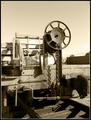
| 04/20/2004 08:15:19 PM | Next Lifeby scottwilsonComment: *Critique Club*
I really like the color here. That is the first thing that stands out to me in this photo. Sorry it's not the wheels, but it doesn't really matter to me. I like the image as a whole. The color is simply amazing. The wheels are a very important part of the image, and I like the seperation. I like where you have placed the wheels within the frame, and the angle is wonderful. Your title is very clever as well. Definately a different take on the subject. You took a potentially boring subject and captured it interestingly. Focus and clarity are good, lighting is good, and I can't see anything I would really like to see differently. I do wonder how this would look with the horizon or some sky in the shot, but you would have to practically be IN the water for that...still might be interesting. However, nothing wrong with how you have it. ~Heather~ | | Photographer found comment helpful. |
| 04/20/2004 07:59:29 PM | Desert Trainby boomerComment: *Critique Club*
I like the 'color'. Definately works with an old subject like this. I do think that there are a few blown out hot spots in the shot that are a bit distracting. I think most are inthe sky and on that white 'sack?' that is on the back of the train. Focus and clarity are great. very nice detail on the train. I would maybe like to see this backed up a bit though, maybe not such a tight crop on the sides? I'd have to see it to really say if I thought it made it better or not, but I think it is definately cropped off close on the right side. I think you picked an interesting subject, and not just a common wheel, and to that you peeked interest, and also with the details. maybe not something I would personally hang on my wall, however, I think that it is well done. ~Heather~ | | Photographer found comment helpful. |
| 04/20/2004 07:38:58 PM | Rollin' Bonesby amblaineComment: *Critique Club*
Skateboard Wheels.
I'm seeing a few things here. One of which is the bottom right hand corner, that has a small light colored triangle that covers a part of the metal inner ring of the wheel. This to me is distracting. I do think that your Depth of Field is nice, and focus is good on your subject as well. I think that the angle and framing/cropping is good, and I can tell it's wheels. What else would they be? Cheese? I do think though that the subject lacks major interest, however, the photo is well taken, except for the distraction in the lower right corner. Your lighting seems good. There is a small hot spot near the center of the photo, that we could do without, however, I do not think that it takes away greatly from the overall photo. In my opinion, the photo is well done. ~Heather~ |
| 03/12/2004 10:43:07 PM | |
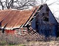
| 02/19/2004 01:18:53 AM | Rough Around the Edgesby deafwolfComment: this isn't what I had pictured for this challenge, but there is texture. I'm not fond of the blaring white sky, and wonder how this would look black and white. a lot of times, when the color is removed, our eyes concentrate more on texture and shapes. would be something to try anyway. ~Heather~ | | Photographer found comment helpful. |
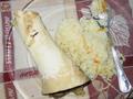
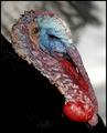
| 02/19/2004 01:16:30 AM | Skin Deep by moodvilleComment: this has got to be the ugliest animal in the history of ugliness. wow. what texture though. looks a lot like intestines or something. I will never eat turkey again. ugh. my only glitch with the photo is the large black blob near the turky's head in the background. wish that weren't there, but otherwise a very nice shot for the challenge. ew again. ~Heather~ | | Photographer found comment helpful. |
| 02/19/2004 01:14:25 AM | I do...by KerryComment: the large area near the front of the photo is soft focus. I do think that soft focus works and DOF is important to a lot of photos, but I think that here, the area that is soft is so large, that it draws a lot of attention, and away from the ring. I would like to see the ring in a brighter part of the photo. see how it is sitting in the shadows? kind of dark. The upper right looks more inviting, and the ring is just hiding down there in the darkness. It should be the brightest part of the photo in my opinion. ~Heather~ |
| 02/19/2004 01:11:40 AM | Da Palmby ResurrectedComment: I think the red tint here bothers me. Doesn't seem natural and my mind keeps wanting to change the color of this shot. Also the background is a little off. it's mostly black, but then near the left side middle, it has color. I'd like to see that more uniform. ~Heather~ | | Photographer found comment helpful. |
|
Showing 711 - 720 of ~2785 |
Home -
Challenges -
Community -
League -
Photos -
Cameras -
Lenses -
Learn -
Help -
Terms of Use -
Privacy -
Top ^
DPChallenge, and website content and design, Copyright © 2001-2026 Challenging Technologies, LLC.
All digital photo copyrights belong to the photographers and may not be used without permission.
Current Server Time: 07/22/2026 12:33:43 PM EDT.
|