|
|
|
Showing 321 - 330 of ~2785 |
| Image |
Comment |
| 05/09/2005 01:41:22 PM | fishermen @ capones islandby imagesloyolaComment: *Critique Club*
Well, this is definately minimal. When I first looked at the photo though, I wasn't exactly quite sure what I was looking at. But with the title I was able to say 'oh yeah, that's what it is'.
Focus on the water looks good, but the boat is so tiny that it's hard to tell on the boat. Not much detail there.
Lighting on the water is also good, but again, on the boat it is a little bright. See the area down the center of the boat? That's where it gets a tad bright in my eyes.
I like the trails from the boat in the water. I think that adds interest without being distracting.
I also like the negative space above and in front of the boat. Overall a neat photo with great perspective, but wish the boat were maybe a bit bigger so we could get some detail from it.
~Heather~
|
| 05/09/2005 01:03:04 PM | mintby du5k0neComment: *Critique Club*
Guessing by the placemnt in the bottom 4%, your assumptions that you were not sure this is what you should be putting up were correct.
This is an interesting shot. Looks like a guy celebrating something in the forground and a guy at a jukebox?? in the background. I would say that there was too much going on in the photo for it to be considered minimal.
Setting the challenge aside, since you already know you went wrong there. I'll comment on the photo itself.
I like the redish tones to the photo, but the guys face looks unnaturally reddish also. He looks very badly sunburned or something. The guy in the back and what he's doing is what really catches my eye, so I wonder if this might have been better without the guy in the front.
I like the angle and framing/cropping on the guy in the back and the guy in the front doesn't really seem to fit into the photo much at all. The background is calm and he's definately not.
Focus is a bit soft, which I'm assuming was what you were going for to show the movement in the photo, but I'm thinking I would like to have SOMETHING in focus. The darkness probably had a hand in that.
Overall the photo is interesting, but doesn't really hold me in.
~Heather~ |
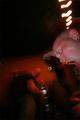
| 05/09/2005 12:51:59 PM | One Man's Dreamby mrezaComment: *Critique Club*
First of all, let me congratulate you on your top scoring photo with this one.
This is a very nice, simple photo.
Very good use of negative space in the upper portion of the photo. You did a very nice job with that. Attention is definately drawn down to the subject.
The background has the appearance of being tilted, however, sometimes it's more of an optical illusion.
The shot does seem a bit grey, maybe a boost of contrast could help that some.
Focus and clarity appear to be right on, and I see nothing that is distracting at all. Which, I think is the point behind being simple and minimalistic.
Lighting looks to be a bit overcast, which could be the reason for the greyness. Or, the greyness could be a reason the photo looks overcast. Eitherway, I think this shot would benefit slightly from some contrast adjustments.
Nice take on the challenge.
~Heather~ |  Photographer found comment helpful. Photographer found comment helpful. |
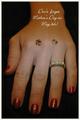
| 05/08/2005 09:37:32 PM | Wish Listby OzzieComment: *Critique Club*
First reaction to this photo is that the jewels on the back of the hand are a really silly thing. Who has jewels on the back of their hand? That one detail is strong enough to ruin the photo for me. Very out of place, very non realistic, very odd.
The lighting is uneven, which I see could be used to draw attention to a certain area, however, the area that is most brightly lit is to the left of the ring, and below the 2 random jewels.
The placement of the hand is awkward. The perspective is distorting the hand in weird ways. I think maybe having the hand horizontally placed, and not straight on the back of the hand might have created more visual appeal in my opinion.
Focus on the ring seems really good. It's a pretty ring, and I think it would stand on it's own without the jewels. The DOF does not work as a jewelry ad for me.
Overall the photo seems awkward to me.
~Heather~ |
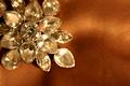
| 05/08/2005 09:20:06 PM | Elementalby utroComment: *Critique Club*
The first thing that jumps out at me right away is the focus. It seems a bit soft on the subject and there is a small piece of cloth in the bottom right corner that is in perfect focus. I think I would prefer a wider DOF to show more detail in the jewelry itself and less on the background.
The color seem odd as well. I realize the background is orange, but the jewelry has kind of an orangish tint as well. Maybe the white balance was off, maybe it was lighting, or could just be reflections of the background. Can't really tell without being there, so you may be the only one to know where the issue lies.
As far as being a Jewelry Ad, I don't think it is very effective at all. I can't tell if it's a ring, a necklace, or an earring. Needless to say, if I don't even know what it is, I probably wouldn't buy it. While I do like the negative space, I think it would be important to show the subject in it's entirety so we can at least tell what it is.
I see that the center jewel seems to be a bit more in focus than the rest of the jewel, but it just doesn't seem like enough to me. I want to see what I am buying.
~Heather~ |
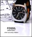
| 05/08/2005 12:42:30 PM | Arkitektby sbeaumontComment: *Critique Club*
I'm going back and forth on weather or not I like the blueprints behind the watch. My first thought is that it draws attention away from the watch and makes the photo look a bit busy in the upper half.
My second thought is that it does make a nice creative meaningful background for the watch. I guess I'd have to see it without it to be able to make a final decision on that, but I think that you being the photographer probaby know which way it looked best.
Focus and clarity are really good. Nice detail in the watch and the DOF is really good on the blueprint.
The angle is really good, but wonder if the top should be cropped a bit higher to show the entire watch. The part of the watch band I CAN see is orange and if the watch band on this watch is all orange, I would not buy it. I'd want a watch that had an attractive band as well as face. So maybe seeing a little more of the watch band would be a good idea if you were trying to sell this watch.
Lighting is good. There are only a few reflections I can see. On the upper points on the watch face, there are 2 yellowish orange reflections. There is a dark reflection on the upper area of the watch face, and then the reflection from the blueprint on the left side of the face. Not sure how to avoid these, but they could have been lessened in post processing.
I like the text. It's to the point and grabs our attention to make us want to look at the pic more. I think it's a good choice and placement.
I also like the reflection of the watch in the surface it's sitting on. Not sure why, but I think it adds something to the bottom of the photo that would not be there if the reflection were not there. Just a little something that is not distracting, but enough to add interest.
Overall, a good shot, but might just need a bit of cleaning up and maybe a taller crop.
~Heather~ | | Photographer found comment helpful. |
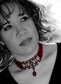
| 05/08/2005 03:09:59 AM | Highlighting Beautyby Travis99Comment: *Critique Club*
Very nice portrait.
I love the backlighting that shines through her hair. In my opinion the lighting here is really good. No distracting hot spots or dark shadows and it's really pretty even throughout the photo.
I like the diffent angle you chose for this, and I think that the cropping is well done too. I like the diagonals.
The only thing that I keep coming back to that I might like to see differently is the positioning of the eyes. They seem to be looking just a bit too far to the right (her left). I wouldn't want to see them looking straight at the camera, but maybe just a bit more toward the camera would seem more natural. Maybe natural isn't the best word, but I hope you get my point.
I love the selective coloring. Really draws the attention to the necklace. I think you did a really nice job with that and for me, that's what really makes the photo stand out.
I'm debating weather or not this would make an effective ad. While it is a really good portrait, I'm not sure if it would make me want to rush right out and buy this necklace. Where would the text go?
Focus and clarity are really good, and overall the image has high visual appeal to me and I would rate this well.
~Heather~ | | Photographer found comment helpful. |
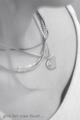
| 05/08/2005 02:09:14 AM | Untitledby troyloxComment: *Critique Club*
Ohh...I could almost see this as a real ad. There are only a few things that I would prefer to see adjusted, but the composition is very nice. I like the angle and the framing/cropping is also wonderful.
The one thing I would like to see is a bit more contrast, as others have mentioned, this is a very 'grey' photo. No real blacks.
Second, I would have removed the necklace that looks like a huge rubber band.
The last thing I'd like to see differently is the strand of blurry hair over the left side of the photo. In my opinion it adds nothing to the photo and creates a distraction over the necklaces.
Other than those minor things, I think the image is beautiful. The focus doesn't bother me. It has a nice soft feeling to it.
The angle is what has won me over though. Nice dramatic angle giving this much visual appeal in my eyes. Good shot.
~Heather~ | | Photographer found comment helpful. |
| 05/08/2005 01:57:37 AM | The Perfect Settingby ChasSourekComment: *Critique Club*
First of all, beautiful rings.
There are 2 things that stand out to me right away in this shot and that is the inside of the top ring, and the fact that the stone is almost lost in the second ring.
See how the stone goes right along the inside of the bottom ring and almost follows the curve of the ring right around to the other side of the stone? To me, the stone kind of gets lost there. I'd like to see it moved slightly to prevent that.
The white background is reflecting on the inside of the top ring and kind of absorbs the background in the reflection. Wish there were some way to create a defined edge on the inside top ring.
Other than that, let me just say wow.
Focus and clarity are awesome.
The angle and framing/cropping are wonderful. Nice space for the words. It's simple and effective. I don't find the words too big at all. They are eye catching, as are the rings.
Lighting is really good. Looking closer, I do see a bit of a blue reflection and 2 very tiny orangish reflections, one in each ring near the front. More specifically, in the upper left prong that holds the stone in place on the top ring. Those could be fixed with a little spot editing.
Overall very nice shot which deserved it's high placing in the challenge. Congrats.
~Heather~ | | Photographer found comment helpful. |
| 05/07/2005 05:49:04 PM | Give Her Beaded Elegance in Turquoiseby joyinlightComment: *Critique Club*
I think this is an excellent portrait. I'm not so sure about being an Ad though. Some of the earring is covered by her hair and without seeing the entire piece of jewelry, I probably would not be interested in buying it.
Focus and clarity are very good. Very nice eyes, and detail in the earring.
The lighting is uneven. There are some patches which are bright and there are also shadows. That doesn't destroy the photo, but it is noticable.
I like how the color of the shirt and earring is similar. It doesn't distract, but I think it adds to the photo. The background is nice. blurred green, nothing distracting there.
Again, this is a really good portrait, but in my opinion, not as good of an ad.
~Heather~ | | Photographer found comment helpful. |
|
Showing 321 - 330 of ~2785 |
Home -
Challenges -
Community -
League -
Photos -
Cameras -
Lenses -
Learn -
Help -
Terms of Use -
Privacy -
Top ^
DPChallenge, and website content and design, Copyright © 2001-2026 Challenging Technologies, LLC.
All digital photo copyrights belong to the photographers and may not be used without permission.
Current Server Time: 07/17/2026 03:38:44 PM EDT.
|