|
|
|
Showing 301 - 310 of ~2785 |
| Image |
Comment |
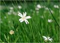
| 06/03/2005 12:37:13 PM | Sunlight on grass with flower footlightsby puzzledComment: *Critique Club*
By your comments, I think you understand why this didn't score higher than it did. It does seem to me that the lighting isn't an important part of this photo. I mean, it IS important, but not major. If this makes sense. In this challenge, I ask myself 'does the lighting MAKE this photo something special?' in this photo, that answer is no.
Ok. Off that subject, I read your other comments and saw something about 'white halos' in 2 of the comments. I may be missing something, but I'm not really seeing them. The only thing I'm seeing is in the long stems that have white behind them in the background. There is a slightly brighter white following the stems, but to me, that doesn't really effect the photo much, so I'm wondering if I'm just missing something??
However, I do see 'jaggies'. We all know that flower petals are generally smoothe, and in this shot, they are jagged. I think this is created by sharpening or by the way you resized the photo? I saw the comment about it being from USM, but I have had jaggies in my photos before, and I don't HAVE USM, so there has to be something else that creates it. I wish I could offer some better advice on that, but I'm just not sure how to fix that.
Your colors are really good. I like the bright white on the green background.
Focus and clarity are really good. I like the DOF to put the background out of focus and the 'bokeh' (I think that's the right word) really adds to the photo as well.
Overall a visually appealing photo, but as you already know, maybe not the best for the challenge.
~Heather~ |  Photographer found comment helpful. Photographer found comment helpful. |
| 06/03/2005 12:23:32 PM | To the darkness and backby nicklevyComment: *Critique Club*
The first thing I noticed about this photo when it popped up on the screen was the left eyebrow (our right). I think it seems odd in the photo. Like it doesn't belong almost. Just kind of makes the photo look strange.
The second thing I notice and this is what my eyes keep going back to over and over again, is the texture in the background on the white side. I think that with a simplistic photo such as this, the texture kind of takes away the simplicity. It adds a distraction that also doesn't seem to belong in the photo. It clashes with the other half of the photo.
Focus and clarity are good. I like the detail in the face right down to the facial hair.
I like the lighting (other than the eyebrow) because of the simplicity. The negative space adds to the shot in my opinion and I think it works well.
So really, other than the eyebrow and the texture on the white side, this shot doesn't seem to need any other improvement in my eyes. Nicely set up and well done.
~Heather~ | | Photographer found comment helpful. |
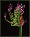
| 06/03/2005 12:09:15 PM | Eruptionby TelehubbieComment: *Critique Club*
Well, it's a bit difficult to add suggestions to photos which place so high, due to the fact that there really isn't much that can be improved upon.
I like the lighting very much. It does make this photo, which makes it perfect for the challenge.
The colors are rich and beautiful. I really like the purple with green against the black background. It stands out very well this way.
Angle and framing/cropping are good. I like the centered comp you chose. I think it works so well because the stem is off centered. Had the stem been centered as well, I don't think it would have worked so well.
The focus is wonderful. Really crisp in the areas that are in focus. The DOF though COULD have been a bit wider, but I think being narrow dosen't hurt the photo at all.
Overall a really nice shot, sorry I can't offer any advice for improvement, but as you can see by your score, it doesn't really need any improvement. Congrats on this beautiful photo.
~Heather~ | | Photographer found comment helpful. |
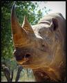
| 06/01/2005 12:39:20 PM | Rhinoby BaasComment: This sure is a fancy photo, but I don't see how it meets the challenge at all. I ask myself 'what decision is being made here'? I do not see him making any decisions and I do not see any 'options' for him to made decisions from. About the photo... Focus and clarity are good on the rhino, background is nicely blurred. The bright area of sun in the upper right is distracting and also creates some bright areas on the rhino's skin. ~Heather~ |
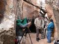
| 05/31/2005 01:37:37 PM | Oh Those Photographers!by bellComment: *Critique Club*
I realized that I had drawn this photo for a CC comment, however, did not get to comment on it before the challenge change over and it fell off my list, so I have come back to add my comments. Sorry for the delay.
This is a neat looking spot. I think you captured people in a nice environment very well.
This even says something about the people themselves.
The lighting is good. There is only a small section near the center top that is a bit bright. Looks like sun coming through a crack in the rocks and being a bit bright.
focus seem ok. Maybe a bit soft, but not enough that it distracts from the photo at all.
I can't help but want a close up of the bearded man. He looks like a very interesting character, with heaps of personality.
I like the angle and framing you chose. I like how we get the entire group in the photo and also get to see the surroundings.
Overall a nice shot for the challenge. I hope you also got lots of pics of the writings.
~Heather~ | | Photographer found comment helpful. |
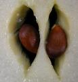
| 05/31/2005 01:31:23 PM | Galaby bellComment: *Critique Club*
Wow. That's really close. My first reaction to the shot was 'ew'. It looks like we are looking up a nose and there are seeds jammed into the nose. lol So, that's my first impression.
Focus looks really good and texture in this shot is amazing. I like the wet texture on the white part of the apple and the seeds are a dark smooth. That makes for a nice contrast in textures.
Lighting seems a bit dark in the center, with some bright reflections on the white of the apple.
I wonder how this would look at a different angle. Maybe not so centered in the photo. I think one comment said to off center it a bit, my suggestion would be to try to just make it so we are looking at it from a more of a side angle rather than straight on. The seeds could still be in the center of the photo, but we would not be looking dead on that way.
Overall, you have a nice pic of a good looking apple.
~Heather~ |
| 05/26/2005 02:57:49 AM | Boccie by the Bay.by NodeComment: *Critque Club*
I like the colors in this shot.
Not really knowing what a Boccie is, I wouldn't be able to tell you if this really captures the spirit of 'boccie', but it looks like a lady throwing a ball. Don't know what she's throwing it at, and by the pic, there doesn't seem to be any real purpose to her throwing the ball. This, to me, doesn't make for a captivating photo. Maybe if I knew more about it, it might gain interest for me, but I don't, so it doesn't. Does that make sense?
Anyway, like I said, the colors are really nice. I like the blue on green. Nice blues, nice greens.
Focus seems good. There are nice crisp lines on the outlines of the people. The blurred ball creates a bit of motion there, which I think has more impact than if the ball were in focus.
I do wish we could see what she's throwing the ball at. Is she trying to throw it into a basket? Is she throwing it at something on the ground? Into a 'goal'? At someone? These questions are unanswered by your photo. I wonder if a crop to show that might have been more effective for people who aren't familiar with 'boccie'.
As for being a silhouette? I didn't vote, so who cares. lol. Seriously though, in my opinion, I think it's borderline. There's a little too much detail to be a 'silhouette', but not enough detail to show the subjects well. So I could go either way on the decision, and would probably have given you the benefit of the doubt if I had voted.
~Heather~ | | Photographer found comment helpful. |
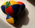
| 05/24/2005 12:50:14 PM | A handfull of trianglesby summer03Comment: *Critique Club*
This is a nice idea for this challenge. I think it fits the challenge of triangles well.
The lighting does not work in my opinion though. I think that the round shadows in the lower right distract from the triangle shapes we are suposed to be concentrating on. The lighting is just way too harsh/dark to work effectively here.
I do however, like the triangle shape shadows in the upper right and lower left corners of the shot. I think that works. If you could somehow keep those shadows while eliminating the others, I think that could be cool.
Colors are good, just maybe a bit dark.
Focus seems ok on the seams, but the edges of the balls seem a bit soft to me. This might be a lighting thing too.
Overall, I like the idea and the set up is nice, but suffers greatly from lighting.
~Heather~ | | Photographer found comment helpful. |
| 05/17/2005 01:03:59 AM | "POLICE WARRENT, GET ON THE GROUND"by sofapComment: *Critique Club*
Funny shot. Definately not the first thing that comes to my mind when I think of 'night shot' so that gives you points for originality.
I see no real logical reason for this to be in such a long short (almost panoramic) crop. I think the trees on each side don't add to the shot, so don't see a purpose for adding them in with this crop. I think I'd rather see a vertical crop surrounding the police shield.
For being a night shot in low light, focus seems really good. It's hard though to tell that he's holding a gun, if you're not expecting it. You know? We expect him to be holding a gun, but can't really see it.
There is a light glare on the front of the shield that I wish somehow could have been more minimal. Seems to really stand out in our face a bit.
Overall I think it's an original shot for the challenge, but I think it's lacking something to hold my interest.
~Heather~ |
| 05/12/2005 12:05:23 AM | Pittsburgh, PA @ nightby cj_gvineComment: Originally posted by cj_gvine:
thanks everyone...but i really don't understand that last post. any hints? |
I meant...what a shame that it wasn't taken within the legal time frame. |
|
Showing 301 - 310 of ~2785 |
Home -
Challenges -
Community -
League -
Photos -
Cameras -
Lenses -
Learn -
Help -
Terms of Use -
Privacy -
Top ^
DPChallenge, and website content and design, Copyright © 2001-2026 Challenging Technologies, LLC.
All digital photo copyrights belong to the photographers and may not be used without permission.
Current Server Time: 07/17/2026 02:54:52 AM EDT.
|