| Image |
Comment |
| 09/11/2005 01:29:39 AM |
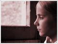
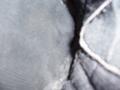
Despair & Lonelinessby glad2badadComment: *Critique Club*
Add me to the list that doesn't like the red tones of the image. I think this is really my only complaint about the image as a whole. It's a personaly preference really, some will love it, others wont.
By looking at just the photo without the title, I wasn't able to guess the D and L. I had guessed Dark and Light.
Now, the image itself is great! (setting aside the red) Focus and clarity are really great. I love the textures of the window. The specks of dirtiness really do contrast the girl and it works.
The angle and framing/cropping are good too. I like how she is to the right of the photo staring out the left of the photo with the neg space being the window it works really well.
Light coming from the window is great on the girl and surroundings, however, looks a bit bright in the window itself. As I look at that further, I think that only adds to the image.
What I really think hurt this, is the color. Everything else is excellent. Great shot.
~Heather~ |
 Photographer found comment helpful. Photographer found comment helpful. |
| 09/11/2005 01:16:38 AM |
Dark and Lightby coffeebellComment: *Critique Club*
Wow. Excellent scene. By looking at your image, I would not have immediately guessed the D and L. I would have labeled it like 'boats and sky' or something like that.
As for the image. The focus seems a bit soft. I'd like to see some real sharp focus on either the boats, or the water as well as the sky. The sky seems ok soft as is, but seems to be somewhat grainy-ish.
The background, while beautiful seems to have an unlevel appearance along the horizontal line. Someone mentioned barrel distortion from wide angle lens. If this is the case, I believe it can be fixed post processing.
The lighting is beautiful. I really like the seperation of the light and dark. It works nicely with the rain cloud thing only bearing down on one area.
~Heather~ |
| 09/11/2005 01:01:55 AM |
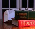
Dictionaries and "L"by 2hooComment: *Critique Club*
Hi there. I really love the idea behind this image. Very clever and excellent set up. I think the only thing that really hurts the image for me is the lighting. Kind of harsh toward the bottom right and a bit dark on the book in back.
The book not having words on the bottom half seems odd to me also, but nothing that impacts the image. The L is excellent. By looking at your image, I would be able to know the D and L without looking at your title. Focus seems a bit soft toward the back, however on the books in front it is pretty good. I like how the glasses are off to the right of the photo and not dead center of the photo. Makes us look around and notice it subtly. The window in the back makes for a neat background in my opinion as well. A solid background would make this seem TOO set up. As is, it almost looks like an accidental find. Really neat job.
~Heather~ |
| Photographer found comment helpful. |
| 09/11/2005 12:11:47 AM |
Deep Longing (to join a game with the big boys!)by trobergeComment: *Critique Club*
I'd have to agree that the neatimage (or similar effect) looks a bit overdone. By looking at the photo itself, I would not be able to guess the D and L. This is a shot that I feel relys on the title to help it through the challenge. I like the look on the skin, but I think it makes the hair look odd that way. Nice crisp focus on the shirt. I like the texture there. The background is ok, nothing distracting there, although maybe a tad bright near the top. I like where you have placed the boy within the photo. This creates some good negative space, and the fact that there is neg. space in front of him does add appeal. Good job avoiding shadows/bright spots on his face. Overall definately a great shot for the photo album. I would try lightening up on the neatimage just a bit, and maybe editing the hair seperate, so that it doesn't seem so much different than his face. If that makes sense.
~Heather~ |
| Photographer found comment helpful. |
| 09/06/2005 02:48:36 AM |
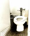
Bathroom Grungeby JutildaComment: I like the crop on this shot better than the crop for the one submitted in the rooms challenge. I think it works better because the door isn't in the way. The filter on this one is also more appealing to me, simply I think because it makes the bathroom look so gosh darn aweful. Definately looks like I'd not be peeing at this stop. The toilet paper looks bright among the rest of the image, but i think it works in an odd kind of way like that. Ironic kind of. ~Heather~ (7 of 10 comments given to Judy) |
| Photographer found comment helpful. |
| 09/06/2005 02:39:47 AM |
Roadside Restroom Circa 1958by JutildaComment: Lighting seems a tad bright here. I think it might work well with the feel I think you were trying to accomplish. While it's not my personal preference, I think the grain also works with the feel I think you were trying to get. Overall the image works nicely together, but it really isn't my cup of tea. The stall door on the left is a bit distracting since it takes up So much space in the photo. Love the floor. Overall nicely done. ~Heather~ (6 of 10 comments I'll be giving Judy) |
| Photographer found comment helpful. |
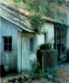
| 09/06/2005 02:08:58 AM |
Bano de Lluvia en Mexicoby JutildaComment: This is really neat. Figures the first one I click I really like. At first, I was like 'aha! bright light in the upper left', but then as I looked at it further, I like it that way. I really think it has a nice overall lighting. The rain kind of gives this a watercolorry feel to it. Really nice angle and framing/cropping. Focus is right where it needs to be in my opinion. Great shot! ~Heather~ (1 of 10 comments I'll be giving Judy) |
| 09/03/2005 09:14:40 PM |
ShOe aRtby senojComment: Not quite sure what I'm looking at. If this weren't in a shoe challenge with the title shoe art, I would definately not know it was a shoe. There is nothing in focus, and really nothing to look at. It might be easier for you to see cause you know exactly what you were taking a photo of. The colors are dull, can't really see any texture, the shadow doesn't add anything to the comp. I'm just not feeling this photo. Sorry. |
| Photographer found comment helpful. |
| 09/03/2005 09:03:19 PM |
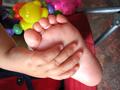
one small step for mankind...by MardukulComment: Cute pic of a babies foot. I do not think of shoes when I see this photo. There are no shoes in the photo and it doesn't imply shoes either. The color is good. Nice focus and clarity. The photo size is quite small. Only 400x300. Best to use the max alloted photo size. Cute shot, but not appropriate for the challenge. |
| 09/03/2005 01:43:47 AM |
Baby Classicsby rolandComment: Definately shoes. I'm thinking that a different crop would have maybe been a better choice. It's awefully tight on the left and you don't really show enough of the shoe on the right to make up for it. Focus looks good. I like the texture I can see in the shoe. Background has some specks in it. some vertical lines in the right side, and horizontal lines to the left side. Show up mostly when lightened, don't show up when viewed darker though. Depending on calibration, depends on who's going to see it and who wont. |
Home -
Challenges -
Community -
League -
Photos -
Cameras -
Lenses -
Learn -
Help -
Terms of Use -
Privacy -
Top ^
DPChallenge, and website content and design, Copyright © 2001-2026 Challenging Technologies, LLC.
All digital photo copyrights belong to the photographers and may not be used without permission.
Current Server Time: 07/16/2026 10:07:48 PM EDT.