| Image |
Comment |
| 12/10/2002 12:11:53 AM |
Christmas Time Is Hereby jenaromComment: What great focus and clarity. I really like the placement of the bulb within the photo. The branch is a great touch. Your DOF is good in my opinion. Color is wonderful! This could be on a christmas card for sure. great use of negative space as well. Good luck in the challenge. |
 Photographer found comment helpful. Photographer found comment helpful. |
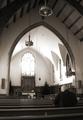
| 12/09/2002 02:50:55 PM |
Light of the Spiritby jmsetzlerComment: Lovely architecture. I wonder if this would benefit from a couple steps to the right. More of a head on to the archway. I like the person in the photo, and while I'm not a huge fan of exaggerated lights or shadows, the light coming from the window is nice in this situation. Focus and clarity in this shot are great. The detail we get to see is perfect. Good luck in the challenge. |
| 12/09/2002 02:48:22 PM |
Sabbatier Starby GordonComment: Interesting. Is the an inverted image? I think you have framed it well. I like how it falls out of the frame of the photo. Your angle is good as well. The color is quite pretty, although a bit un natural looking. Not like I'd really know what the "natural" colors would be, but it almost look inverted. I like the pattern as well. Nice abstract kind of shot. Good luck in the challenge. |
| 12/09/2002 02:46:05 PM |
one yellow eyeby BadPiggComment: Kind of strange. Not totally my cup of tea, however, technically well done. The color is nice, and your focus and clarity are good. Angle and framig/cropping are good. I don't mind at all that this is centered. The "halo" or yellow ring around it almost brings it out of the center and towards the upper left. not litterally, but our eyes are drawn that way. Had not been for that yellow circle around your object, I think this would look silly just sitting there. So that was a great decision. Lighting also seems good on the subject. Nice shot. Good luck in the challenge. |
| Photographer found comment helpful. |
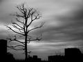
| 12/09/2002 02:43:36 PM |
Harsh landsby NatashaComment: What perfect focus! Look at the little branches on that tree! I like the "color". I don't think "color" is the word I'm looking for rather the TONES of the photo. Very nice exposure and contrast. I love the sky. Great silhouettes. Angle and framing/cropping are good as well. A lovely shot. GOod luck in the challenge. |
| Photographer found comment helpful. |
| 12/09/2002 02:41:24 PM |
Birds Eye Viewby spidermanComment: The sky on this is quite white out and the photo seems to contain speckles. (noise?) It might be the brightness of the sky in the background that makes the focus look soft. The patterns are nice though, and the angle and framing/cropping you chose is nice. Good luck in the challenge. |
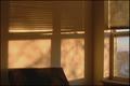
| 12/09/2002 02:35:51 PM |
Morning Shadowby tjuneau13Comment: What a very pretty marble effect on the wall. I like the shadows and the color is great. I like the pattern. You did a great job to show part of the actual window in the shot. It gives a bit of symetry, without being symetrical, if that makes sense. Your focus and clarity are great. Very nice find. Good luck in the challenge. |
| 12/09/2002 02:34:23 PM |
Maybe I Can Sneak Into DPC2by GeneralEComment: Cute kid, and cute shot. I would have liked it better had the strong horizontal line (neck level) been horizontal, rather than have a right tilt. Neck level isn't really the best place for the horizontal line actually, it cuts his head right off. Maybe I would opt for a totally different background. However, the shot of the kid is nice and crisp. Great focus and clarity. Lighting is nice, and the angle on the kid is good as well. Good luck in the challenge. |
| Photographer found comment helpful. |
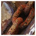
| 12/09/2002 02:31:32 PM |
Linksby jjbeguinComment: Very nice DOF. I like how the chain is in good focus and the surroundings are softer focus, putting the visual focus directly onto the chain. The angle and framing/cropping are good. I like the strong diagonal. Color and lighting are very nice as well. What a great find. Good luck in the challenge. |
| 12/09/2002 02:29:42 PM |
?by sjgleahComment: LOL...Looks kind of funny sitting there on it's own. The light seems pretty bright on the leaves, but looks like there is a shadow on the sign. I would like to see it the oposite, with more light on the sign. Otherwise, though, I like the angle and framing/cropping. Your focus and clarity are good, and the color is good as well. Good luck in the challenge. |
Home -
Challenges -
Community -
League -
Photos -
Cameras -
Lenses -
Learn -
Help -
Terms of Use -
Privacy -
Top ^
DPChallenge, and website content and design, Copyright © 2001-2026 Challenging Technologies, LLC.
All digital photo copyrights belong to the photographers and may not be used without permission.
Current Server Time: 07/25/2026 07:53:16 AM EDT.