| Image |
Comment |
| 04/21/2003 09:59:09 PM |
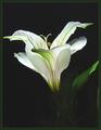
Lily Lightby KazComment: This is really pretty. The flower is lit well, but I wish that the background and stem/leaves were a bit darker. The one lit leaf to the far right is ok, just the ones in the background kind of create a distraction as we can't really see them, but we can tell they are there. I wish that the leaf to the right was not cropped off, otherwise, the framing/cropping are ok. Good luck in the challenge. |
 Photographer found comment helpful. Photographer found comment helpful. |
| 04/21/2003 09:55:04 PM |
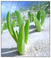
Ozzie Beach Lifeby andrewlrComment: Wonderful. Excelent. I love the angle and framing/cropping you chose for this. Focus and clarity are supurb. The detail you captured in this is just amazing. The little grains of sand on the plant. The color is great. This is a 10 from me this week. DOF is just perfect. Great job. Good luck in the challenge. |
| Photographer found comment helpful. |
| 04/21/2003 09:48:42 PM |
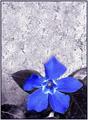
Concrete Wall Flowerby CLarson557Comment: The effect doesn't really appeal much to me, but the flower is really pretty. I am not sure I like the color and the negative looking effect. Maybe just desaturated, but it doesn't appeal to me. I do like the negative space at the top and how you have placed the subject in the bottom right. The focus seems a tad soft on the upper petal of the flower. Good luck in the challenge. |
| Photographer found comment helpful. |
| 04/21/2003 09:46:31 PM |
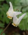
Dutchman's Breachesby jnevittComment: This is excelent. But I wonder about the focus. Seems a tad soft to me. If I remember correctly though, this kind of flower has a funny texture, which may be just making it seem like it's soft focus. Sometimes textures really mess with a photo. The angle and framing/cropping are nice. The color is good as well. You have done a nice job blurring the background as to not make anything distracting. Good luck in the challenge. |
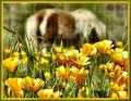
| 04/21/2003 09:43:54 PM |
A California Pastureby sherryk471Comment: This is quite a lovely shot of the flowers. I like the focus and clarity and the lighting is wonderful. What bothers me is the background. Had the fence(?) not been there, I think this would have been super great. The fence adds a distraction to me though. Nice color and definately fits in the challenge. The border works well for this image as well. Good luck in the challenge. |
| Photographer found comment helpful. |
| 03/23/2003 07:55:49 PM |
Multi-Talentedby KonadorComment: Very nice and clear photo. The focus and clarity are excelent. I like the blue/purple on the mainly white surrounding. The angle and framing/cropping are good. I think that I may have moved the cup over to the right just a small bit to center it up. normally, I like subjects off center, but this is one that I'd like to see right in the middle. good luck in the challenge. |
| Photographer found comment helpful. |
| 03/23/2003 07:46:14 PM |
Sugar & Spiceby ChrisW123Comment: this seems really pixeled to me. I don't know if this was done on purpose, but it isn't my preference. The focus and clarity are ok I think, but with the pixelated texture, it's almost hard to tell. Lighting is nice, no distracting shadows or dark spots. I like where the shadows lay. good luck in the challenge. |
| Photographer found comment helpful. |
| 03/23/2003 07:41:37 PM |
kitchen mascotby kenboComment: The focus here is too soft for my taste. I think that there should at least be something in focus. I can't tell where the focus is here. The background is good. nothing distracting and the lighting is also good. angle and framing/cropping are also nice. I just wish for more focus. Good luck in the challenge. |
| Photographer found comment helpful. |
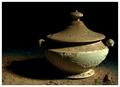
| 03/19/2003 11:05:58 AM |
Dusty old soup tureenby GotchyaComment: I really like this shot. I think that the angle and framing/cropping are excelent. The placement of the soup pot is very nice to the right of the photo. focus and clarity are also very nice. I expecially like the lighting. definately adds to the oldness of this shot. I'm glad you didn't do this in black and white. although it would have still been very nice, I like the bonus of the extra color. Great job. one of my fovorites. |
| Photographer found comment helpful. |
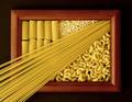
| 03/19/2003 11:01:13 AM |
Pastaby FranziskaLangComment: cute idea. gives your shot kind of a 3d effect. focus and clarity are great. lighting is excelent. very nice lighting on the pasta. no distracting shadows or hot spots. I like the angle and framing/cropping you chose for this. very creative and original. good luck in the challenge. |
Home -
Challenges -
Community -
League -
Photos -
Cameras -
Lenses -
Learn -
Help -
Terms of Use -
Privacy -
Top ^
DPChallenge, and website content and design, Copyright © 2001-2026 Challenging Technologies, LLC.
All digital photo copyrights belong to the photographers and may not be used without permission.
Current Server Time: 07/24/2026 11:04:09 PM EDT.