| Image |
Comment |
| 05/08/2003 02:28:56 PM |
For Mother's Dayby myqylComment: I sense that you used a wide angle lense to capture this scene. The distortion of the buildings is such that the buildings look very silly and tilted. It is a nice scene, however, I think that the distortion ruins it. Focus and clarity are good, and the angle at which you took the image is good, just way too much distortion for my personal tastes. ~Heather~ |
 Photographer found comment helpful. Photographer found comment helpful. |
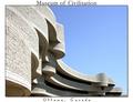
| 05/08/2003 02:26:21 PM |
Museum of Civilisationby kosmikkreeperComment: I have to wonder if this is suposed to be Civilization, but seeing it is in Canada, I know you guys spell things funny. *wink* I like the angle and framing/cropping you chose for this shot. The sky is beautiful. very postcard like. focus and clarity are also good. I would buy this as a souvenier. ~Heather~ |
| Photographer found comment helpful. |
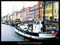
| 05/08/2003 02:22:30 PM |
A friendly greeting from Copenhagen!by pollonosComment: When you see postcards, you see "perfect worlds". I think the sky here is quite bland. And while it may be true to the scene, I don't think it is something we would see in a postcard. Realizing that the weather was not cooperative everywhere, you probably did the best you could, but since the weather wasn't cooperating, maybe you could have tried something else. Lighting on the buildings in the distance is really harsh, and I think that is due to the weather conditions as well. Just not the right time for this shot. ~Heather~ |
| Photographer found comment helpful. |
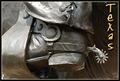
| 05/08/2003 02:05:52 PM |
Texasby DennisFComment: Lvoe it! I love the angle and framing/cropping, the lighting is wonderful, and the focus and clarity are great as well. A 10 from me this week. I even really like where you put your text. Just enough room without crowding it or the photo. Great job. ~Heather~ |
| 05/08/2003 01:52:33 PM |
Baltimore Inner Harborby RefocusedComment: As a photo, I think this is nice. As a post card though, I think that the sky is a little bland. especially the upper left. When we think of postcards, we think of the perfect world. Realizing you only had a week to get 'the perfect sky' and weather this time of year doesn't always cooperate, I understand, but think that for a postcard, it should have a more interesting sky. Also, the focus seems just a little soft. Nothing real serious, but I wonder if this could be just a bit sharper. ~Heather~ |
| Photographer found comment helpful. |
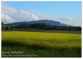
| 05/08/2003 01:49:36 PM |
Geneva countrysideby jjbeguinComment: A lovely field. Really pretty. I like the angle and framing/cropping. The lighting seems good. The sky is a bit noisy. Has speckles throughout it. Otherwise, i'd buy this as a souvenier. Great shot. ~Heather~ |
| Photographer found comment helpful. |
| 05/08/2003 01:47:49 PM |
The Old Millby boyte1Comment: Beautiful. Love the angle with the mill over to the right. I also really like the railings of the bridge. The grass in the front is perfect. The focus seems a bit soft in places, I wonder if it was slightly windy? Otherwise great job. Just a suggestion, the writing is a little hard on the eyes. Maybe a non cursive print would have worked better. ~Heather~ |
| Photographer found comment helpful. |
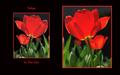
| 05/04/2003 11:23:27 PM |
Tulips in the Sunby TerryGeeComment: I think this might have a higher visual impact on me had it been 2 seperate photos of the tulips. This is one photo, flipped. The photo is beautiful, excelent lighting and I love the black/green background on the tulips. The border fits wonderfully. Focus and clarity are good. Looks better on the right than left however. Overall nice. Good luck in the challenge. |
| Photographer found comment helpful. |
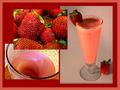
| 05/04/2003 11:19:00 PM |
Add Milk and Honey and Blend Wellby GraciousComment: This looks delicious. The one thing that bothers me though, is on the photo on the right, on the base of the glass, there is a hair. that takes all the deliciousness away and makes me think gross. Also, the strawberries look a bit oversaturated, and the leaves of the one on the glass are kind of brown and crusty. While I think you have an excelent set up and combination of photos, it needs a bit of fine tuning and cleaning up. Good luck in the challenge. |
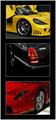
| 05/04/2003 11:13:23 PM |
$peedVisionby RiderGalComment: Somebody went to a car show last week. :) Looks excelent. Something I would hang on my wall. Great job. I like how you have 3 different colors of cars, the lighting is wonderful. my only suggestion might have been to stagger the direction of the cars. You have the top 2 at a NW angle, and the bottom one at a NE angle. Maybe stagger them so that the top is NW, the middle is NE and the bottom is NW. if that makes sense. Otherwise, great job! good luck in the challenge. |
| Photographer found comment helpful. |
Home -
Challenges -
Community -
League -
Photos -
Cameras -
Lenses -
Learn -
Help -
Terms of Use -
Privacy -
Top ^
DPChallenge, and website content and design, Copyright © 2001-2026 Challenging Technologies, LLC.
All digital photo copyrights belong to the photographers and may not be used without permission.
Current Server Time: 07/24/2026 04:01:07 PM EDT.