| Image |
Comment |
| 06/13/2003 06:19:14 PM |
Runner's Worldby ToddhComment: excellent shot. great focus and clarity of the front runner. Love how you caught her in the air like that. angle and framing/cropping are good, but the powerline running right through the shot is a little distracting. it slices the woman right in half. otherwise great shot. |
 Photographer found comment helpful. Photographer found comment helpful. |
| 06/13/2003 06:17:54 PM |
Stuff Magazine - or - Playboyby DrJOnesComment: she's pretty, but her suit is not fitting her at all. see how her boob is falling out the bottom on the right side of the photo (her left boob). also, see how tight it is around the bottoms?? It's making an indent in her hip. not very attractive at all. it's like when a girls bra is too small, and it makes these ripples in her back. ugh.
Anyway, the shot is beautiful. it really is. the sky is perfect, the skin tones are really good, and she's fake looking enough to really be on the cover of a magazine.
Something else that is bothering me though, is this tiny mark above her strap on the bottoms. looks like a tattoo that was covered up, or like she missed a patch of hair when shaving or something. it's right above the little plastic circle on the left of her bottoms. (her right) Great shot anyway. |
| Photographer found comment helpful. |
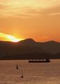
| 06/13/2003 06:09:21 PM |
Beautiful British Columbiaby ellamayComment: beautiful sky. I really love the colors. definately looks like a magazine cover, but I'd have straightened out the horizon. did that make the long boat look crooked though? either way, I find it a bit distracting. Actually, you can crop out the water entirely, and I think you still have a great picture. The bird is a perfect touch. |
| Photographer found comment helpful. |
| 06/13/2003 06:07:18 PM |
Playboatingby vjozComment: I am not sure I like the border. Weather or not it's used in the magazine or not, it doesn't really appeal to me. That being said, excellent capture. The focus and clarity are good on the water, I really like the stop motion there. lighting on the guy looks a little dark though, he doesn't seem to stand out like I'd like him to. looks like he's got a head injury. I'd like a bit more lighting on his face, but don't know what you really could have done about that. |
| Photographer found comment helpful. |
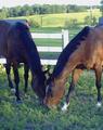
| 06/13/2003 06:05:18 PM |
Thoroughbredby LeahStephenComment: Lighting conditions for this shot were not ideal. I think that the colors seem muted. there really isn't any detail in the darker horse at all, the sky is blown out and the fence is really quite too bright. The angle and framing/cropping of the horses is good though, I would have cropped out the icky sky. focus seems a bit soft as well. we can't really see the eyes of the horses. |
| Photographer found comment helpful. |
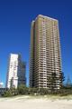
| 06/13/2003 06:00:43 PM |
Accommodation Guideby AndymationComment: wide angle lens distortion? I don't like how the buildings tilt inward. also the bright light, and shadow on the little building is distracting. Definately a nice structure though. |
| 06/13/2003 05:59:24 PM |
Garden Designby DennisFComment: Great macro. Wonderful focus and clarity. The center is really full of detail and beautiful to look at. colors are wonderful, background works perfect. nothing distracting from the beauty of this image. great shot. |
| Photographer found comment helpful. |
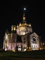
| 06/13/2003 05:58:20 PM |
The Architect's Journalby gowf67Comment: Beautiful building. Your focus and clarity really show it off well. looks like some wide angle lens distortion affecting this shot though. I know it happens, but for some reason it has never appealed to me. Still a wonderful shot though, full of excellent detail, and what a wonderful shot to look at. lighting is perfect in my opinion. |
| 06/13/2003 05:56:57 PM |
"DOG WORLD"by melissartsComment: dramatic angle works for this shot, but I'm afraid that the lack of detail in the dog is unappealing. The lower left is really too bright. If you were trying for a silhouette on the dog, there is too much detail for it to work. however, not enough detail to work as a regular shot either. focus also looks a bit soft, which could be because of the harsh lighting.
|
| Photographer found comment helpful. |
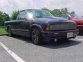
| 06/13/2003 05:55:15 PM |
Mini Truckinby AllenComment: This truck could definately work in a mini truckin magazine, but the surroundings are definately not right for the front cover of the magazine. Besides, where's the chick in the swimsuit? lol
The powerlines, lines in the parkinglot, other red car and uncontroled glare on the window just don't make it to the front page. focus is also a little soft.
|
Home -
Challenges -
Community -
League -
Photos -
Cameras -
Lenses -
Learn -
Help -
Terms of Use -
Privacy -
Top ^
DPChallenge, and website content and design, Copyright © 2001-2026 Challenging Technologies, LLC.
All digital photo copyrights belong to the photographers and may not be used without permission.
Current Server Time: 07/24/2026 02:08:47 AM EDT.