|
|
|
Showing 1001 - 1010 of ~2785 |
| Image |
Comment |
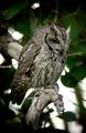
| 06/14/2003 12:16:18 PM | Ranger Rickby vtruanComment: This would be good on one of those ZooBooks for kids too. Your focus and clarity on the owl are nice, and the background works for the most part. I find the purple glow around the right edge of the branch to be very distracting. Very pretty animal. |  Photographer found comment helpful. Photographer found comment helpful. |
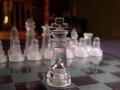
| 06/14/2003 12:14:04 PM | Chess Monthlyby DavidLevinComment: This board is hard to photograph. Trust me, I know. I do think though that the background is a bit distracting, and probably anyone who would be reading a chess magazine, would be confused as to why this king was just sitting in the middle of nowhere and no other pieces around.
Something I find quite distracting is the orangish light in the background toward the upper left.
Good focus on the king. Those frosted pieces are WAY difficult to get to look right, so going with the clear piece was a good choice. | | Photographer found comment helpful. |
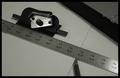
| 06/14/2003 12:10:53 PM | Picture Framing Magazineby alternaruleComment: I like the diagonals in this shot. Focus and clarity are really doo as well. Nice crisp numbers on the ruler. Lighting is ok. No bad glares, but I wish that the shadow on the diagonal object in the upper right were a bit more subtle. Overall nice shot though. | | Photographer found comment helpful. |
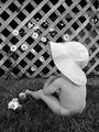
| 06/14/2003 12:09:10 PM | B&W Magazine (The Joys of Summer)by SonifoComment: Very nice tones in this shot. Perfect black and white. I really like the light colored flowers on the darkish background. The baby is positioned very nicely as well. My eyes want to see her face though. Even without the face, this is a wonderful shot, great focus and clarity and the lighting looks to have been perfect as well. Great shot. | | Photographer found comment helpful. |
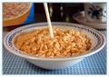
| 06/14/2003 12:02:35 PM | Snap, Crackle and Popby mariomelComment: *Critique Club*
Excellent capture. What really makes this for me is the crispiness...I mean, crispness. You show us wonderful focus and clarity here, and the detail that comes out of it is just perfect.
Add me to the few people that thinks that the milk looks a bit odd. I do think it looks like a white straw. I think it's the lighting on the milk that makes it look like that though. Bright on the right side, and dark on the left.
I am not sure weather or not I prefer the cereal box in the background or not. I find it a bit of a distraction, however, I think it adds a nice touch. I'm a great help there, huh? The light colored things in the center behind the milk though, are definately a distraction. I like the cup though. I think that because it goes with the bowl, it's not a bad addition at all.
Definately sound related. You can't eat this cereal in peace.
Good one.
~Heather~
|
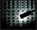
| 06/14/2003 11:46:42 AM | Mackie 24.4.4by TarbiniComment: *Critique Club*
I do like very much how the lighting is here. I find though that the actual light itself is distracting. it's just kind of THERE. it intrudes from the right, and covers a portion of the subject.
While this is a photo of something dealing with sound. I'm stuck thinking about the actual buttons rather than 'sound'.
The angle and framing/cropping is good, but wish that the actual light was not in the shot. I feel myself looking at that more than at the buttons themselves.
The focus and clarity are really great. I think that you did a great job getting the detail and crispness of the lettering around the buttons. That is really important to even recognize this as something dealing with sound.
While I don't SEE the sound, I do definately think about it. I like how the subject fills the entire frame of the photo.
Good find.
~Heather~ | | Photographer found comment helpful. |
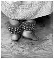
| 06/14/2003 11:39:14 AM | With Bells Onby friscaComment: *Critique Club*
Interesting comments you got on this one. Some I agree with, some not. Had this been a shot of MY legs in bells, I would have definately gone with black and white cause my legs are so pale and white that that would be the only way to balance it out. LOL Anyway, I think that color would probably be a bad choice here because of the busy patterns on the rug and the skirt. Also, I think that black and white really brings our eyes to the darkest subject, which is right where you want them to be, on the bells.
The bells are so big that they make the feet look really small, giving a couple people the impression they are kids feet.
I think that the suggestion for a slower shutter speed is a bad one. While it would 'show motion' the entire shot would be blurry and in some cases, that just doesn't work. I think that it would not work here at all. That is just my opinion.
I think that the focus is already a bit soft, but not to the point of making the shot unattractive. I think it's still a very nice shot full of detail.
Good shot of something that makes sound.
~Heather~ | | Photographer found comment helpful. |
| 06/14/2003 11:28:09 AM | Screamby arnitComment: *Critique Club*
I think we can definately hear the sound in this shot.
I was thinking though, that when people are screaming at the top of their lungs, they don't usually have their eyes open, but I do see that her fists are cleched, which is another 'stereotype' of screaming at the top of your lungs.
Something that is bothering me in this shot, and I just can't seem to shake it off, is that her right eye (our left) is more in focus than the other one. I don't think anyone else mentioned this, so maybe it's just something that bothers me only, but I do find it a bit strange. Even that eyebrow is sharper focus than the other one.
I do really like the way it makes her hair look. Flipping out like you'd see in the cartoons with their hair all standing out on end, but here it's the angle that makes it look dramatic.
I personally like the extra room on the left of the shot. She's not all centered perfectly, and I think that goes well with the dramatic from above angle.
Lighting appears to have been just great for this shot.
Very nice.
~Heather~ |
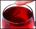
| 06/14/2003 11:07:50 AM | Resonanceby rcrawfordComment: *Critique Club*
I like how we can see the ripples in the liquid in the glass. I DON'T like how we can see shadows in the liquid, especially the one that looks like a man creeping from the right to the left of the inside of the glass. Also, there is a shadow outside the glass to the right.
Focus seems a bit soft throughout. The finger is soft, the edge of the glass is soft, and the ripples in the liquid are soft. I do wish that at least the edge of the glass were in focus.
The background works very nicely here. The white creates no distractions from you image, other than the shadow created by your hand.
The angle and framing/cropping are ok. I like the closeness of the shot. I think that was important for showing the ripples in the liquid. Yo have centered the glass in the frame, which works for me here. I'm not sure if I'd like more of the finger showing or not. The crop there seems to be a bit tight, but not sure if showing more would help.
I think it would help though if the finger were in focus too. probably hard to do and get the ripples captured properly though.
Overall good, and it does portray some kind of sound.
~Heather~ | | Photographer found comment helpful. |
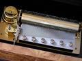
| 06/13/2003 07:25:42 PM | melodious music boxby camelotnorthComment: *Critique Club*
Excellent focus and clarity. THIS is the amount of detail I love to see. I also see 'tripod' mentined in your comments, and this is a perfect example of WHY people should use one. Great clarity!
The angle and framing/cropping are ok, but maybe a little close on the right side.
Lighting is great. With the combination of great crispness, and good lighting, it really really brings out even the finest of the details here. I love how we can see how some of the little prongs are raised preparing to make some lovely music.
Definately portrays sound in my imagination. I think it fits the challenge perfectly.
Other than the crop on the right, I see nothing I'd like to have seen differently here.
~Heather~ | | Photographer found comment helpful. |
|
Showing 1001 - 1010 of ~2785 |
Home -
Challenges -
Community -
League -
Photos -
Cameras -
Lenses -
Learn -
Help -
Terms of Use -
Privacy -
Top ^
DPChallenge, and website content and design, Copyright © 2001-2026 Challenging Technologies, LLC.
All digital photo copyrights belong to the photographers and may not be used without permission.
Current Server Time: 07/23/2026 05:27:52 PM EDT.
|