| Image |
Comment |
| 02/23/2006 06:33:52 AM |
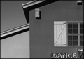
The Danceby Firstrich1Comment: Love the composition! Looks simple but it's so very clever. I think the B&W conversion is just a little bit flat. The stark, geometric shapes of this subject could profitably handle more contrast than this. But I still like it very much. 7. |
 Photographer found comment helpful. Photographer found comment helpful. |
| 02/23/2006 06:29:46 AM |
# 48by CEJComment: Great composition and processing (well, it's too blue for my taste, but that's irrelevent). This is a brilliant example of harmonious asymmetery. And it's much harder to do than it looks. 7. |
| Photographer found comment helpful. |
| 02/23/2006 05:51:28 AM |
Silenceby pix-areComment: Simple but eloquent. It's much harder to do this minimalist stuff than it looks ...I know; I've tried and failed. You haven't. 7. |
| Photographer found comment helpful. |
| 02/23/2006 05:49:24 AM |
sailing early morningby lolor275Comment: Beautiful image. It's a simple but effective idea, skillfully photographed and processed. The most appealing thing for me is the connection between the traps and the boat. It makes the image work intellectually as well as graphically. And the toning is very nice, too. 7. |
| Photographer found comment helpful. |
| 02/23/2006 05:45:48 AM |
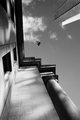
My Neck Hurtsby cloverstarComment: Hard to believe that the person capable of taking this thoughtful and beautiful photograph could also come up with such an awful title. But title aside, it's one of the most interesting images in the challenge. Very fine work. 7. |
| Photographer found comment helpful. |
| 02/23/2006 05:41:29 AM |
The Retireesby slyshamusComment: This could have been quite brilliant, if only it was a reasonable size. I'm old (nearly a retiree myself), and I can hardly see it. The idea, and your execution of it, is otherwise very good indeed. 7. |
| 02/23/2006 05:38:56 AM |
The Early Birdby owenComment: I like this image a lot. Great idea, fabulous composition, and processed perfectly ... all except for the yellow, which I'm afraid I really dislike. It just about overwhelms the many beautiful and subtle qualities of the photograph. Like a lovely woman wearing awful, strident makeup. But that aside, it's terrific. 7. |
| Photographer found comment helpful. |
| 02/23/2006 05:31:32 AM |
Projecting for the Treesby seebrownComment: What a wonderful, absurd photograph! It's one thing to have an idea as "out there" as this, but quite another to be able to execute it with this level of skill. Among the many things I love about it is the reflected light on the tree trunks. And how impressive that you resisted the temptation to have an image of any kind on the screen. There's also lots of barely-visible detail hidden in the darkness, so the less imaginative souls among us will at least be able to use it as a monitor calibration test image.
In a world of dull, dross and drear, this image is like a triple shot of tequila. Pow! 10. |
| Photographer found comment helpful. |
| 02/23/2006 05:16:45 AM |
A dark side of the cityby AntoninoComment: This is a wonderful city detail. It reminds me of some of the Paris photographs of Eugene Atget, except for the rotation, of course. But in this case the rotation seems justified, because it forces some depth and perspective into this staircase and its surroundings. Processing is very nice, too .... there's really no clue (other than the rotation, and that bit of graffiti) that this is not a photograph from the 1920/30's. It's a very impressive, absorbing work. 8. |
| 02/23/2006 05:01:27 AM |
Designer Thoughtsby honikumComment: Unusual. Great impact too, and not just because of the body art. The lighting and composition are very effective, and the simple background motif is used brilliantly for your intended purpose. The toning is excellent. It would have been even better in the maximum allowed size ... it's such a clever and thoughtful photograph that I'm wondering if your under-sizing was deliberate? If so, it's the only choice you made that I can't support. 7. |
| Photographer found comment helpful. |
Home -
Challenges -
Community -
League -
Photos -
Cameras -
Lenses -
Learn -
Help -
Terms of Use -
Privacy -
Top ^
DPChallenge, and website content and design, Copyright © 2001-2026 Challenging Technologies, LLC.
All digital photo copyrights belong to the photographers and may not be used without permission.
Current Server Time: 08/05/2026 08:03:41 PM EDT.