|
|
|
Showing 2531 - 2540 of ~2734 |
| Image |
Comment |
| 01/14/2003 04:56:38 PM | When was the last time you watered the plants, dear? by jjbeguinComment: Nice idea!
I like the composition, altough I think that a more horizontal angle would have a better effect on the table. Adding the bowl of (?)nuts(?) makes the scene more interesting.
One thing tough, the scene looks underexposed. The wine is shifting to black, the greens are rather dark, the shadows hold little detail and the white wall doesn't look white. Not because the whitebalance isn't right, its more an underexposure thing. However, the exposure of some of the 'nuts' is very good, and some of the flowers are well exposed too. (This monitor is calibrated)
I think that this picture can benefit from two possibilities:
1) More light from beneath to fill in the shadows, plus perhaps another light on the wall.
2) Exposure compensation / exposure bracketing
I might tell you something you already know; The white wall fools the camera's exposure meter, just like snow. It measures something to bright for its reference of 18% grey and chooses an exposure setting that compensates in the other direction. But that leads to underexposure of the scene. I think that this scene could benefit from a 1/3th to 2/3th wider aperture or the equivalent of shutterspeed for that (1 stop wider aperture is equal to a doubling of the shutter open time). So when you don't wan't to mess with the depth of field, you need a longer shutter.
Good sharpness, focus and depth. Colors look very natural (altough dark), so the whitebalance seems ot be good.
Anyway, I like this pic and there is one of the better humour shots, so I gave it a 9. Would be a 10 if it weren't for the things I told above.
(I was still in Critique Club mode, so that's why I got carried away with this reply) |  Photographer found comment helpful. Photographer found comment helpful. |
| 01/14/2003 04:40:01 PM | Reflecting in Rain -- Purple Rain_Princeby smellyfish1002Comment: ~~~~Critique Club Comment~~~~
Composition (content)
Nice composition, I like it how the light works here, it leads the attention to the face. The raindrops add a good texture, they look nice in this state. Raindrops running down the window, wouldn't have been nice at this shutter.
The face makes the picture, it is an interesting element, portrayed in an original way. The purple edges in every drop is also very nice.
Was the window dirty? In the face area there are some strange stripes / smears, it is a little bit distracting as it is an unnatural element in this composition.
The exposure must have been difficult. You still have a dark right side, while the left side of the face starts to blow out. Was it lit from the left, it looks that way. Perhaps that changing the position could help bring a more even lighting if you want to. It is not a big deal.
Background
No comment.
Camera Work (Technical)
Can't judge. Because it is so dark I can't see if this is really sharp. It isn't so important here I think. The blurred background face is ok, the soft look goes well with purple rain.
Digital Processing (technical)
You have done a lot of work to get it this way, interesting to read how you did it. I can't add anything else to it.
My opinion
Interesting concept, good idea.
I'd like it more without the stripes in the face area. | | Photographer found comment helpful. |
| 01/14/2003 01:49:44 PM | karmacomaby stephanComment: ~~~~Critique Club Comment~~~~
Composition (content)
Arghh, this must be the most difficult picture to comment on in my whole CC career. :)
I tried to capture the mood and create a visual representation of what I think fits to the song.
I know the song, but I don't like it (music, never listened to the lyrics) to put it mildly. This image puzzles me, I don't know what I am seeing. I wan't to, but I can't. Perhaps that is a little frustrating. The mood it expresses to me is a dark and depressed one.
I have looked up the lyrics. They seem to be a bit dark and puzzled as well, so I guess you have done a good job.
..duplicate, then you wait for the next kuwait....
..i drink on a daily basis
though it seldom cools my temper
it never cools my temper....
Interesting. When it comes to drinking by the way, that could be reflected in the strange curvy flow in the top. Like the world distortions you see when you are drunk, just before you fall on the floor with the world spinning very very very hard. (I succesfully avoid that the last couple of years).
The thing that I most like about the picture itself (without the feeling it expresses) is the color and arrangement of the yellow/green texture.
The figure seems to have the profile of a teddybear. My first thought about the green stuff was a green lit LP, but it has got to many tracks.
This is something that works for you and then it is great, or it doesn't and then it means nothing to you.
Background
No comment.
Camera Work (Technical)
Was there away to avoid that spot in the yellow, left of the figure?
Digital Processing (technical)
No comment.
My opinion
I don't really know what too think of it. | | Photographer found comment helpful. |
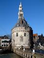
| 01/14/2003 01:13:04 PM | Council sells 1532 defence tower (local frontpage)by AzrifelComment: About the right and left side: This is the cleanest crop possible. More to the right is a sign for tourists and a modern kind of fish boot and parkinglots in front of the houses. More to the left is a pump for ships and there were some high cars spoiling the classic buildings.
The best time for shooting this is on a cold clear Sunday morning, from the ice in the harbour when it is there and stand back more. Because you are deeper in comparison to the walls, the angle of view takes out the cars and most modern stuff and shows the tower in its 'natural' surroundings with old houses in the background. Doesn't happen often.
So now it was centered. That's why I stood back and let the wooden landing stage lead the eye into the pic. Message edited by author 2003-01-14 13:14:42. |
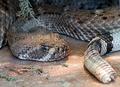
| 01/13/2003 05:43:27 PM | "Slither" - Metallicaby YomiComment: ~~~~Critique Club Comment~~~~
Composition (content)
The postion of the snake in this composition is very good. Two of its most known features, the head an the rattler (I think it is, the head looks to be of one and the tail suggest it, but I am no expert on them) are captured in the frame at composition-wise nice positions.
The bit of body at the left suggests the size, it must be pretty big and that enhances the feeling that this is a dangerous creature. The head is in a nice position, the animal seems to be checking the viewer out. Too bad there is a reflection in the eye, a clear pupil is more powerful.
Don't know what to make of the branch. I don't think it interferes much, it tells something about the habitat. Perhaps it would have been better if there was more of it.
Nice angle, puts you face to face.
Background
The color of the background goes well with the snake. It could be lying on a rock, it doesn't say "Zoo", nice effect. The pieces in front of the face add some flavour and another color (good).
Camera Work (Technical)
I think that this picture would have benefitted from a smaller aperture in combination with a focus that would allow for more depth of field in front of the snake. The blur in the background is good, but it would have been nice to have the rattler in the field of focus as it is an important feature of the snake. Only 1/3th of the DOF is in front of the focus point and 2/3th behind it, so it would need to be focussed well in front off the face. The tail perhaps.
As it is, the focus is good and the sharpness excellent.
Good exposure as well.
Digital Processing (technical)
Color balance, sharpness etc are all ok.
You have room to save it at a higher quality level. The benefit of that is that you keep a higher sharpness of the details. No obvious jpeg degradation here, but it is something to keep in mind. No reason not to save high quality work at the highest quality.
My opinion
Nice image. I like the power of the snake, but it could use more depth in the front in my opinion to make it better. I don't understand the high number of three's and two's. | | Photographer found comment helpful. |
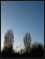
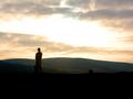
| 01/13/2003 05:14:56 PM | 'Blue Skies' by Tori Amosby ManicComment: ~~~~Critique Club Comment~~~~
Composition (content)
If it wasn't for the challenge and the title I'd say that there is bit much of empty space above the silhouette. For a silhouette it is a nice image, the composition of it is pleasant and the different types of tree provide different textures to prevent a boring view. The small resolution took away some of the detail. :(
In this case (talking about the blue sky as the main subject now), the silhouette adds something interesting, nice and well done. I also like the color graduation behind the trees, be it on the soft side.
Nice border.
Background
See composition.
Camera Work (Technical)
The exposure that resulted from the camera work and post processing is good. The silhouette is completely dark.
The blue sky shifts from whiteblue in the left to a darker blue in the upper right. Was it taken with a polarizer on, it is something you often see with polarizers used at a less perfect angle to the sun. The polarizer might make the sky blue'er when you haven't used it. I believe the S40 has possibilities for that..
Digital Processing (technical)
Good job. Very clean sky.
My opinion
As it is, too empty, but met the challenge well. | | Photographer found comment helpful. |
| 01/13/2003 04:51:04 PM | Someone Pass the Tagametby TurbotechComment: Hi Turbo,
Interesting effect from the flash, the 602 really seems to benefit from them. I like it how the background provided enough bounce to prevent hard shadows. Something to keep in my mind. :)
And the orange screems at you. Would make me laugh in the humor challenge as well. ;)
One other note, the image isn't level / the horizon isn't straight. When you have photoshop you could set the ruler on one of the straight lines (follow the tilt) and then go to Rotation, Arbitrary to get the horizon straight really easy. | | Photographer found comment helpful. |
| 01/13/2003 04:43:39 PM | Stranger in Candy Landby karmatComment: ~~~~Critique Club Comment~~~~
Composition (content)
I think this is too "set up", the big black hole between the "Squares" and the "Chicklets" gives it away too much. Another angle, more from above might have given a better, more complete, less obvious view. The shelf suggestion of Indigo is a good one. Another interesting idea is to put it in a sea of M&M's and paint a M&M logo on the tomato. The red M&M color almost matches the tomato's.
The "Kisses" produced a lot of nasty glare and are very dominant in the image.
Good lighting, no nasty shadows.
Background
See composition.
Camera Work (Technical)
Good exposure, but the foreground is a bit soft. Was this from close by? If so, try to stand back and zoom in to create a larger field of focus (increase the DOF at F8). The focus is good.
Digital Processing (technical)
It looks a bit oversharpend to me, a lot of jaggies around the curves of the M&M's and all the letters on the packages in the background. Colors are very good.
The jpeg quality can be a level higher as you have some room for a higher filesize. Stronger compression enhances the sharpening jaggies.
My opinion
The concept has some interesting potential, but as it shows too much that it is a setup. I don't have problems with setups. | | Photographer found comment helpful. |
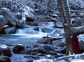
| 01/13/2003 04:21:16 PM | WINTER by Tori Amosby indigo997Comment: ~~~~Critique Club Comment~~~~
Composition (content)
Nice composition. The tree and the person add depth and scale. The most striking part of the stream is in a nice position in the frame and it runs to frame well. The crop as it is, shows its natural surroundings. The blue cast adds cold.
Good choice of aperture and shutterspeed. The whole scene is interesting, so it benefits from a large depth of focus. The .3s shutter gave a nice flow motion blur to the water, a silky touch.
I get the feeling that the image is slightly tilted to the right tough.
It would have been nice when the lady in red would have looked at the stream, instead of the rock. The red of her coat adds some color, which is nice in my opinion.
Background
The snowy treebranches hold very little detail at this resolution, not a problem as it transfers the focus to the right side of the frame.
Camera Work (Technical)
See comments at composition. Exposure is ok, it tends to a little bit of underexposure, but that enhances the darker feeling of winter. No problem. Focus and sharpness seem to be ok (it looks like it is sharpened / USM'd in the digital processing as well). I wonder how a bit softer looks.
Digital Processing (technical)
No further comments.
My opinion
Perhaps it sound stupid, but I like the lower half the most. At this resolution the upper half looks busy and clutterd, I am sure it balances out at a higher resolution. Nice work, deserved to score this high. | | Photographer found comment helpful. |
| 01/13/2003 02:21:45 PM | It's too noiseyby PaulkComment: But the composition is pretty good. I like the human element, it creates depth and scale. | | Photographer found comment helpful. |
|
Showing 2531 - 2540 of ~2734 |
Home -
Challenges -
Community -
League -
Photos -
Cameras -
Lenses -
Learn -
Help -
Terms of Use -
Privacy -
Top ^
DPChallenge, and website content and design, Copyright © 2001-2026 Challenging Technologies, LLC.
All digital photo copyrights belong to the photographers and may not be used without permission.
Current Server Time: 06/11/2026 01:24:00 PM EDT.
|