|
|
|
Showing 2471 - 2480 of ~2734 |
| Image |
Comment |
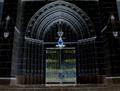
| 02/08/2003 10:17:31 AM | Eternal Doorwayby AnachroniteComment: ~~~~Critique Club Comment~~~~
Composition (content)
Very cool effects here and a composition where centering it works because of the great balance between left and right.
The effect of the blue lamp is great and it is wonderful to see how it seems to throw some blue illumination on the arch and door. The yellow/gold on the hinges pull back the attention to the door. Good job.
The situation doesn't seem level with the horizon. It could possibly benefit from a small rotation to the right. In PS you could use the ruler to decide between which points the horizon should be and level it with arbitrary rotation.
The photo shows distortion (The right and left wall tilt into the picture) caused by using a wideangle lens from closeby. I don't criticise what you did, because I think it looks pretty cool, but when you wan't to avoid that distortion there are two options (three when you count in perspective control lenses) that might work.
1) Stand back and zoom in
2) Try to get the lens at the same height as the center spot of your photo
Camera Work (Technical)
Good focus and sharpness, altough some of the details have been lost in the resampling proces.
When you had trouble with motion blur/camera shake at 1/20s try aperture priority next time with an aperture of F5.6 or F4. The situation doesn't really need the wide dof of F8. F5.6 will get you a shutter of 1/40s and F4 1/80s.
Digital Processing (technical)
No further comments.
My opinion
The most beautiful part is the arch with the lamp. Just a crop of that would be awesome but not suitable for this challenge. |  Photographer found comment helpful. Photographer found comment helpful. |
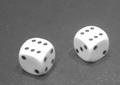
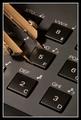
| 02/08/2003 09:58:35 AM | luckythrowby desmckechnieComment: ~~~~Critique Club Comment~~~~
Composition (content)
Nice off-center subject placement, good enough angle. Good choice of black and white.
The two main problems are the soft aut of focus look and the fact that it has a low wow-factor, a better background or something else like a throwing cup could make the photo more interesting. The background looks like a plastic and has skin-like texture. Fabric like they use in casino's gives a much softer/natural and consistent background for example.
The (very) soft focus is caused by several things I think:
a) There seems to be a little bit of motion blur, closeups in low light situations really benefit from using a tripod or another stable platform.
b) I think that this camera cannot focus from close distance. I checked the Jenoptik website and the only reference to this camera I found was the JD C 1300. That one has a focus range of 40cm to infinity. That means that it cannot get the subject in focus when you are closer to it then 40cm. The above looks like 25-5cm to me. I think that for your camera the same rule applies.
Using you Nikon 775 in Macro mode on a Tripod would have yielded an excellent focus.
Lighting is nice, the most light seems to come from above from several light sources.
Camera Work (Technical)
See Composition.
Digital Processing (technical)
Nice B&W.
Your picture is about 95kb out of 150kb allowed. Saving it at a higher jpeg quality (less compression) can avoid edge softness, keep detail sharpness and avoid color/tone degradations. It isn't important here because of the soft focus, but something to keep in mind for the future.
My opinion
Not very interesting and bad focus. Composition ok. |
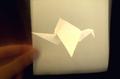
| 02/08/2003 09:33:16 AM | Just A Quick Fold Awayby paully2k1Comment: ~~~~Critique Club Comment~~~~
Composition (content)
Good idea and nice try with your "crap camera". :)
The challenge was square of course, so I can understand the decision to enter it as it is, but I think that photowise a huge composition improvement can be made by cropping it differently. The view on the folded bird is now very centered.
Lets forget about the square challenge. I would cut off 1/6th of the top and about 1/7th of the right side. That way you get a much more interaction between the hand, the orginal paper and the folded bird. And it takes away the motion blur and uninteresting black at the right.
As someone else said, the bird seems to float/fly. That is a very cool effect. Creative and well done.
Background
The soft darkbrown tones at the left are nice, the darker right side less so.
Camera Work (Technical)
It is hard to get the exposure on the hand better. More light would mean that the paper itself will be brighter as well, that way ruining the detail of the folded bird. I like the exposure as it is, the folded bird is detailed and bright, the center of attention and the unfolded paper is like a soft curtain.
I wonder how you created this effect, a shutter of 1/15 is slow. Hardly any time to tell when to pull the paper away. Or is it a multiexposure?
The bird is in focus and sharp.
Digital Processing (technical)
The image looks a bit noisy and details a tad soft. I think that that is caused by the heavy/agressive jpeg compression. Your picture is less than 25kb out of 150kb allowed. Saving it at a higher jpeg quality (less compression) can avoid the harshness of the noise, keep detail sharpness and avoid color degradations in the white's.
My opinion
Cool idea, composition and digital processing needs some improvement. Message edited by author 2003-02-08 09:55:59. | | Photographer found comment helpful. |
| 02/05/2003 04:36:34 PM | Church Doorsby inspzilComment: ~~~~Critique Club Comment~~~~
Composition (content)
Interesting conversion, combined with the subject it looks like Gothic art. What most struck me in this image was the strange shadow of the handrails, intensified by the glowing edges. It looked strange, out of place.
I really like the effect of what you did and the early morning exposure has made sure that all the details on the arches are clear and not covered in a deep shadow.
I have a small list of suggestion though:
* Level the horizon
* Try to seek a more balanced crop between left and right. The left pillar has space at the left, while the right pillar has been cut trough. A level horizon could also produce a cleaner cut on top, so that the curly decorated stones provide a better top framing (or leave them out).
* Try to spot edit the shadows of the handrails away (it was allowed for this challenge). On the stairs it isn't a problem, but on the door and pillar I think it to be a bit distracting
Including some of the street in front was a good thing.
Camera Work (Technical)
Exposure seems to be good, can't say anything about the other camera stuff. :)
Digital Processing (technical)
See composition.
Was this the max jpeg quality for a monochrome image? I know that sometimes you can get 100%jpeg for monochromes, but with all that detail it makes me wonder. Your picture is only 100kb out of the allowed 150kb you see. Saving it at the highest quality possible within the 150kb filesize limit ensures more edge and detail sharpness and for color images it keeps the colors more consistent.
My opinion
Cool effects, but needs some improvement. |
| 02/01/2003 02:52:55 PM | | | Photographer found comment helpful. |
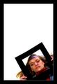
| 02/01/2003 02:51:58 PM | Life inside the Frameby arnitComment: Nice how the frame around the face corresponds to the frame around that frame. :) The big space above works good.
Cool shooting angle.
Cool model. :)
I do think that she should have unzipped that sweater, to show more of the neck, it would make her face look more friendly. |
| 02/01/2003 02:49:32 PM | All Sides Equal...by DavenitComment: The use of the compass makes this an original image (and it adds color without breaking the balance), the combination of angles is very good.
Good lighting, nice frame. |
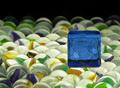
| 02/01/2003 02:46:58 PM | Riding on a Sea of Marblesby smellyfish1002Comment: This is a very cool idea and well executed.
The colors of the marbles and the blue block are great. Good lighting and exposure. I love it how the choice of dof fades the marbles into the background.
This calmes me down, it is very pleasent to look at. | | Photographer found comment helpful. |
| 02/01/2003 02:37:01 PM | What the Duck?by dodobirdComment: ~~~~Critique Club Comment~~~~
Composition (content)
Great subject placement, the sign clearly stands out in the foreground, with a nice representation of its surroundings in the background. The foreground and background relate very well.
The lighting of the sign and the surrounding area is very good. The motion blur of the passing cars has its ups and downs. The red/orange rear lights (of a truck?) are nice, they seem to add something perspective wise. But the big yellow/white streek of frontal lights that runs from the right to the left is a bit too much, it is blown out and spoils the lighting balance.
You need an assistent! :) On a serious note, someone helping here could be very useful. Either to tell you if the road is clear enough for a 10s exposure or to stop the traffic.
The use of F8 aperture has created the nice twinkling around the lights, cool touch.
I also like the angle at which you shot the sign.
Camera Work (Technical)
Good exposure, focus and sharpness.
It wouldn't have been a big problem to widen the aperture I think. Using F5.6 to go to a 5s shutter would still have had a lot of depth as a result at the same exposure value, but the influence of the cars might have been less. F4 2.5s/F2.8 1.3s/F2 .65s to blur the background would have been a possibility as well.
Digital Processing (technical)
Good natural color, good sharpness.
There is some rome left for saving the picture at a higher quality 130 of the 150kb max filesize is used.
Good balanced frame.
My opinion
Very nice. | | Photographer found comment helpful. |
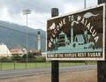
| 02/01/2003 02:20:42 PM | Sweet Inspirationby CubComment: ~~~~Critique Club Comment~~~~
Composition (content)
First of all my apologies. I didn't see the relation between the sign and the background during the challenge, I just saw a sign with an ungly factory ruining the background. But now that I read your comment and have looked a bit better for this critique it was so obvious. :)
As soon as you see/know the relationship the telephone cables and stuff are just some background noise, shame that they are there, but not to big of a problem.
There are not too many ways to get the sign and its background relation into the same frame, so I think you did a good job on this. The sign's perspective points to the sugar mill and the horizon is in a nice position. The use of the small aperture creates enough depth of focus to get everytink in focus in the frame. The weather may be bad, but it has created an very balance lighting of the whole scene with natural colors, but without nasty shadows.
It is just that the sugar mill itself is ugly and seems like industrial waste in a mountain landscape.
Background
See composition. The sharpness of the hill is very nice.
Camera Work (Technical)
Good focus, sharpness & exposure. No comments.
Digital Processing (technical)
Color balance looks good, sharpness as well.
The filesize has some room for saving the pic at a higher quality. It isn't very noticible here because a good algoritm is used, but a higher qualitye (close to 150kb in filesize) can save edge sharpness and the representation of contrastnoisy patches like the mud in the foreground.
My opinion
Now that I know the relation: very cool.
But the subject isn't so beautiful. :)
Good eye, original!
| | Photographer found comment helpful. |
|
Showing 2471 - 2480 of ~2734 |
Home -
Challenges -
Community -
League -
Photos -
Cameras -
Lenses -
Learn -
Help -
Terms of Use -
Privacy -
Top ^
DPChallenge, and website content and design, Copyright © 2001-2026 Challenging Technologies, LLC.
All digital photo copyrights belong to the photographers and may not be used without permission.
Current Server Time: 06/11/2026 08:06:04 PM EDT.
|