| Image |
Comment |
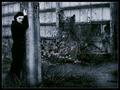
| 01/06/2005 04:19:44 PM |
Not To Be So Depressive by sahkoComment: This photo is so complete. Everything seems to work together. The cold toning, the mess in the background, the clothes of the subject, the pose, the look on the face and the color toning. Yes, it breathes depression.
Excellent job, one of two 10's in this challenge. |
 Photographer found comment helpful. Photographer found comment helpful. |
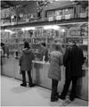
| 01/03/2005 02:12:12 PM |
|
| 01/03/2005 02:05:37 PM |
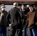
The Skateboardersby novaComment: Is he afraid that they are going to steal his gun or do policemen always have their hand on their gun in your country? On the other hand, that dude in the middle looks like Axle Rose so you really can't blame him. :)
Great ' Authority' pic too btw. |
| Photographer found comment helpful. |
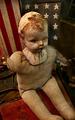
| 12/22/2004 11:52:58 AM |
Millerby AzrifelComment: I agree with the comments about the movement of the wind. Unfortunately I had no tripod with me, else I'd have shot it @ F18, ISO200 and probably a polarizer attached. The shutterspeed would need to be very slow, because the wings were not turning fast. So I opted for freezing @ 1/1000s.
Another aspect of uncertainty is the person in the shot. I should have asked him to pose, but I was not that bold. The reason why I kept him in is that a similar photo without him looked boring (The pose could be way better). I kept the grey box in because cropping it tighter made the stairs look too short and wrong.
Anyway, the photo was interesting enough to get a lot of comments, most helpful. Thank you all.
|
| 12/14/2004 04:49:23 PM |
broken or bust?by whiteroomComment: Good title.
I like the idea and how the lower part of the photo looks (it looks like a 10 score). But than the background above the neck spoils it. The ugly wall and roof, the unrelated matter and especially the blown out (exposure-wise) windows draw so much attention a way. Just where you'd like to focus all of your attention on the cut off face. Averages out to a 7.
I'd like more of the background the way the floor looks. The highlights on the body are no problem for me. |
| Photographer found comment helpful. |
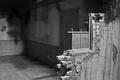
| 12/14/2004 04:43:38 PM |
Broken Homeby cabaComment: The light, the shadows, the lines, the dof it all comes together so well. The house seems to tell a story, the way this is photoghaphed makes me look at it for a relatively long time. I like it a lot, it is my favorite in this challenge.
The lines of the broken wall intersect and flow over in the lines of the shadow inside. As if the house knows its fate. Perhaps that explains a bit what I see. |
| Photographer found comment helpful. |
| 12/14/2004 04:36:21 PM |
|
| Photographer found comment helpful. |
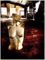
| 12/14/2004 04:34:17 PM |
It Took Forever!by tyt2000Comment: Hilarious. Because of the thin shell even the inside that we cannot see shines through and even there the creature marked the wall, splendid!
|
| Photographer found comment helpful. |
| 12/14/2004 04:31:56 PM |
|
| Photographer found comment helpful. |
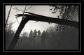
| 12/14/2004 04:30:25 PM |
Broken treeby RUEDISCHMUTZComment: Such a simple subject but such a strong portayal. I love it how the dark broken tree is so dark vs the bright sky (with tone preserved instead of blown out = good). The frame you made also works well with that. Good use of background elements to give the viewer a feeling about what he is looking at and in what settings. |
| Photographer found comment helpful. |
Home -
Challenges -
Community -
League -
Photos -
Cameras -
Lenses -
Learn -
Help -
Terms of Use -
Privacy -
Top ^
DPChallenge, and website content and design, Copyright © 2001-2026 Challenging Technologies, LLC.
All digital photo copyrights belong to the photographers and may not be used without permission.
Current Server Time: 06/18/2026 01:12:46 PM EDT.