| Image |
Comment |
| 01/13/2005 04:32:36 PM |
Breakfast at Tiffany'sby AleciaComment: This looks great. Her pose and looks is so classic. She really looks like (and perhaps she really is) a famous moviestar.
The balance of light and dark combined with the toning is just great. The addition of the cigarette holder makes it mory dynamic. If I imagine the portrait without it, it somehow looses its power.
The things that draw me as first is the hair and the glasses. Especially the tone gradation in the glasses makes it a bit "who's that girl?" (to be sure: not Madonna related at all!). |
 Photographer found comment helpful. Photographer found comment helpful. |
| 01/13/2005 04:26:51 PM |
|
| Photographer found comment helpful. |
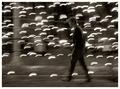
| 01/10/2005 01:54:49 AM |
Electric Avenueby sherComment: Whaaaattt? 5.861 and 45th? No way!
Hmm, if you add the average vote of commenters to the average score and divide the total by 2 you'd be the winner. ;)
Edit: BTW, cool new portfolio portrait! Message edited by author 2005-01-10 07:12:28. |
| Photographer found comment helpful. |
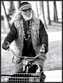
| 01/09/2005 10:23:19 AM |
Old ladyby sahkoComment: Classic strong portrait of a very interesting looking person. |
| Photographer found comment helpful. |
| 01/09/2005 10:22:02 AM |
Practiseby leafComment: Good lighting and composition. But there seems to be a bit too much red. Perhaps it is from playing the instrument (cello?) but it looks as if it has been in the sun too much or like it came from the cold and is now warming up. Same can be seen to some extent on the nose. A slight adjustment of the mix of the red channnel in the channel mixer might easily solve that. |
| Photographer found comment helpful. |
| 01/09/2005 10:18:32 AM |
Happy Days by qmdiComment: Nice lighting, he is much darker than the background and that makes him stand out more.
Love the dog in the basket. |
| Photographer found comment helpful. |
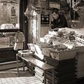
| 01/09/2005 10:17:13 AM |
Businessby jjbeguinComment: Given the window of the building in the background and the language on the walls this must be france. The window rules out Canada.
I like the composition. The store is a pleasant mess, I can almost smell the fish.
The Sepia tone works well, better than B&W I think. |
| Photographer found comment helpful. |
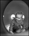
| 01/09/2005 10:09:53 AM |
"I see you!"by parrotheadComment: The thing she (?) is sitting in creates a great frame around the her. Nice moment.
|
| Photographer found comment helpful. |
| 01/09/2005 10:08:24 AM |
Natural Beautyby librodoComment: I like the composition, the pose, the saturation and the lighting. But the details look a bit smooth, too smooth. Agressive Neatimage smooth.
|
| Photographer found comment helpful. |
| 01/09/2005 10:06:03 AM |
|
| Photographer found comment helpful. |
Home -
Challenges -
Community -
League -
Photos -
Cameras -
Lenses -
Learn -
Help -
Terms of Use -
Privacy -
Top ^
DPChallenge, and website content and design, Copyright © 2001-2026 Challenging Technologies, LLC.
All digital photo copyrights belong to the photographers and may not be used without permission.
Current Server Time: 06/18/2026 01:10:28 PM EDT.