| Image |
Comment |
| 01/21/2005 06:34:43 PM |
-Cass-by HokaheyComment: Very cold, hard and intimidating. This is caused by his pose, the lighting and the cool toning. It is interesting how this contrasts to the cross around his neck, wich is supposed to stand for warmth, love and community. Interesting.
Without the light in the eyes it would loose its impact. |
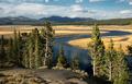
| 01/21/2005 06:31:37 PM |
Hayden Valleyby GallatinComment: I like it how the line of the river leads me across the plains, but in that background it lacks a certain punch. 7 |
 Photographer found comment helpful. Photographer found comment helpful. |
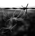
| 01/21/2005 06:30:46 PM |
Split Endsby geewhyComment: Simple but effective, entertainting lines. I like the contrast in this photo, both the contrast of light as the contrast between the soft white stuff vs the hard barb-wire. 7 |
| Photographer found comment helpful. |
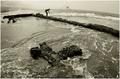
| 01/21/2005 06:29:15 PM |
The Fishermanby chunsumComment: Interesting perspective, but just too much unnaturally curved. Shot with a fisheye?
It is also very busy, especially the element in the foreground draws the attention away from the fisherman.
Despite all that, interesting shot. Makes me think of the saltpanning works on several Carribean Islands. The structure looks to geometrical alligned to not be human made.
|
| Photographer found comment helpful. |
| 01/21/2005 06:24:02 PM |
Sunrise Strollby admart01Comment: The human element in this makes it have a good impact. I like the roll of the waves, makes the scene more dynamic. The sun looks a bit strange, but that can happen. 7 |
| Photographer found comment helpful. |
| 01/21/2005 06:22:47 PM |
|
| Photographer found comment helpful. |
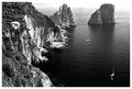
| 01/21/2005 06:21:20 PM |
Faraglioniby ChiquiComment: The composition is the strengt of this photograph. The lines of the hills take you from the bottom, up and to the right. The boats in the water add some interest to that space and give a scale reference. The blowout brightness at the top prevents the eye from leaving the scene. On the other hand, the brightness on the rocks is a bit too much and there are few shadows. Earlier or later in the day might yield better contrasts. 7 |
| Photographer found comment helpful. |
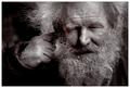
| 01/21/2005 06:18:29 PM |
Can't 'ear you.by PedroComment: Heh heh he, check my profule photo. I guess this is how I'll look like 40 to 50 years from now. :)
Great portrait, I like the weathered expression, lookes like a seasoned fisherman.
The way the light falls is very good. All the bright tones on the face and beard, all the dark tones on his jacket and background. Makes the face stand out very well. |
| Photographer found comment helpful. |
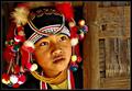
| 01/21/2005 06:10:31 PM |
Morning Greetingby librodoComment: I kept wondering: This is a great portrait, but why did I give it an 8? I had a look at it several times and I think it is because of the balance between the person and the reed wall. For my feeling there is a bit too much wall, it brings the impact of the photo out of balance.
Had a go at it in Photoshop and cropped this version from the left with a constrained aspect ratio of 5:4. Less wall, more emphasize on the face. IMHO the 5:4 crop works better.
|
| Photographer found comment helpful. |
| 01/21/2005 06:05:37 PM |
Dinner with Rosemaryby DJLubaComment: I do not entirely like the composition, but softness of the background is soo sweet to the eye, especially with the shallow dof that it makes up for that. There is a great 'mood' in this photo. 8
|
| Photographer found comment helpful. |
Home -
Challenges -
Community -
League -
Photos -
Cameras -
Lenses -
Learn -
Help -
Terms of Use -
Privacy -
Top ^
DPChallenge, and website content and design, Copyright © 2001-2026 Challenging Technologies, LLC.
All digital photo copyrights belong to the photographers and may not be used without permission.
Current Server Time: 06/18/2026 09:34:20 PM EDT.